What corner radius do modern products use for primary buttons?
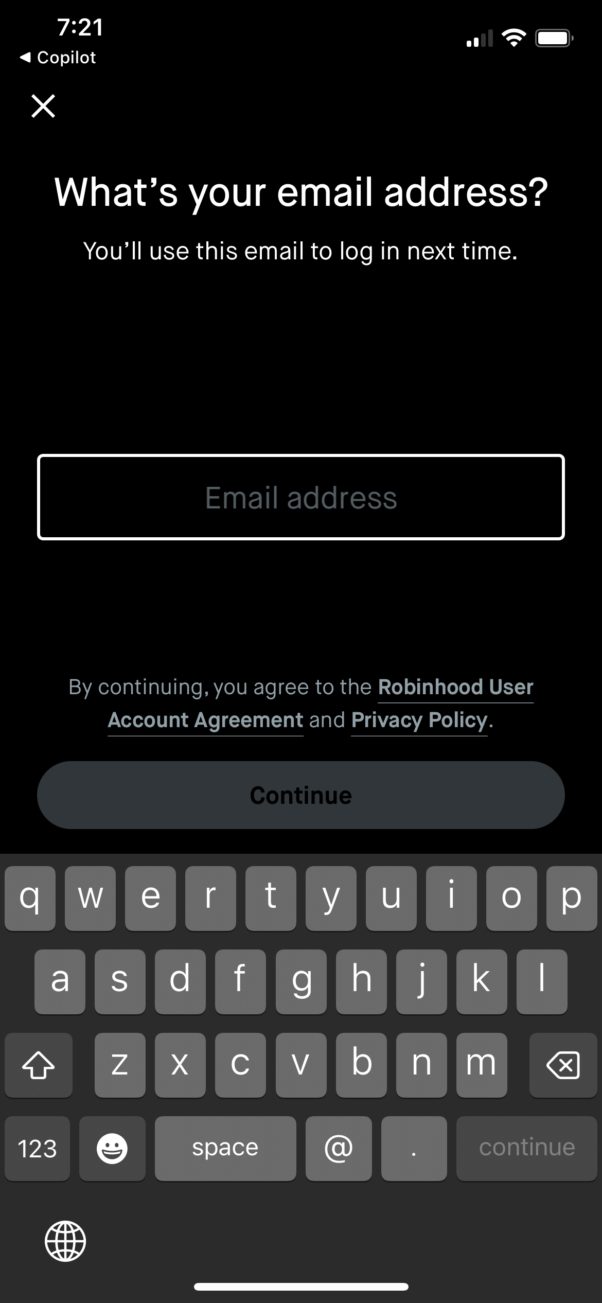
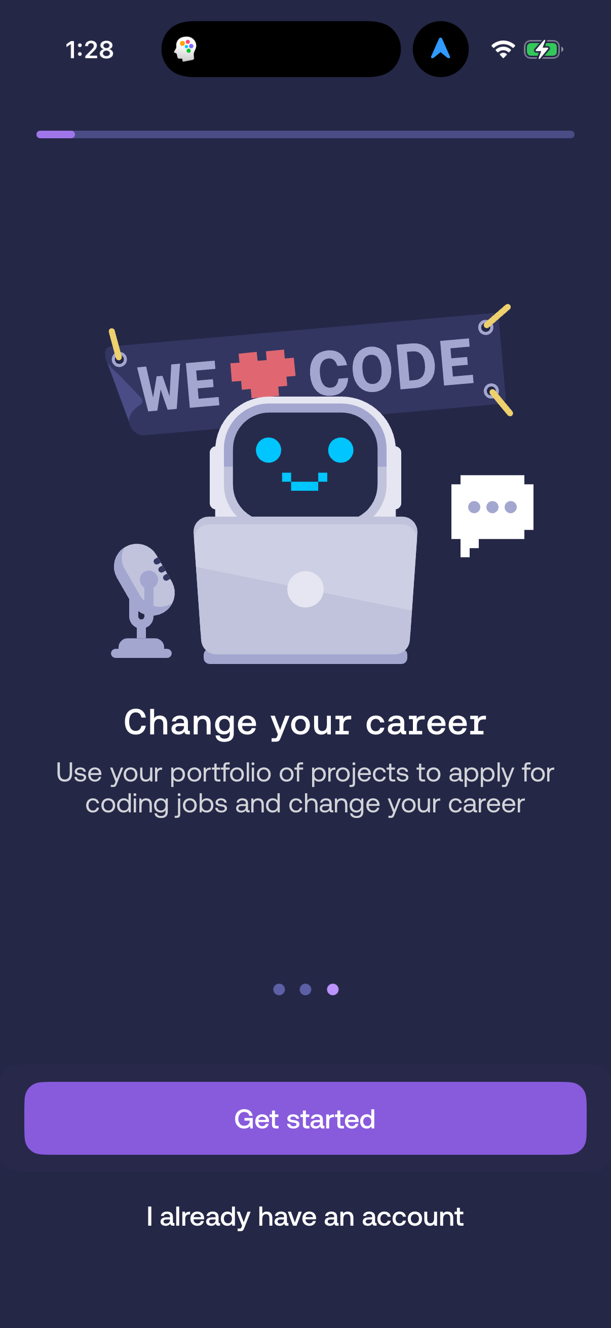
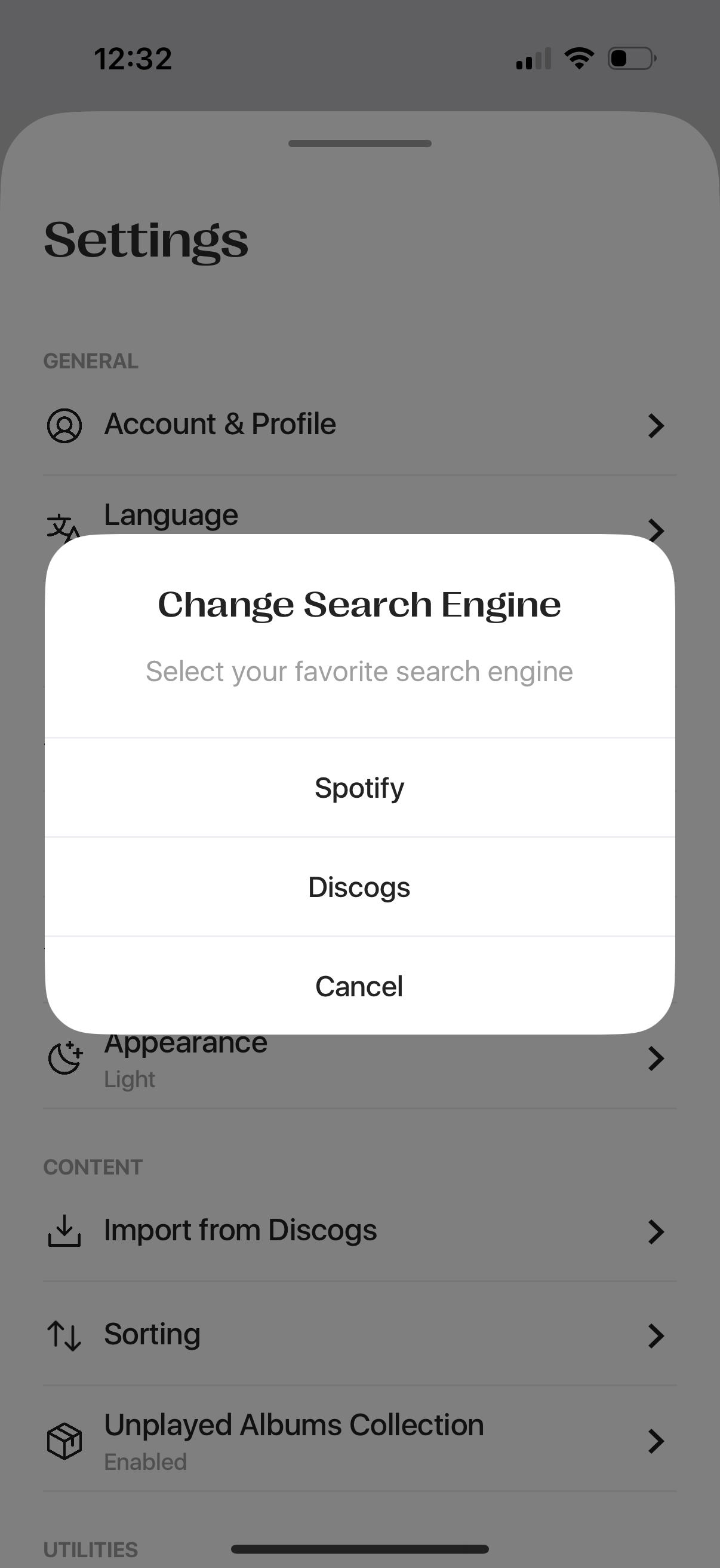
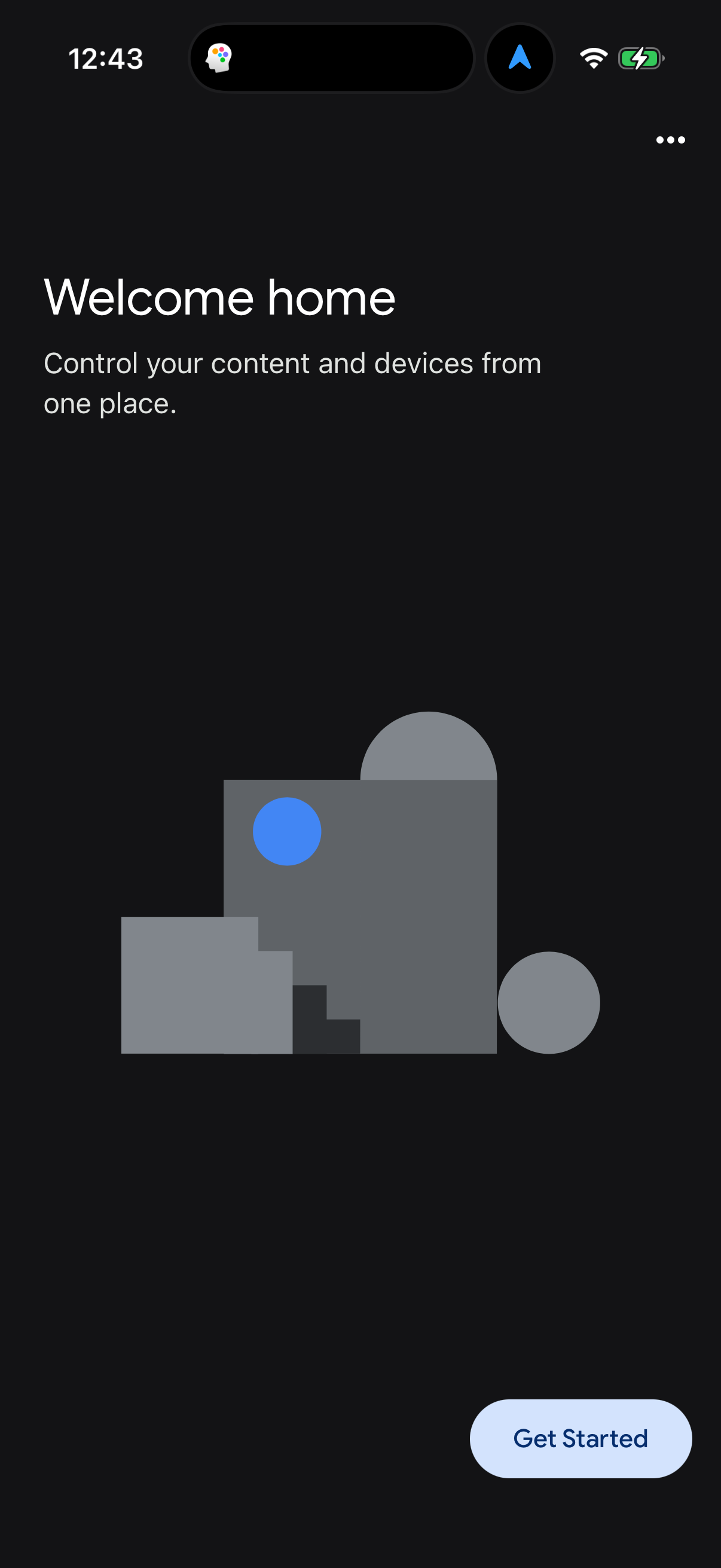
Fully-rounded pill buttons are the single largest bucket: 32.3% of 514 audited design systems use a 40+px (pill/full-round) primary button, and another 27.0% sit in the 7-12px 'rounded' range [1]. Sharp 0px corners are nearly extinct at 2.9% [1]. Rounded-to-pill is the modern default.
32% of 514 audited design systems use pill-shaped (40+px) primary buttons; only 3% use sharp 0px corners, July 2026.
| Item | Share |
|---|---|
| 40+px (pill/full-round) | 32.3% |
| 7-12px (rounded) | 27.0% |
| 21-40px (large) | 18.3% |
| 1-6px (subtle) | 10.9% |
| 13-20px (very rounded) | 8.6% |
| 0px (sharp) | 2.9% |
The radius distribution
Primary button corner radius, bucketed by the minimum button radius per system [1].
| Radius bucket | Systems | Share |
|---|---|---|
| 40+px (pill/full-round) | 166 | 32.3% |
| 7-12px (rounded) | 139 | 27.0% |
| 21-40px (large) | 94 | 18.3% |
| 1-6px (subtle) | 56 | 10.9% |
| 13-20px (very rounded) | 44 | 8.6% |
| 0px (sharp) | 15 | 2.9% |
Round the two soft-corner extremes together — 40+px pill (32%) and 21-40px large (18%) — and half the corpus uses heavily rounded buttons [1].
How to apply it
Pick between two modern conventions: pill buttons (40+px) read as friendly, consumer and app-native; a moderate 7-12px radius reads as SaaS-professional and is the second-most-common choice [1]. Sharp 0px corners now signal 'dated' or a very specific brutalist/editorial intent and appear in only 3% of systems — use them deliberately, not by default [1].
Caveats
Radius uses the minimum value_px for button elements per system; 6 of 520 systems lack a button radius entry, giving the 514 denominator [1]. The '40+px' bucket is treated as full-round regardless of the exact stored value [1].
The numbers
| Stat | Computed from |
|---|---|
| pill 40+ 32.3% (166), rounded 7-12 27.0% (139), sharp 0 2.9% (15) of 514 | button_corner_radius |
Sources & citations
- [1] Lazyweb Research analysis of 514 design systems (systems with a button radius), July 2026. Primary button corner radius bucketed by minimum button value_px per system; 514 of 520 systems specify one. ↩
Source: Lazyweb Research — proprietary analysis of real, in-market app screens. Cite as Lazyweb Research, 2026-07-07.