Your landing page’s weakest score is Trust.
How AgentCat ranks
- 1.
AgentCat72
- 2.
Moesif72
- 3.
Alpic60
72Growth scoreupdated
category scores
category scoresShowHide
 Lazyweb ProAI Growth PMTurn this score into growth.Analyze your site and propose fixes across conversion, SEO, and AEOMonitor competitors’ in-product UX and A/B testsLearn from growth experiments across 10,000+ top productsTry Pro Free →
Score over time
Trust
64FairProof that the product is real, competent, and safe to try.
| Trust read | |
|---|---|
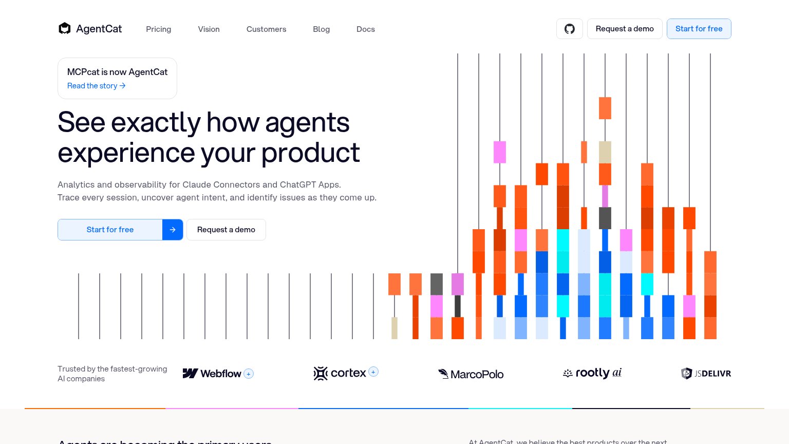
| AgentCat | "Trusted by the fastest-growing AI companies" logo bar with Webflow, Cortex, MarcoPolo, Rootly, and jsDelivr |
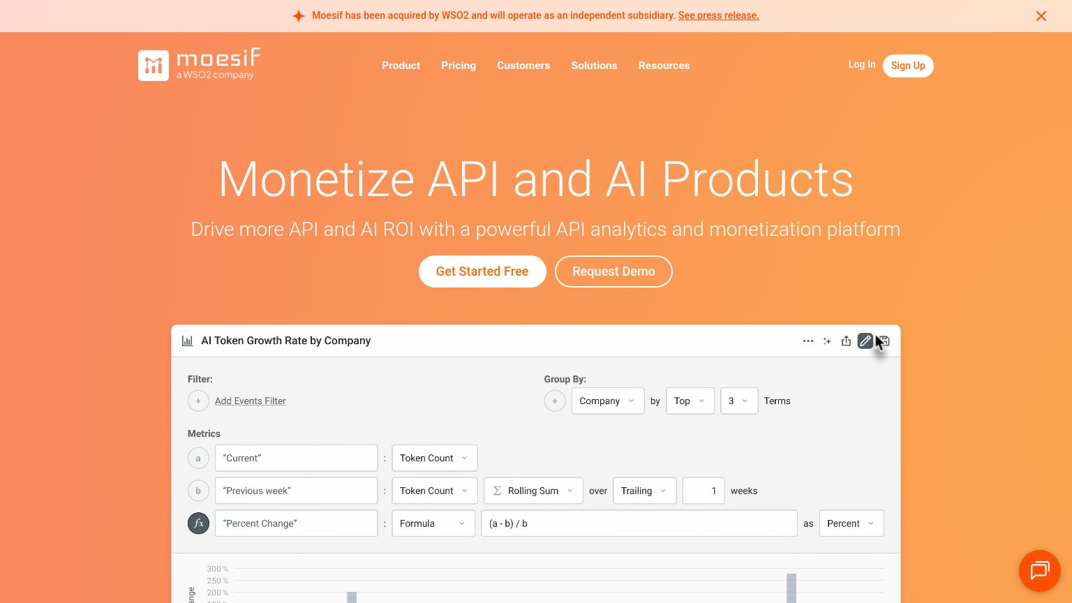
| 'a WSO2 company' badge with acquisition banner | |
| No visible trust signal identified. |
Mobile web
64FairThe phone experience as a first-class citizen.
 1234
1234- Start for free button — Pushed below the first viewport by two decorative graphics, so the primary tap requires scrolling.
- Top bar-chart graphic — A tall decorative visual occupies the prime first-screen slot before any headline or value statement.
- MCPcat rebrand card — The announcement and its "Read the story" link sit above the headline, competing for the first tap.
- Second bar graphic — Wedged between the subhead and the CTA, it adds a full scroll between message and action.
Information hierarchy
68FairDoes the design help or inhibit what the page is trying to say?
 1234
1234- Start for free CTA — Pale tinted fill barely separates from the white page, so the primary action fails the one-second find test.
- Request a demo button — Styled at near-equal weight beside the primary CTA and repeated in the header, splitting the visitor's single action.
- MCPcat rebrand banner — Sits above the headline with a "Read the story" link, offering an exit before the value prop is read.
- Header nav row — Five links plus a GitHub icon compete with the conversion path before the hero begins.
Value props
80StrongTitle, subtitle, hero — do they sell the product's true value?
AgentCat’s headline sells
See exactly how agents experience your product
Analytics and observability for Claude Connectors and ChatGPT Apps. Trace every session, uncover agent intent, and identify issues as they come up.
Working
- Outcome-first headline, not feature list
- Subhead names exact platforms served
- Logo bar backs claim with real customers
Could improve
- Hero graphic decorates, shows no product
- Zero concrete numbers anywhere in fold
- No emotional hook on agent blind spots
CTA
82StrongCopy, size, verb, cost-feel — does the primary CTA earn the click?
Problems
- pale fill weakens desktop dominance
- same visual weight as demo button
- no headline echo in label
Competitors
closest by platform, customer profile, and value propGraded against Lazyweb’s growth rubrics.