Your landing page’s weakest score is Trust.
How Agora ranks
- 1.
Agora78
- 2.
Blooma66
- 3.
Abrigo64
- 4.
Casca43
78Growth scoreupdated
category scores
category scoresShowHide
 Lazyweb ProAI Growth PMTurn this score into growth.Analyze your site and propose fixes across conversion, SEO, and AEOMonitor competitors’ in-product UX and A/B testsLearn from growth experiments across 10,000+ top productsTry Pro Free →
Score over time
Trust
63FairProof that the product is real, competent, and safe to try.
| Trust read | |
|---|---|
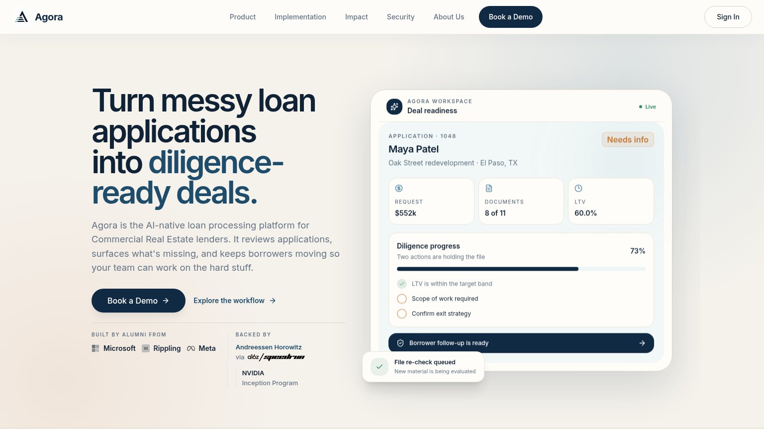
| Agora | 'Backed by Andreessen Horowitz via a16z speedrun' with NVIDIA Inception Program listed beneath the hero CTA |
| Detailed Blooma dashboard UI showing deal pipeline metrics ('85% Overall LTV', '$257.2M Total Loans Balance', asset-type | |
| No visible trust signal identified. | |
| See which AI use cases Gartner® identifies as "likely wins" for banking. |
CTA
75FairCopy, size, verb, cost-feel — does the primary CTA earn the click?
Problems
- booking feels costly and committal
- secondary link feels cheaper to click
- no self-serve or in-product path
Information hierarchy
82StrongDoes the design help or inhibit what the page is trying to say?
123- Top navigation links — Six same-weight links plus Sign In create seven exit paths before the demo CTA.
- Explore the workflow — Secondary link sits directly beside the primary CTA and splits the click at the decision point.
- Mockup checklist text — Small low-contrast checklist items make the mockup's proof points hard to read at a glance.
Mobile web
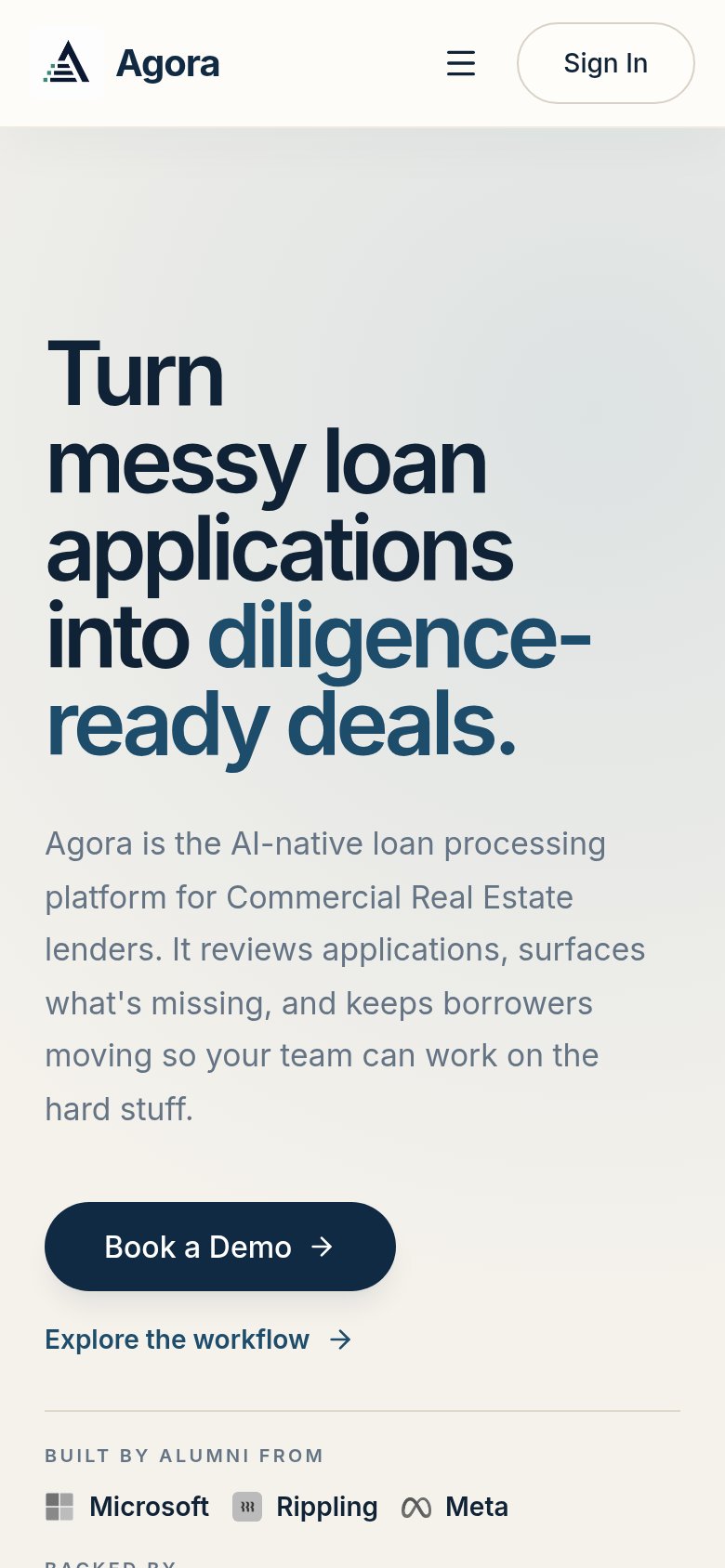
82StrongThe phone experience as a first-class citizen.
 123
123- Hero headline — Barely scaled down from desktop, it wraps into six giant lines that eat half the viewport before the value prop finishes.
- Book a Demo button — Sized at roughly half the column width; on mobile the primary CTA should be near full-bleed for an easy thumb tap.
- Body paragraph — Seven lines of desktop-length copy stack between the headline and the CTA, delaying the tap.
Value props
86StrongTitle, subtitle, hero — do they sell the product's true value?
Agora’s headline sells
Turn messy loan applications into diligence-ready deals.
Agora is the AI-native loan processing platform for Commercial Real Estate lenders. It reviews applications, surfaces what's missing, and keeps borrowers moving so your team can work on the hard stuff.
Working
- Outcome-first headline with emotional 'messy' hook
- Subhead names ICP and exact mechanism
- Hero UI demonstrates the product with real numbers
Could improve
- No quantified outcome (time saved, files closed)
- Proof is founder pedigree, not customer results
- 'Hard stuff' is vague versus the rest of the copy
Competitors
closest by platform, customer profile, and value propGraded against Lazyweb’s growth rubrics.