Your landing page’s weakest score is Trust.
How Alia ranks
58Growth scoreupdated
category scores
category scoresShowHide
 Lazyweb ProAI Growth PMTurn this score into growth.Analyze your site and propose fixes across conversion, SEO, and AEOMonitor competitors’ in-product UX and A/B testsLearn from growth experiments across 10,000+ top productsTry Pro Free →
Score over time
Trust
32PoorProof that the product is real, competent, and safe to try.

| Trust read | |
|---|---|
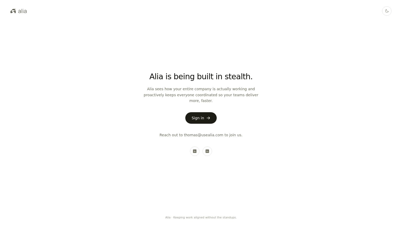
| Alia | Founder contact line "Reach out to thomas@usealia.com to join us" with LinkedIn profile links |
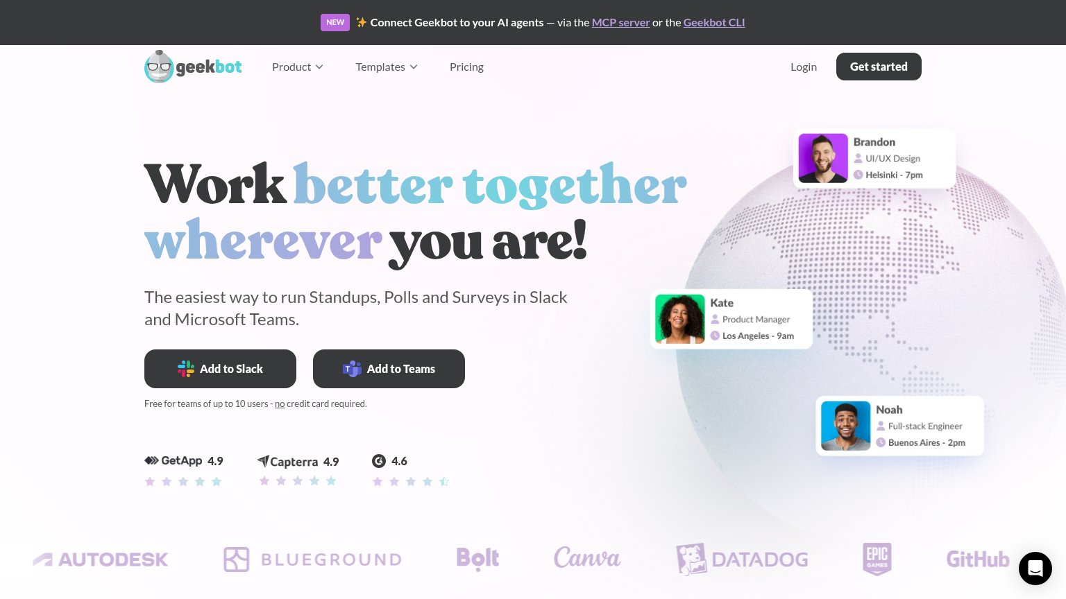
| GetApp 4.9, Capterra 4.9, G2 4.6 review-score row beneath the CTAs | |
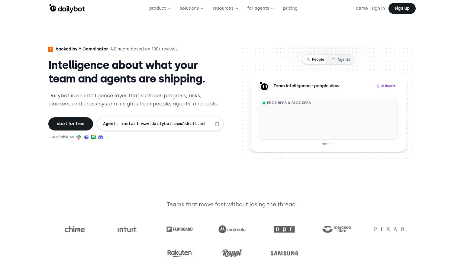
| Customer logo wall with Intuit, Motorola, NPR, Samsung, Pixar, Mercado Libre, Rakuten, Rappi under "Teams that move fast | |
| No visible trust signal identified. | |
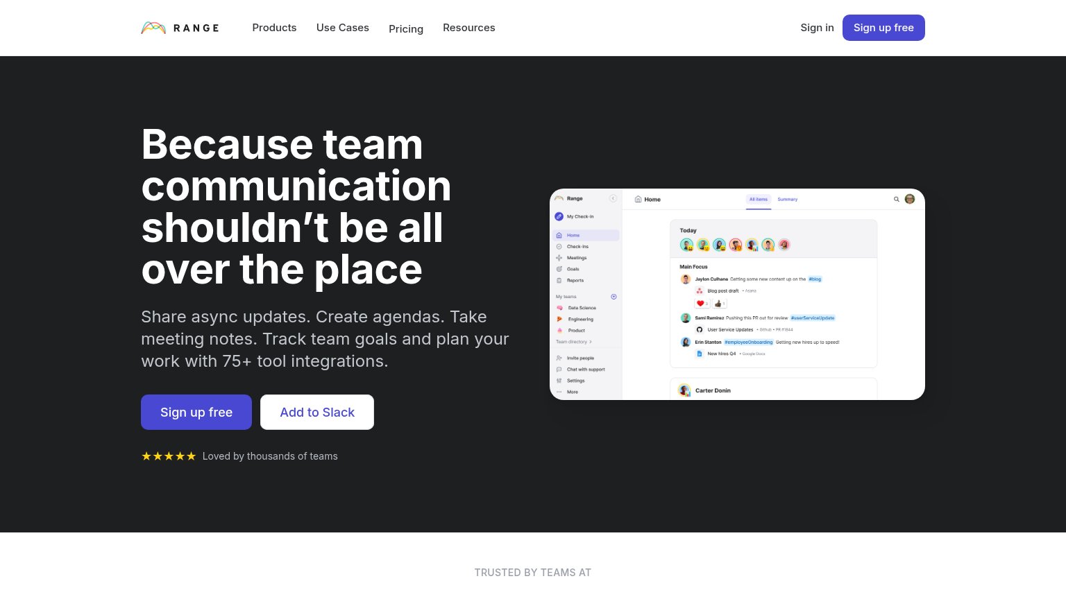
| "Trusted by 50,000 best-in-class businesses" with Intel, IBM, Walmart, Adobe, Google, Slack logos |
Value props
44PoorTitle, subtitle, hero — do they sell the product's true value?
Alia’s headline vague
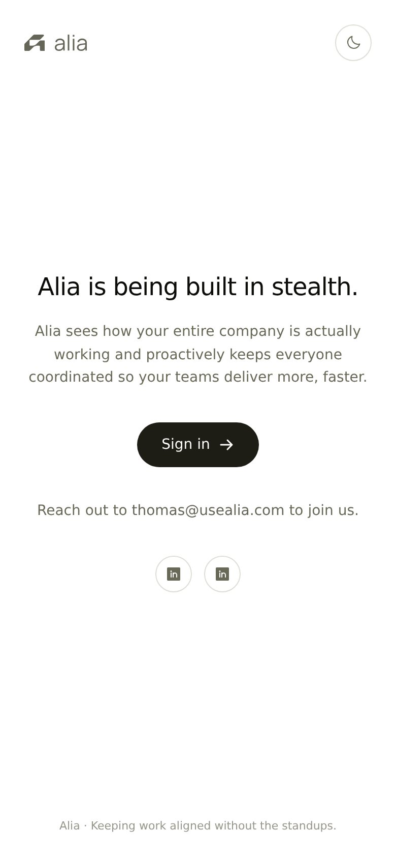
Alia is being built in stealth.
Alia sees how your entire company is actually working and proactively keeps everyone coordinated so your teams deliver more, faster.
Working
- Subhead names coordination as the job
- Footer line kills a real pain: standups
- Clean, single-message fold
Could improve
- H1 announces status, sells nothing
- No numbers or concrete proof points
- No hero image demonstrating product
CTA
60FairCopy, size, verb, cost-feel — does the primary CTA earn the click?
Problems
- targets existing users only
- new visitors must email to join
- no click path to capture interest
Information hierarchy
72FairDoes the design help or inhibit what the page is trying to say?
123- Sign in button — The only styled CTA targets existing users, while the new-visitor conversion (joining) gets no button at all.
- Join-us email line — The page's actual conversion action is plain gray text, visually subordinate to the Sign in button above it.
- Duplicate LinkedIn icons — Two identical unlabeled icons at equal weight are the fold's only exit leaks and give no reason to click either.
Mobile web
81StrongThe phone experience as a first-class citizen.
 12
12- Sign in button — Desktop-proportioned pill floating in the column instead of a near-full-width, thumb-friendly tap target.
- Duplicate LinkedIn icons — Two visually identical icons sit side by side with no labels, so a visitor cannot tell which profile each opens.
Competitors
closest by platform, customer profile, and value propGraded against Lazyweb’s growth rubrics.