Your landing page’s weakest score is Trust.
How Alven ranks
- 1.
LetHub70
- 2.
Alven66
- 3.
EliseAI63
- 4.
Zuma62
66Growth scoreupdated
category scores
category scoresShowHide
 Lazyweb ProAI Growth PMTurn this score into growth.Analyze your site and propose fixes across conversion, SEO, and AEOMonitor competitors’ in-product UX and A/B testsLearn from growth experiments across 10,000+ top productsTry Pro Free →
Score over time
Trust
48PoorProof that the product is real, competent, and safe to try.
| Trust read | |
|---|---|
| Alven | 10K units under management |
| Product UI cards showing AI conversations, e.g. "Hi Dan! Let me know if you have any other questions." and "Billing & Pa | |
| No visible trust signal identified. | |
| Embedded product chat UI screenshot showing a leasing conversation ("Hi, I wanted to book a tour.") |
Value props
55FairTitle, subtitle, hero — do they sell the product's true value?
Alven’s headline undersells
Alven, the AI real-estate agent
Alven is your full time AI employee that
Working
- "10K units under management" is concrete proof
- Category is instantly clear: AI real-estate agent
- "2 week free trial" lowers commitment risk
Could improve
- Subhead ends mid-sentence, states no outcome
- Hero image decorates; never shows the product
- No emotion: no time saved, no pain named
Information hierarchy
70FairDoes the design help or inhibit what the page is trying to say?
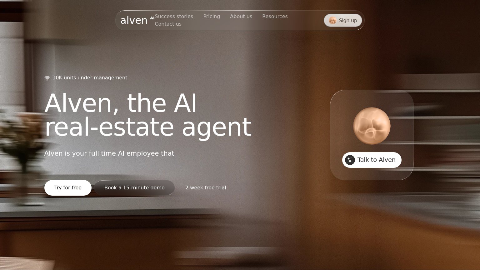 1234
1234- Truncated subheadline — "Alven is Alven's full time AI employee that" ends mid-sentence, leaving the value proposition unresolved at the moment of first read.
- Book demo button — Styled at near-equal weight beside "Try for free", splitting the visitor's decision instead of subordinating to the primary action.
- Talk to Alven widget — A third white pill-shaped CTA in the right panel competes directly with "Try for free" for the same visual priority.
- Wrapped nav row — "Contact us" breaks onto a second line under the wordmark, making the nav read as misaligned and cluttered.
Mobile web
76FairThe phone experience as a first-class citizen.
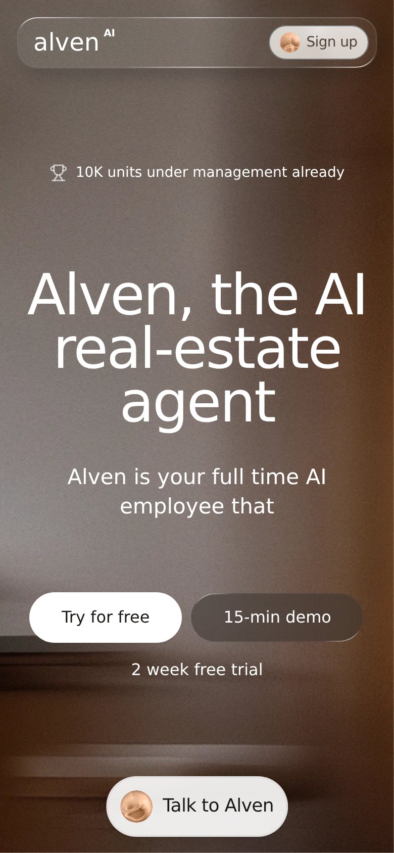 123
123- Side-by-side CTA row — Two half-width buttons split attention and shrink tap targets; the primary should be stacked full-bleed.
- Subheadline text — Renders as an unfinished sentence — "full time AI employee that" — looking broken on the phone.
- Talk to Alven pill — A third competing action at the fold's bottom edge pulls taps away from Try for free.
CTA
82StrongCopy, size, verb, cost-feel — does the primary CTA earn the click?
Problems
- secondary label differs on mobile
- 'Talk to Alven' pill splits focus
- button small next to huge headline
Competitors
closest by platform, customer profile, and value propGraded against Lazyweb’s growth rubrics.