 Lazyweb ProAI Growth PMTurn this score into growth.Analyze your site and propose fixes across conversion, SEO, and AEOMonitor competitors’ in-product UX and A/B testsLearn from growth experiments across 10,000+ top productsTry Pro Free →
Trust
34PoorProof that the product is real, competent, and safe to try.
| Trust read | |
|---|---|
| Cartsy | No visible trust signal identified. |
| implicit context LTK may benefit from pre-existing familiarity among its target audience. |
Value props
48PoorTitle, subtitle, hero — do they sell the product's true value?
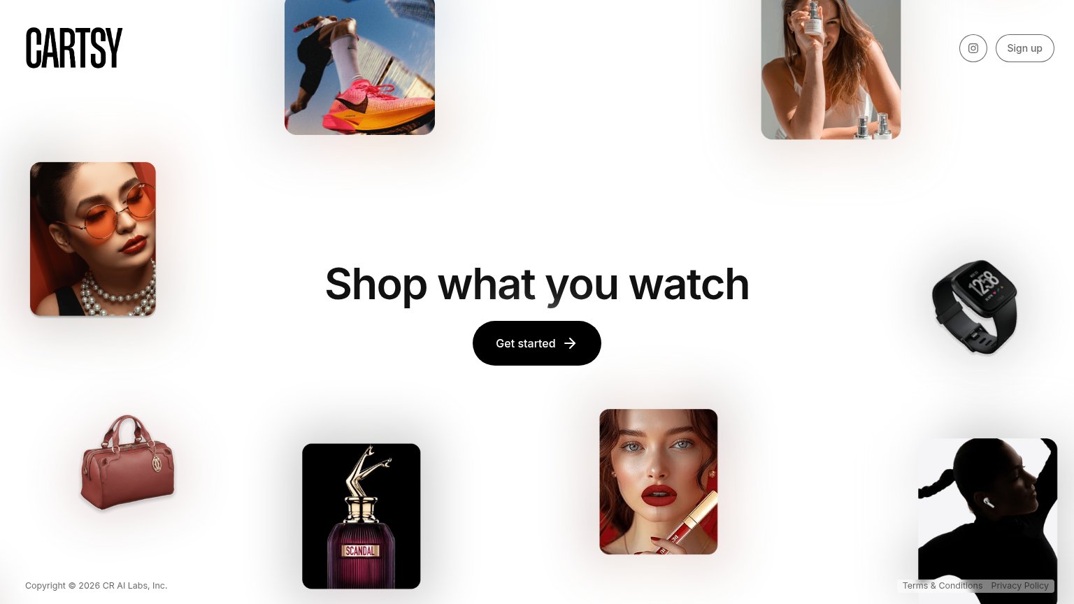
Cartsy’s headline vague
Shop what you watch
Working
- Short, memorable, rhythmic tagline
- Hints at content-to-commerce value
- Product imagery signals shopping breadth
Could improve
- No subhead explains how it works
- Zero numbers or proof points
- Images decorate, don't demo the product
CTA
72FairCopy, size, verb, cost-feel — does the primary CTA earn the click?
Problems
- generic label, no payoff named
- no header echo of shopping promise
- nav says 'Sign up', hero says 'Get started'
- no 'free' despite likely free use
Mobile web
76FairThe phone experience as a first-class citizen.
 123
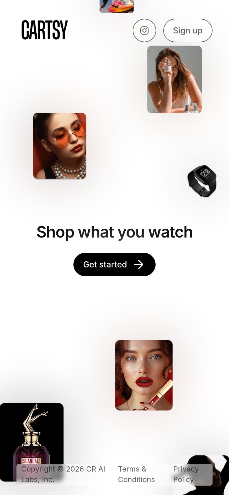
123- Get started button — Desktop-proportioned pill floating in the phone column instead of a near-full-bleed thumb target.
- Footer legal links — Copyright, Terms, and Privacy text overlaps the perfume and headphone images, killing legibility.
- Clipped sneaker tile — Decorative image is cut off mid-frame above the header, making the top of the page look broken.
Information hierarchy
81StrongDoes the design help or inhibit what the page is trying to say?
123- Footer legal links — Terms and Privacy links creep into the fold and overlap the headphones tile, adding exits and visual noise.
- Clipped sneaker tile — The top product image is cut off at the viewport edge and reads as a layout bug, not a design choice.
- Instagram nav icon — A social exit placed at equal prominence to Sign up leaks attention before the primary action.
Competitors
closest by platform, customer profile, and value prop#1 Cartsy62
#2Graded against Lazyweb’s growth rubrics.