Your landing page’s weakest score is Trust.
How Coherence Health ranks
- 1.
Coherence Health71
- 2.
WellTheory66
- 3.
Mymee60
- 4.
Paloma Health58
- 5.
Parsley Health58
71Growth scoreupdated
category scores
category scoresShowHide
 Lazyweb ProAI Growth PMTurn this score into growth.Analyze your site and propose fixes across conversion, SEO, and AEOMonitor competitors’ in-product UX and A/B testsLearn from growth experiments across 10,000+ top productsTry Pro Free →
Score over time
Trust
48PoorProof that the product is real, competent, and safe to try.
| Trust read | |
|---|---|
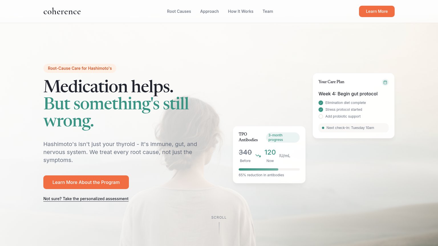
| Coherence Health | 'TPO Antibodies' tracker card showing '340 Before → 120 Now, 65% reduction in antibodies' |
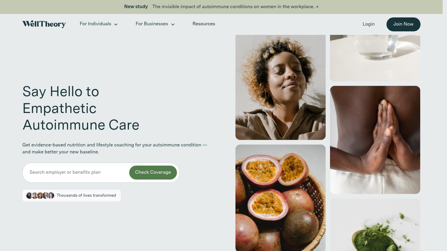
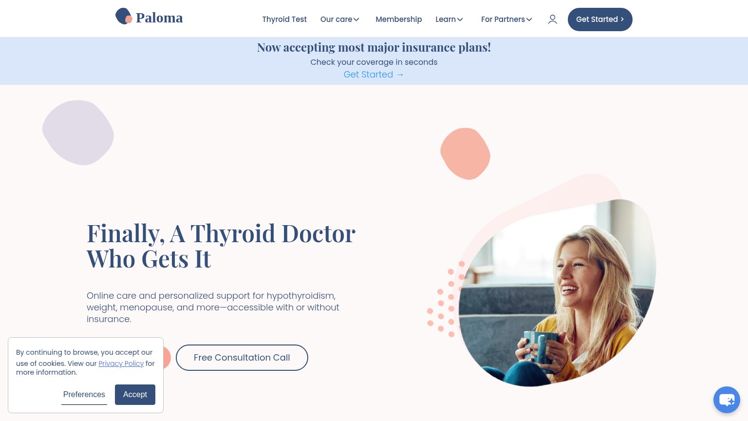
| Now accepting most major insurance plans! Check your coverage in seconds | |
| "Thousands of lives transformed" avatar chip beside the coverage search | |
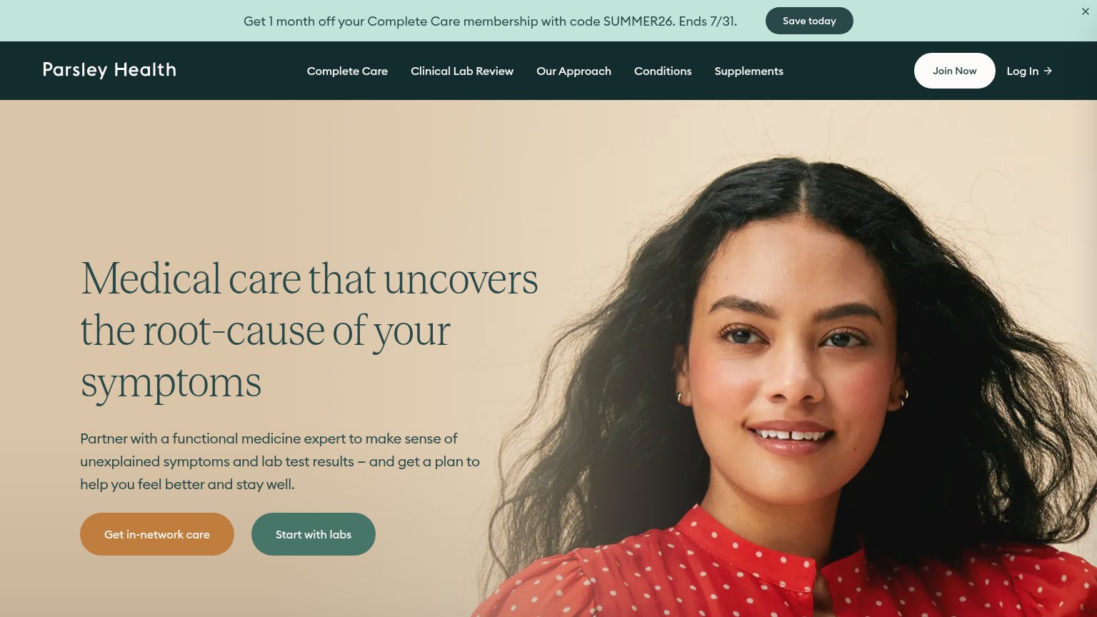
| No visible trust signal identified. | |
| "Mymee is the first digital care solution proven to help autoimmune patients reduce rheumatic flares" |
CTA
62FairCopy, size, verb, cost-feel — does the primary CTA earn the click?
Problems
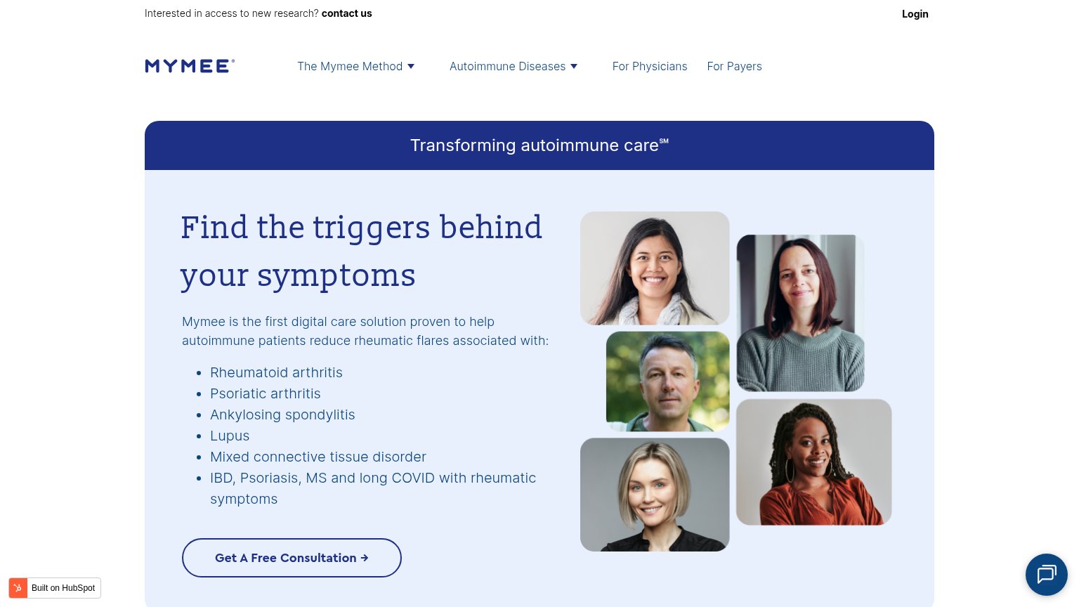
- 5 words — too long to read at a glance
- 'Learn More' is a low-intent verb
- stronger action demoted to text link
- label differs from nav's 'Learn More'
Information hierarchy
78FairDoes the design help or inhibit what the page is trying to say?
123- Nav Learn More button — Identical orange styling to the hero CTA splits the primary action into two competing targets.
- Two floating cards — TPO Antibodies and Coherence Health's Care Plan cards sit at equal weight, competing with each other instead of reading as one proof point.
- Hero CTA label — "Learn More About the Program" nearly duplicates the nav's "Learn More," muddying which click is the intended path.
Value props
81StrongTitle, subtitle, hero — do they sell the product's true value?
Coherence Health’s headline sells
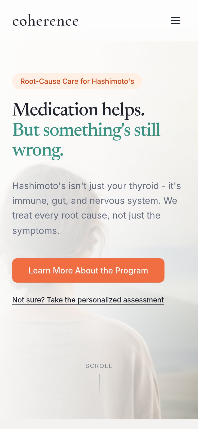
Medication helps. But something's still wrong.
Hashimoto's isn't just your thyroid - it's immune, gut, and nervous system. We treat every root cause, not just the symptoms.
Working
- Voices patients' exact frustration
- Badge names condition and audience
- Desktop cards prove outcome: 340→120 TPO
Could improve
- Headline sells pain, not payoff
- Proof numbers missing on mobile fold
- No timeframe or result in subhead
Mobile web
88StrongThe phone experience as a first-class citizen.
 1
1- Hero headline wrap — "wrong." orphans onto its own line, making the headline read as three ragged lines instead of a tight statement.
Competitors
closest by platform, customer profile, and value propGraded against Lazyweb’s growth rubrics.