Your landing page’s weakest score is Trust.
How Collaborators Inc. ranks
- 1.
Replit82
- 2.
Devin (Cognition)77
- 3.
Cursor75
- 4.
Warp73
- 5.
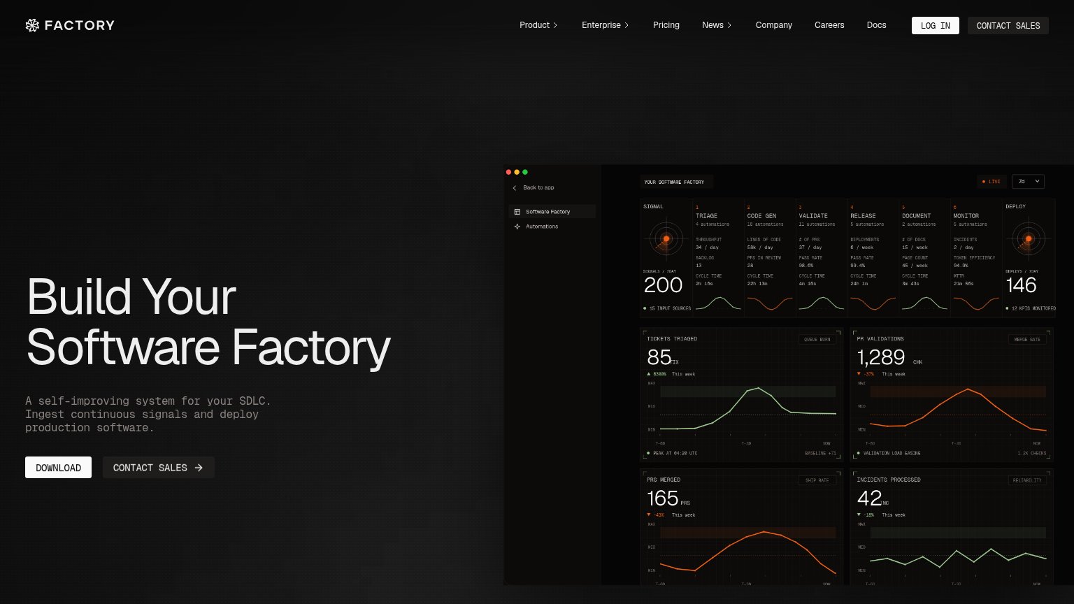
Factory68
- 6.
Collaborators Inc.60
60Growth scoreupdated
category scores
category scoresShowHide
 Lazyweb ProAI Growth PMTurn this score into growth.Analyze your site and propose fixes across conversion, SEO, and AEOMonitor competitors’ in-product UX and A/B testsLearn from growth experiments across 10,000+ top productsTry Pro Free →
Score over time
Trust
28PoorProof that the product is real, competent, and safe to try.
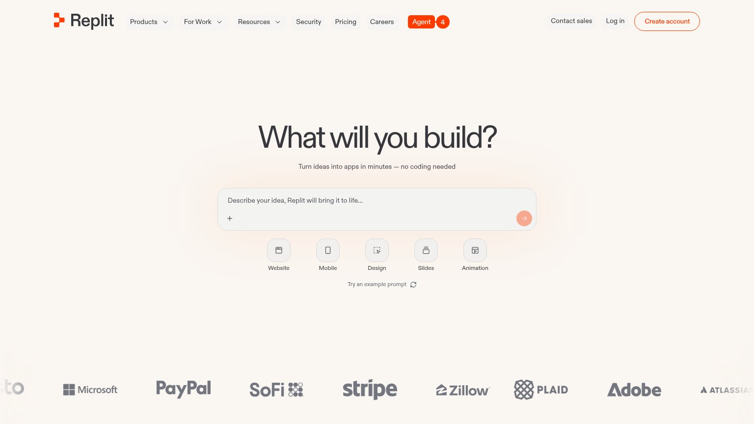
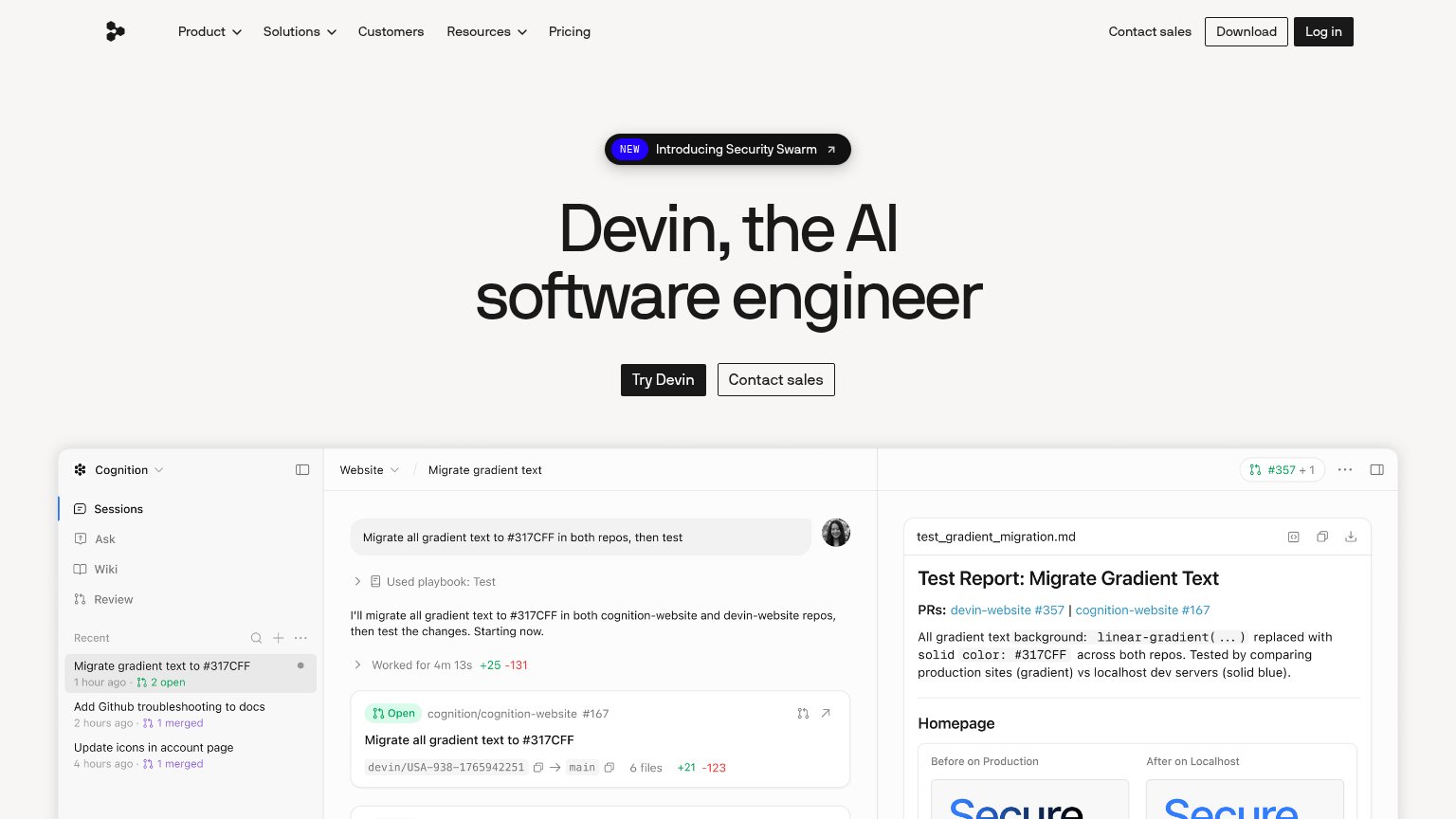
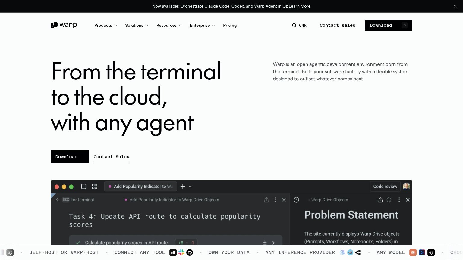
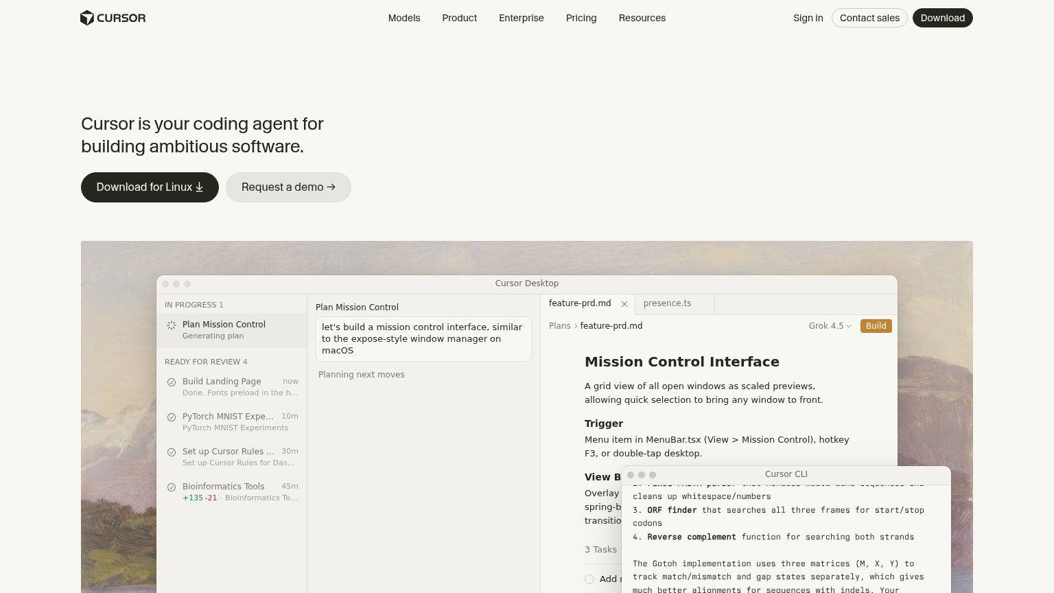
| Trust read | |
|---|---|
| Collaborators Inc. | No visible trust signal identified. |
| Detailed 'Cursor Desktop' product UI showing the 'Plan Mission Control' agent workflow and Cursor CLI output | |
| Embedded Devin session demo showing the task "Migrate all gradient text to #317CFF in both repos, then test" with real P | |
| No visible trust signal identified. | |
| "64k" GitHub star count in the desktop nav | |
| Customer logo wall featuring Microsoft, PayPal, SoFi, Stripe, Zillow, Plaid, Adobe, and Atlassian |
Value props
40PoorTitle, subtitle, hero — do they sell the product's true value?
Collaborators Inc.’s headline vague
Collaborator
A place to build with agents.
Working
- Clean, memorable one-line premise
- Zero jargon or buzzword stacking
- Dual CTA covers waitlist and download
Could improve
- No outcome or use case named
- No visual showing the product working
- 'A place' could caption any tool
CTA
72FairCopy, size, verb, cost-feel — does the primary CTA earn the click?
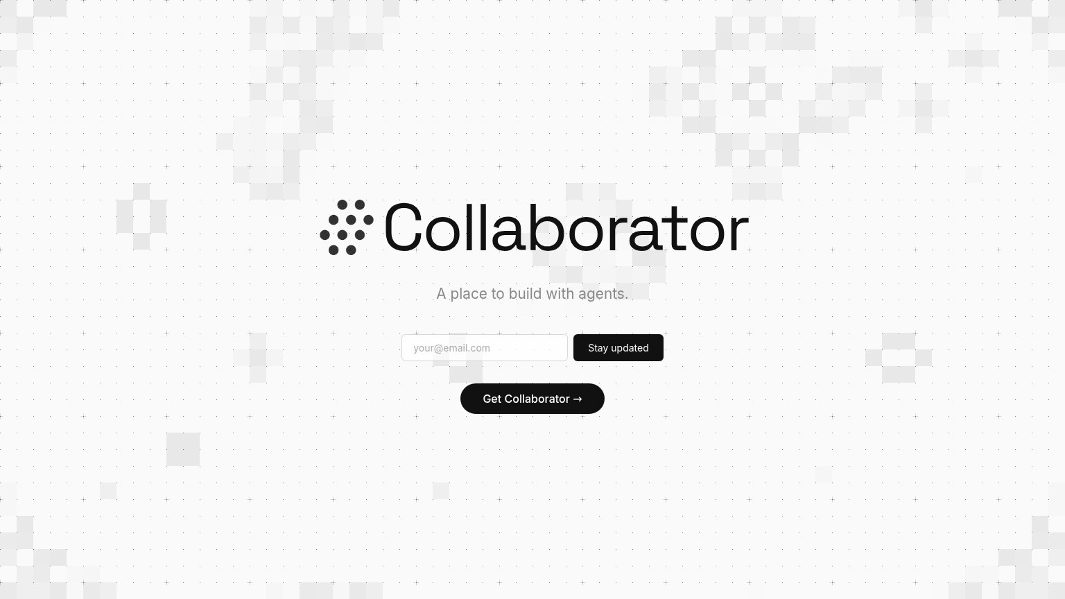
Problems
- competes with equal-weight 'Stay updated'
- payoff unclear: download or signup?
- no 'free' or price signal
Information hierarchy
74FairDoes the design help or inhibit what the page is trying to say?
12- Stay updated button — Same black weight as Get Collaborator and higher in the scan path, so the visitor cannot tell which action is primary.
- Get Collaborator button — The presumed primary action sits last, floating alone with no visual cue that it outranks the email capture above it.
Mobile web
84StrongThe phone experience as a first-class citizen.
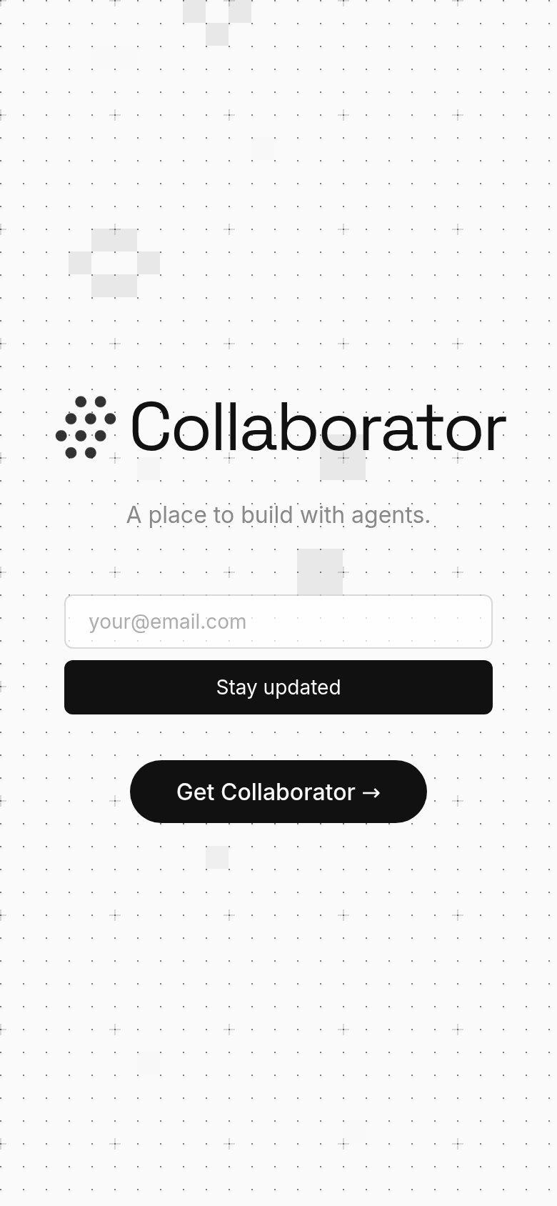 123
123- Stay updated button — Full-width black styling makes the newsletter capture look like the primary action, outranking the product CTA.
- Get Collaborator button — The real primary CTA is narrower and pushed below the email form, inverting the tap hierarchy.
- Email input placeholder — Light-gray placeholder is the only label; it disappears on focus and is hard to read at arm's length.
Competitors
closest by platform, customer profile, and value prop#1Replitreplit.com82
#2Devin (Cognition)devin.ai77
#3Cursorcursor.com75
#4Warpwarp.dev73
#5Factoryfactory.ai68
#6Collaborators Inc.60
Graded against Lazyweb’s growth rubrics.