Your landing page’s weakest score is Trust.
How Colmez ranks
- 1.
Colmez72
- 2.
Wastebits69
72Growth scoreupdated
category scores
category scoresShowHide
 Lazyweb ProAI Growth PMTurn this score into growth.Analyze your site and propose fixes across conversion, SEO, and AEOMonitor competitors’ in-product UX and A/B testsLearn from growth experiments across 10,000+ top productsTry Pro Free →
Trust
42PoorProof that the product is real, competent, and safe to try.
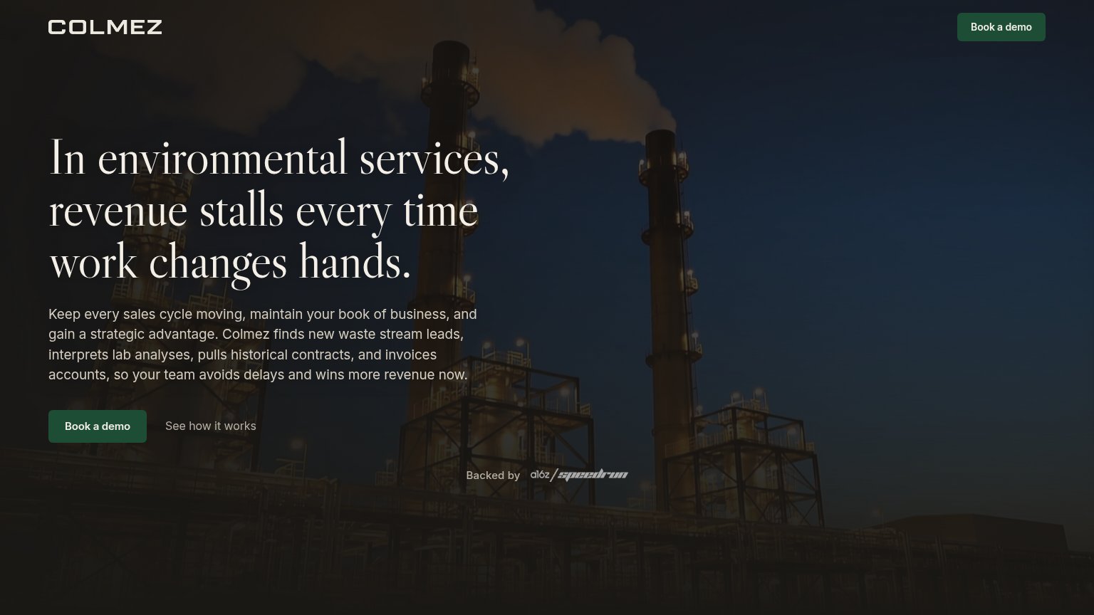
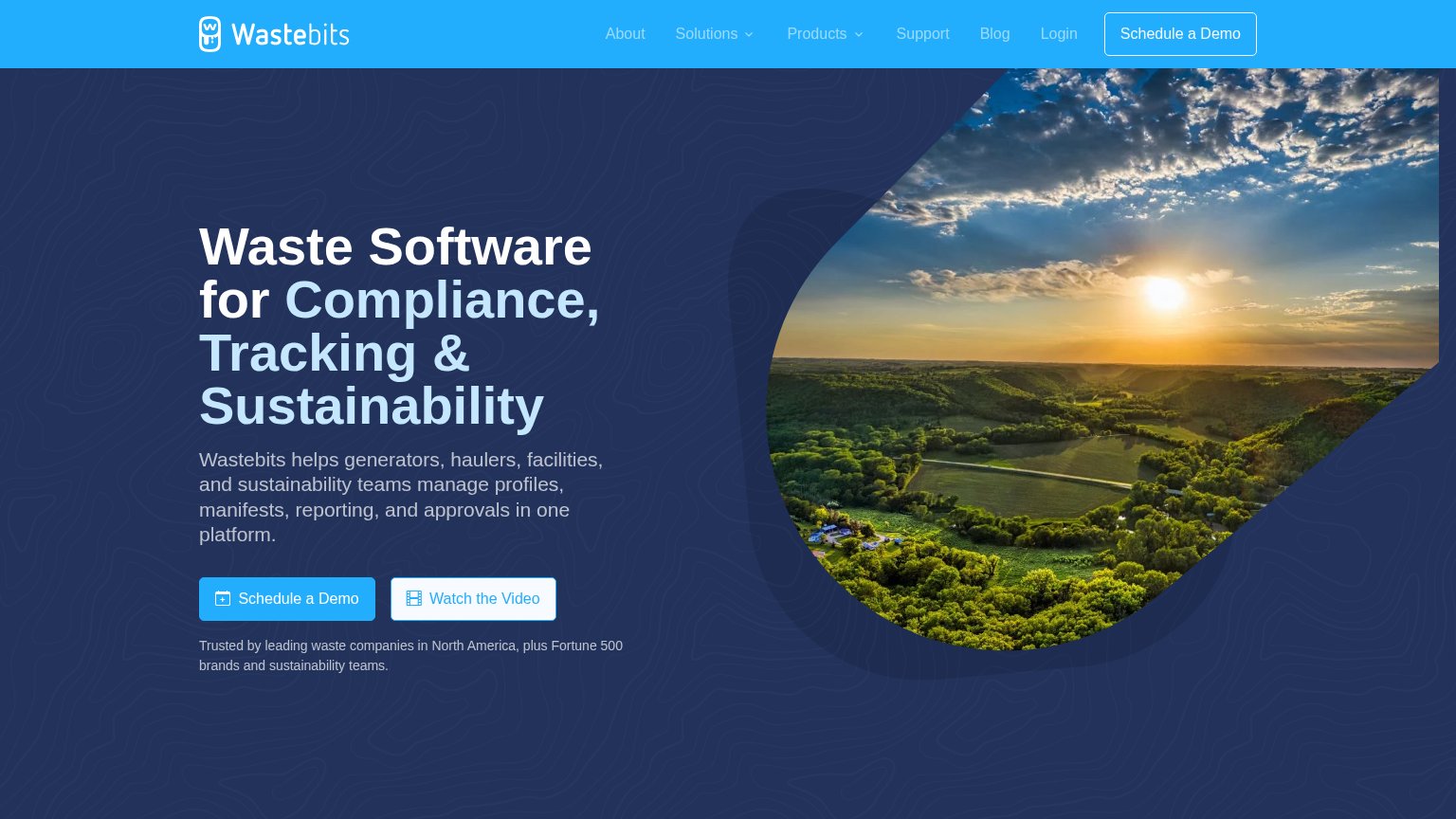
| Trust read | |
|---|---|
| Colmez | "Backed by a16z speedrun" badge below the hero CTAs |
| "Trusted by leading waste companies in North America, plus Fortune 500 brands and sustainability teams." |
CTA
75FairCopy, size, verb, cost-feel — does the primary CTA earn the click?
Problems
- 'Book' feels committal, not receiving
- no value payoff in the label
- no echo of the headline's promise
Value props
79FairTitle, subtitle, hero — do they sell the product's true value?
Colmez’s headline sells
In environmental services, revenue stalls every time work changes hands.
Keep every sales cycle moving, maintain your book of business, and gain a strategic advantage. Colmez finds new waste stream leads, interprets lab analyses, pulls historical contracts, and invoices accounts, so your team avoids delays and w
Working
- Vertical-specific pain named in headline
- Subhead lists four concrete capabilities
- Ends on outcome: wins more revenue now
Could improve
- Zero numbers or timeframes anywhere
- Hero photo decorates, never shows product
- Headline states pain, defers the payoff
Mobile web
80StrongThe phone experience as a first-class citizen.
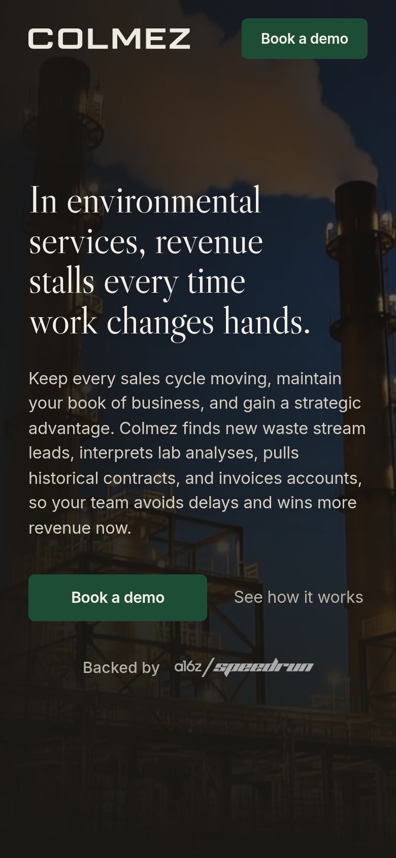 123
123- Body paragraph — Full desktop copy stacks nine lines on mobile, delaying the reader's path to the CTA.
- Book a demo button — Primary CTA sits at half-width when a thumb-friendly near-full-bleed button would convert better.
- See how it works — Ghost link fades into the dark photo, offering almost no tap affordance.
Information hierarchy
82StrongDoes the design help or inhibit what the page is trying to say?
123- Subheadline paragraph — One five-line run-on sentence crams five capabilities into a block visitors will skim past rather than parse.
- Book a demo button — Dark green fill sits low-contrast against the dark hero photo, weakening the one-second find test.
- See how it works — Gray text on dark imagery is nearly invisible, so the secondary path for unready visitors gets missed entirely.
Competitors
closest by platform, customer profile, and value prop#1Colmez72
#2Graded against Lazyweb’s growth rubrics.