Your landing page’s weakest score is Value props.
How DRS ranks
64Growth scoreupdated
category scores
category scoresShowHide
 Lazyweb ProAI Growth PMTurn this score into growth.Analyze your site and propose fixes across conversion, SEO, and AEOMonitor competitors’ in-product UX and A/B testsLearn from growth experiments across 10,000+ top productsTry Pro Free →
Score over time
Value props
44PoorTitle, subtitle, hero — do they sell the product's true value?
DRS’s headline vague
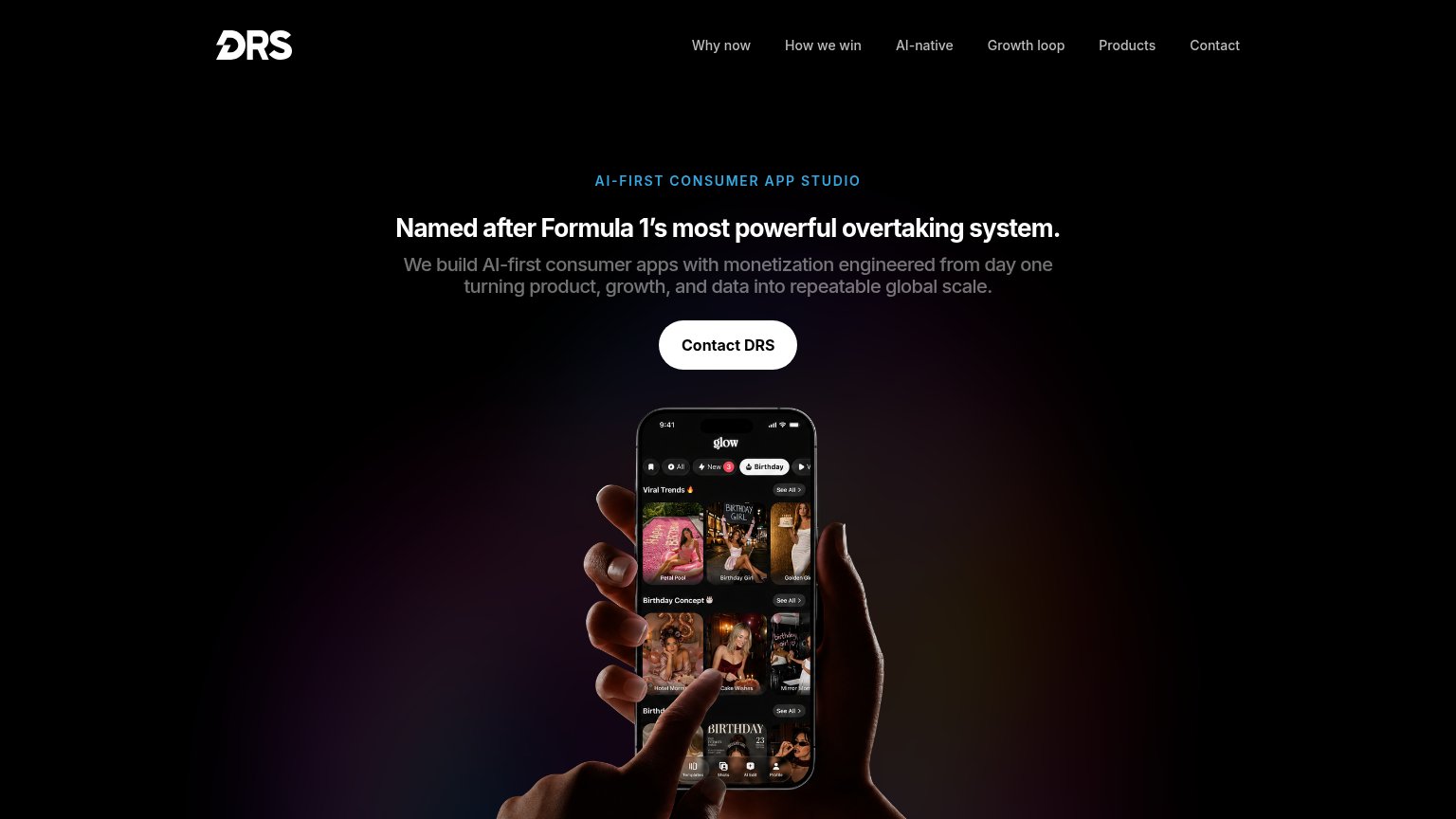
Named after Formula 1's most powerful overtaking system.
We build AI-first consumer apps with monetization engineered from day one turning product, growth, and data into repeatable global scale.
Working
- Eyebrow names the category clearly
- Hero phone shows a real shipped app
- 'Monetization from day one' hints at true value
Could improve
- H1 explains the name, sells nothing
- Zero numbers or proof points in fold
- 'Repeatable global scale' is generic buzz
Trust
44PoorProof that the product is real, competent, and safe to try.
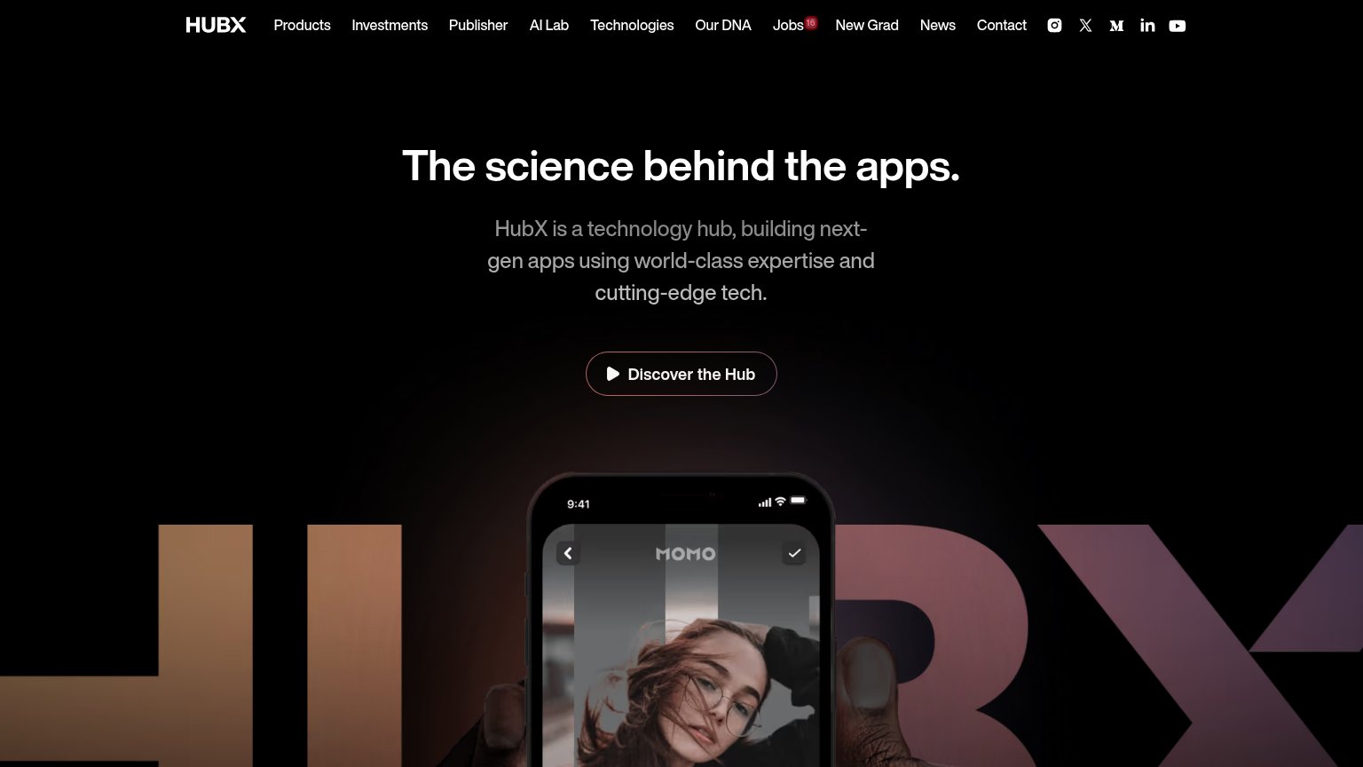
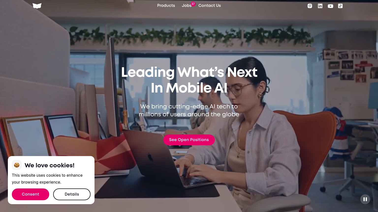
| Trust read | |
|---|---|
| DRS | No visible trust signal identified. |
| We bring cutting-edge AI tech to millions of users around the globe | |
| implicit context Bending Spoons may benefit from pre-existing familiarity among its target audience. | |
| MOMO app screenshot with real editing UI controls (Thick, Lift, Shape, Tilt) | |
| No visible trust signal identified. |
CTA
66FairCopy, size, verb, cost-feel — does the primary CTA earn the click?
Problems
- 'Contact' promises no value
- click feels like sales outreach
- no outcome or next step named
Information hierarchy
80StrongDoes the design help or inhibit what the page is trying to say?
123- Eyebrow category line — 'AI-FIRST CONSUMER APP STUDIO' — the actual value prop — is set at the smallest text weight on the fold while the F1 riddle gets headline size.
- Gray subheadline — The only sentence explaining what DRS does is dim gray on black, the lowest-contrast text in the hero.
- Six-link nav row — Five non-conversion links (Why now, How we win, AI-native, Growth loop, Products) offer exits before the visitor reaches Contact DRS.
Mobile web
84StrongThe phone experience as a first-class citizen.
 12
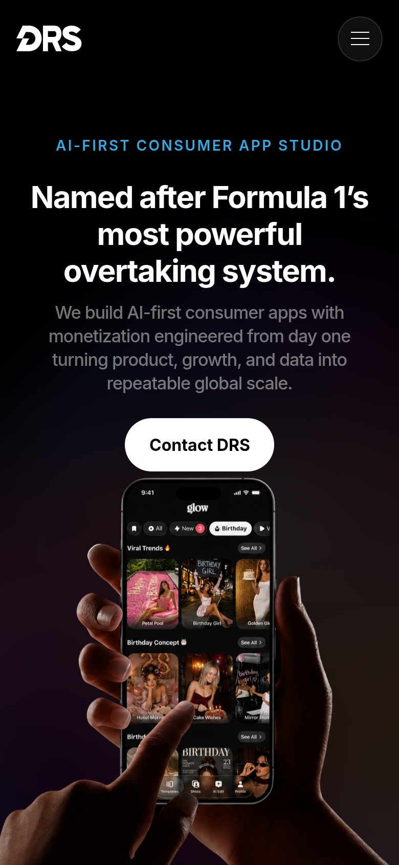
12- Contact DRS button — Floats at under half the column width instead of a full-bleed thumb target.
- Gray subheadline text — Low-contrast gray on black over four lines strains readability at arm's length.
Competitors
closest by platform, customer profile, and value propGraded against Lazyweb’s growth rubrics.