Your landing page’s weakest score is Trust.
How Elu ranks
74Growth scoreupdated
category scores
category scoresShowHide
 Lazyweb ProAI Growth PMTurn this score into growth.Analyze your site and propose fixes across conversion, SEO, and AEOMonitor competitors’ in-product UX and A/B testsLearn from growth experiments across 10,000+ top productsTry Pro Free →
Trust
58FairProof that the product is real, competent, and safe to try.
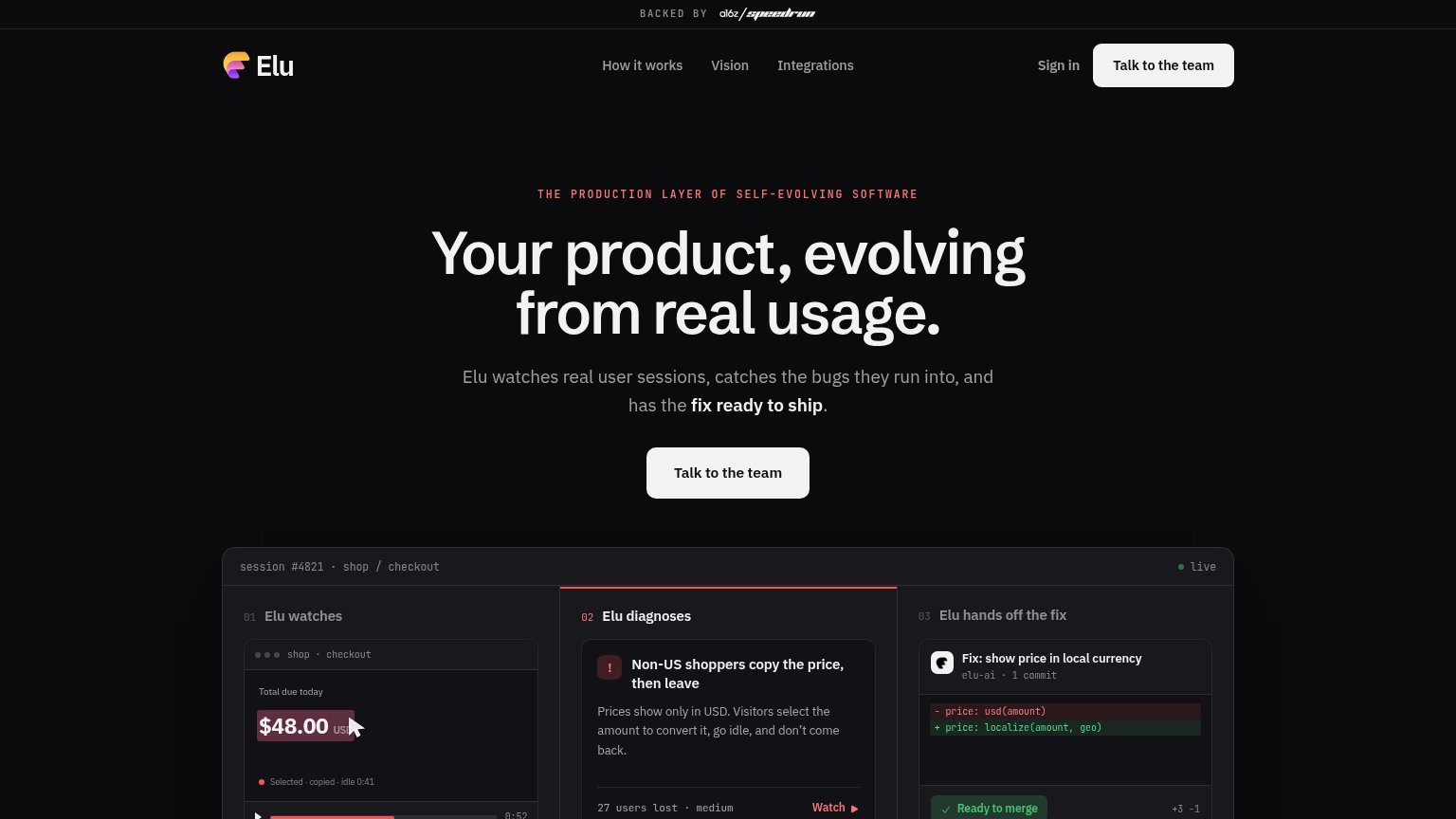
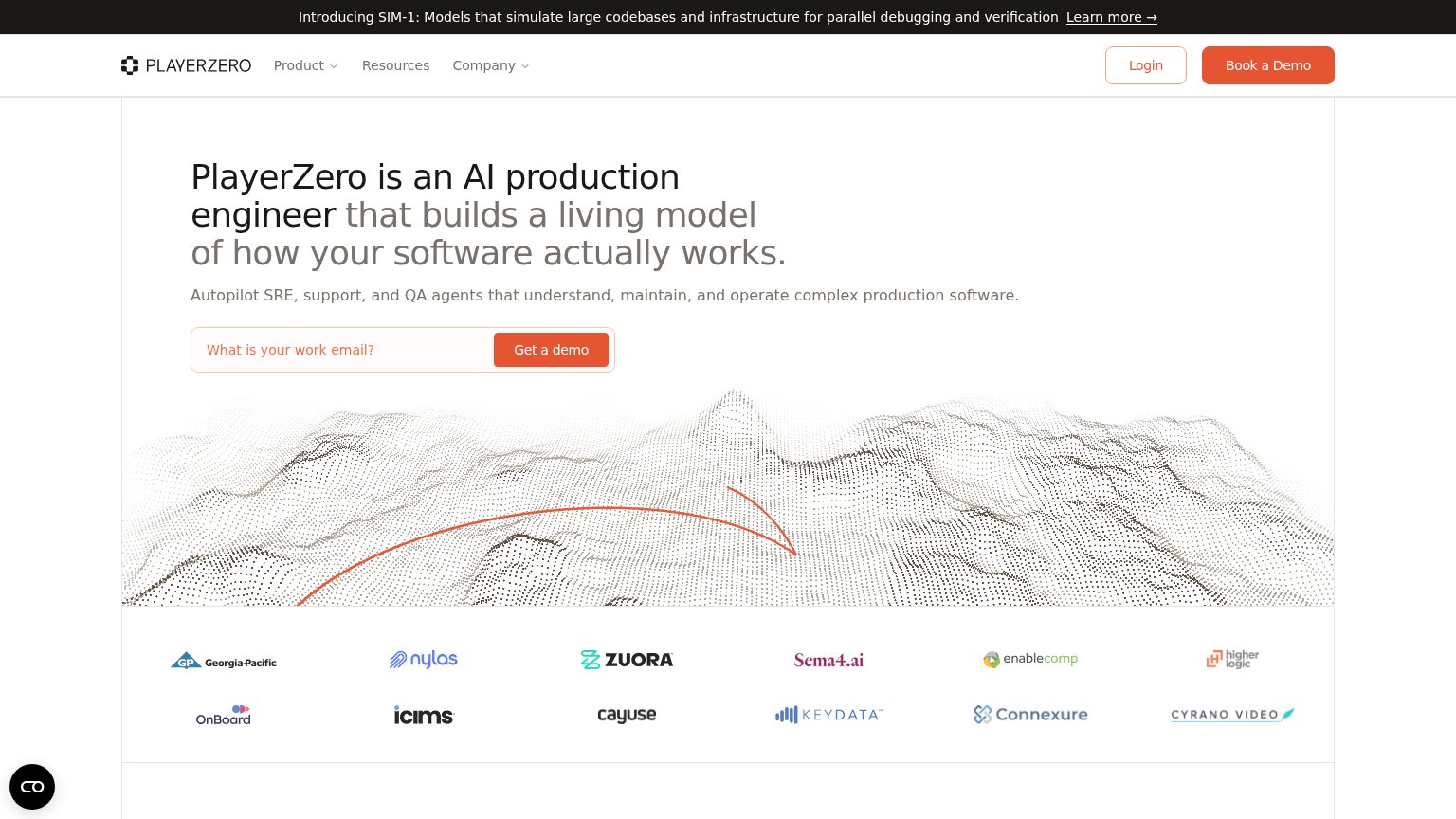
| Trust read | |
|---|---|
| Elu | "BACKED BY a16z speedrun" banner |
| Application monitoring software considered "not bad" by millions of developers. | |
| Customer logo wall including Georgia-Pacific, Nylas, Zuora, Sema4.ai, and iCIMS | |
| Hotline pre poruchy: 0918 060 965, hotline@fume.dev |
CTA
62FairCopy, size, verb, cost-feel — does the primary CTA earn the click?
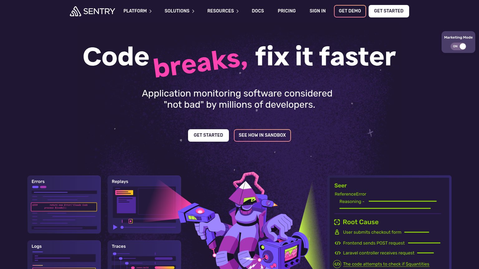
Problems
- click feels like a sales meeting
- 4 words, over the 3-word limit
- no product value in the click
- 'the team' framing, not the visitor
Value props
80StrongTitle, subtitle, hero — do they sell the product's true value?
Elu’s headline sells
Your product, evolving from real usage.
Elu watches real user sessions, catches the bugs they run into, and has the fix ready to ship.
Working
- Subhead names the full loop: watch, catch, fix
- Demo shows real diagnosis and merge-ready diff
- 'fix ready to ship' is a concrete outcome
Could improve
- Eyebrow 'self-evolving software' is jargon
- No numbers in headline or subhead
- Headline alone is too abstract to parse
Information hierarchy
84StrongDoes the design help or inhibit what the page is trying to say?
123- Sign in link — Sits directly beside the primary CTA and offers an exit at the exact moment of decision.
- Watch link — Red arrow link inside the demo panel pulls attention toward secondary content instead of the CTA.
- Red eyebrow tagline — Wide-tracked all-caps monospace slows reading of the category claim before the headline lands.
Mobile web
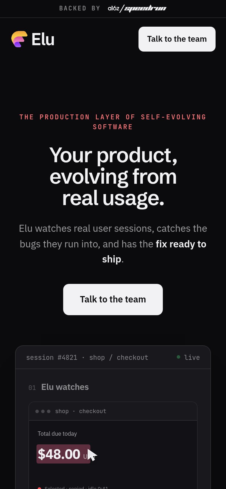
84StrongThe phone experience as a first-class citizen.
 12
12- Talk to the team CTA — Floats at roughly half the column width instead of a near-full-bleed thumb target.
- Red eyebrow tagline — Oversized letter-spaced caps wrap to two lines and compete with the headline for attention.
Competitors
closest by platform, customer profile, and value propGraded against Lazyweb’s growth rubrics.