Your landing page’s weakest score is Value props.
How General Knowledge ranks
- 1.
Dribbble69
- 2.
General Knowledge51
51Growth scoreupdated
category scores
category scoresShowHide
 Lazyweb ProAI Growth PMTurn this score into growth.Analyze your site and propose fixes across conversion, SEO, and AEOMonitor competitors’ in-product UX and A/B testsLearn from growth experiments across 10,000+ top productsTry Pro Free →
Value props
28PoorTitle, subtitle, hero — do they sell the product's true value?
General Knowledge’s headline vague
Knowledge is everything.
Working
- Distinctive, memorable brand mood
- Clean single CTA: JOIN US →
- Confident, uncluttered fold
Could improve
- No product noun or category named
- Zero specifics, numbers, or outcomes
- Hero art decorates, demonstrates nothing
Trust
28PoorProof that the product is real, competent, and safe to try.
| Trust read | |
|---|---|
| General Knowledge | No visible trust signal identified. |
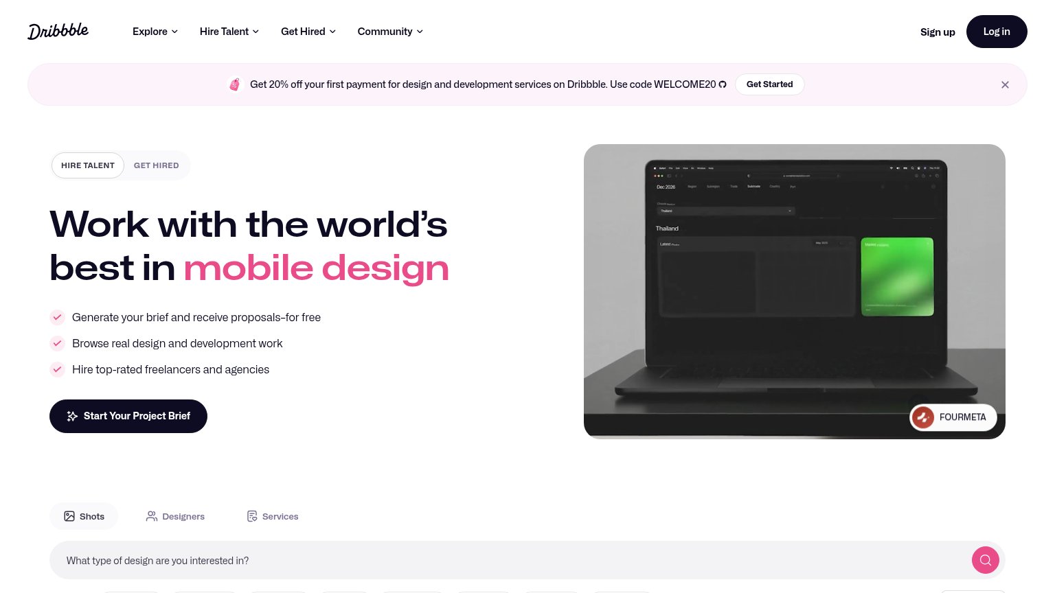
| Hero image of real community design work attributed to "FOURMETA" |
CTA
56FairCopy, size, verb, cost-feel — does the primary CTA earn the click?

Problems
- styled as text link, not button
- tiny footprint vs headline
- 'join' feels committal, no payoff
- no 'free' or value signal
Mobile web
70FairThe phone experience as a first-class citizen.
 12
12- JOIN US link — The primary CTA is a small bare text link with no button shape or full-width tap target.
- Caption overlaps LIGHT — The artwork caption text collides with the LIGHT toggle, making both controls illegible.
Information hierarchy
72FairDoes the design help or inhibit what the page is trying to say?
123- JOIN US link — The sole conversion action is a small, low-contrast text link stranded in the bottom-right corner, easy to miss entirely.
- Knowledge headline — The only message on the page is pinned to the bottom edge and undersized relative to the canvas, so the fold reads as pure image with no promise.
- LIGHT toggle — A boxed theme toggle carries more button weight than the actual CTA, hijacking the top-right scan point for a non-conversion control.
Competitors
closest by platform, customer profile, and value propGraded against Lazyweb’s growth rubrics.