Your landing page’s weakest score is Trust.
How Granular ranks
65Growth scoreupdated
category scores
category scoresShowHide
 Lazyweb ProAI Growth PMTurn this score into growth.Analyze your site and propose fixes across conversion, SEO, and AEOMonitor competitors’ in-product UX and A/B testsLearn from growth experiments across 10,000+ top productsTry Pro Free →
Score over time
Trust
46PoorProof that the product is real, competent, and safe to try.
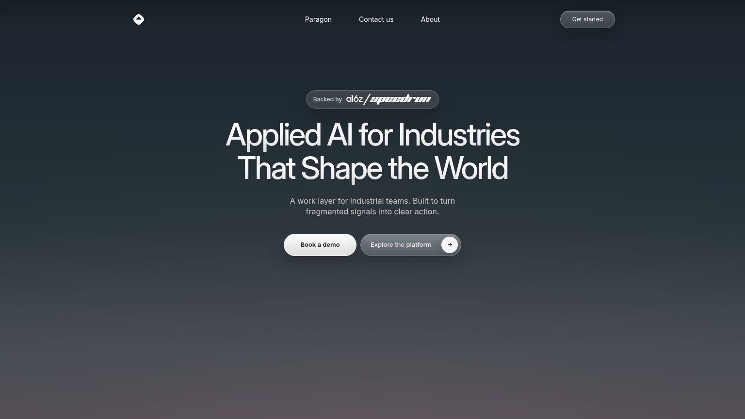
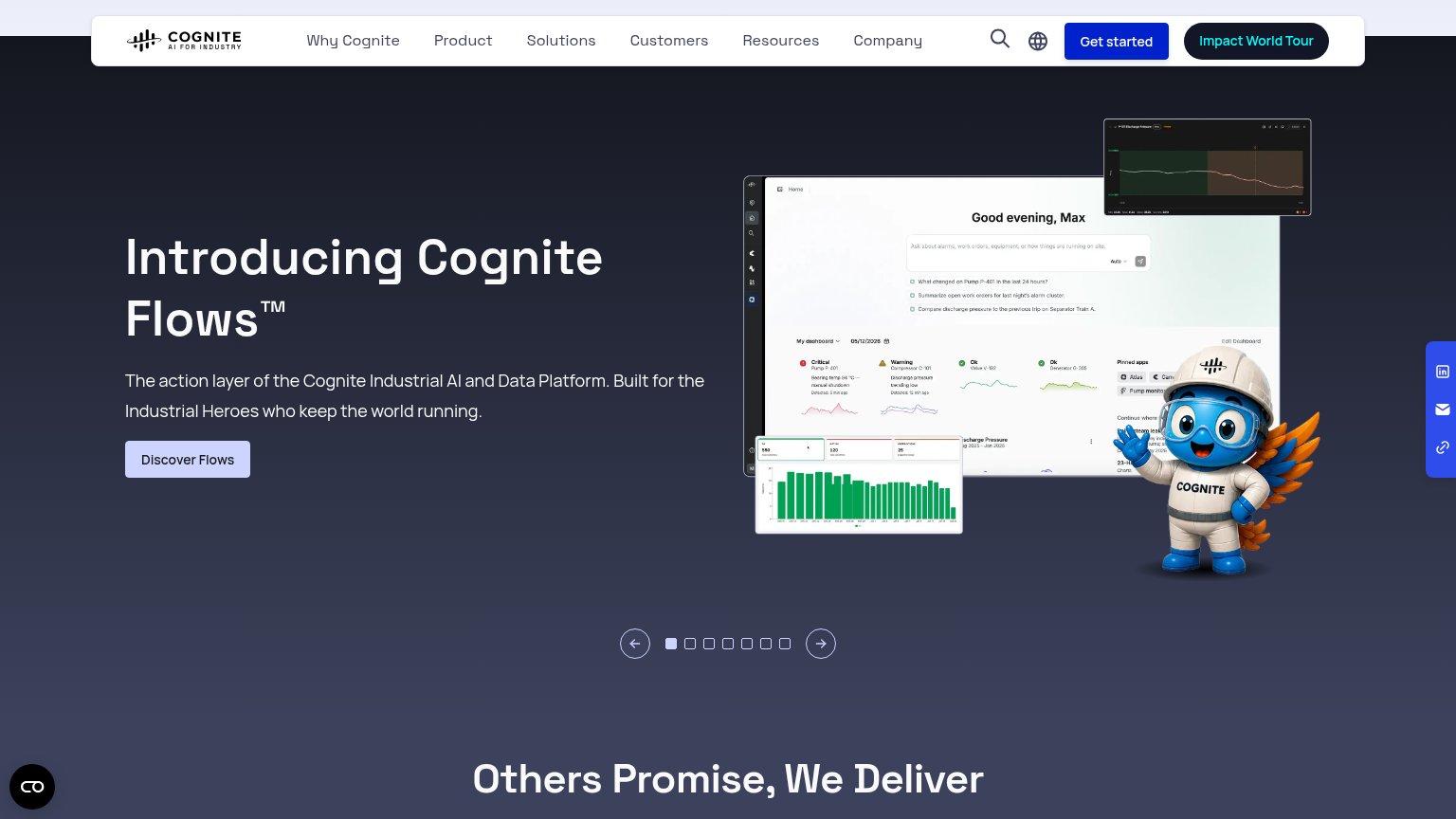
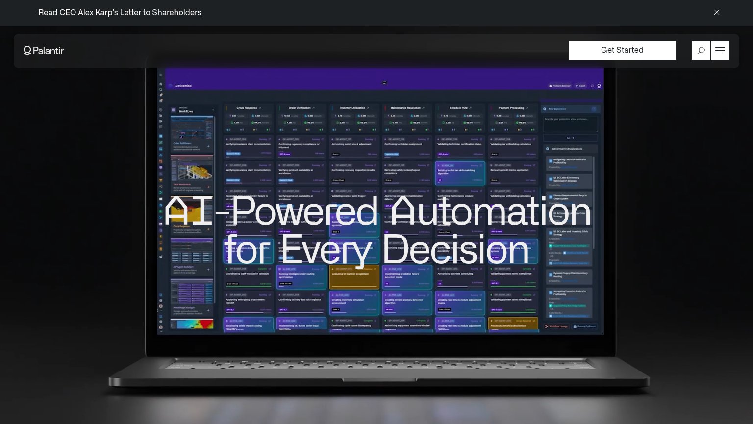
| Trust read | |
|---|---|
| Granular | "Backed by a16z speedrun" badge above the headline |
| Detailed Cognite Flows dashboard screenshot showing alarm cards ("Critical — Pump P-401") and AI query prompts | |
| implicit context C3 AI may benefit from pre-existing familiarity among its target audience. | |
| Detailed real product screenshot of the AI Hivemind workflow dashboard | |
| No visible trust signal identified. |
Value props
50FairTitle, subtitle, hero — do they sell the product's true value?
Granular’s headline vague
Applied AI for Industries That Shape the World
A work layer for industrial teams. Built to turn fragmented signals into clear action.
Working
- "Work layer for industrial teams" hints at audience
- a16z Speedrun badge lends credibility
- Grand tone matches heavy-industry ambition
Could improve
- Headline could caption any industrial AI company
- "Fragmented signals into clear action" is metaphor
- No hero image or demo showing the product
CTA
68FairCopy, size, verb, cost-feel — does the primary CTA earn the click?
Problems
- 'Book' feels costly and committal
- nav says 'Get started', hero differs
- no self-serve or free path visible
Information hierarchy
78FairDoes the design help or inhibit what the page is trying to say?
123- Explore the platform button — Secondary CTA matches the primary's pill size and adds an arrow icon, splitting clicks with 'Book a demo'.
- Get started nav button — A second conversion label competes with 'Book a demo', forcing visitors to guess which action Granular wants.
- Paragon nav link — Unexplained nav item invites an exit before the headline is read, with no context for what it is.
Mobile web
84StrongThe phone experience as a first-class citizen.
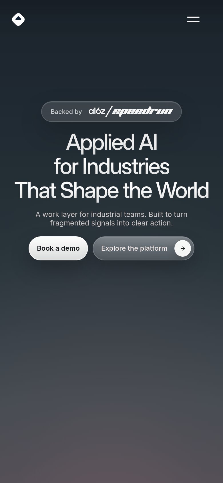 1
1- Side-by-side CTA pair — Splitting the column leaves the primary "Book a demo" button narrower than the secondary "Explore the platform", inverting the visual hierarchy and shrinking the main tap target.
Competitors
closest by platform, customer profile, and value propGraded against Lazyweb’s growth rubrics.