Your landing page’s weakest score is Value props.
How her labs ranks
- 1.
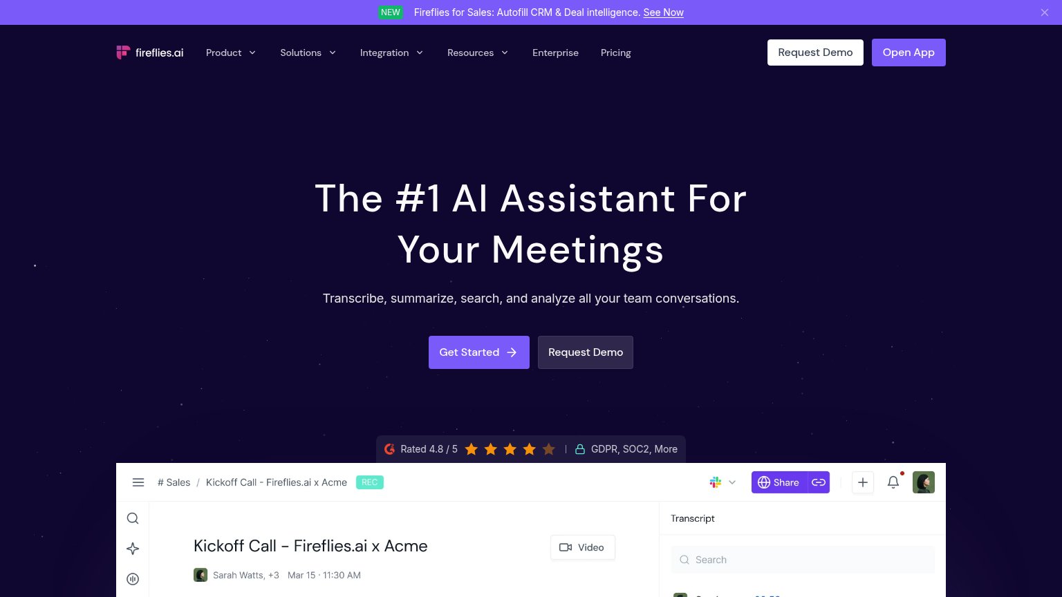
Fireflies.ai76
- 2.
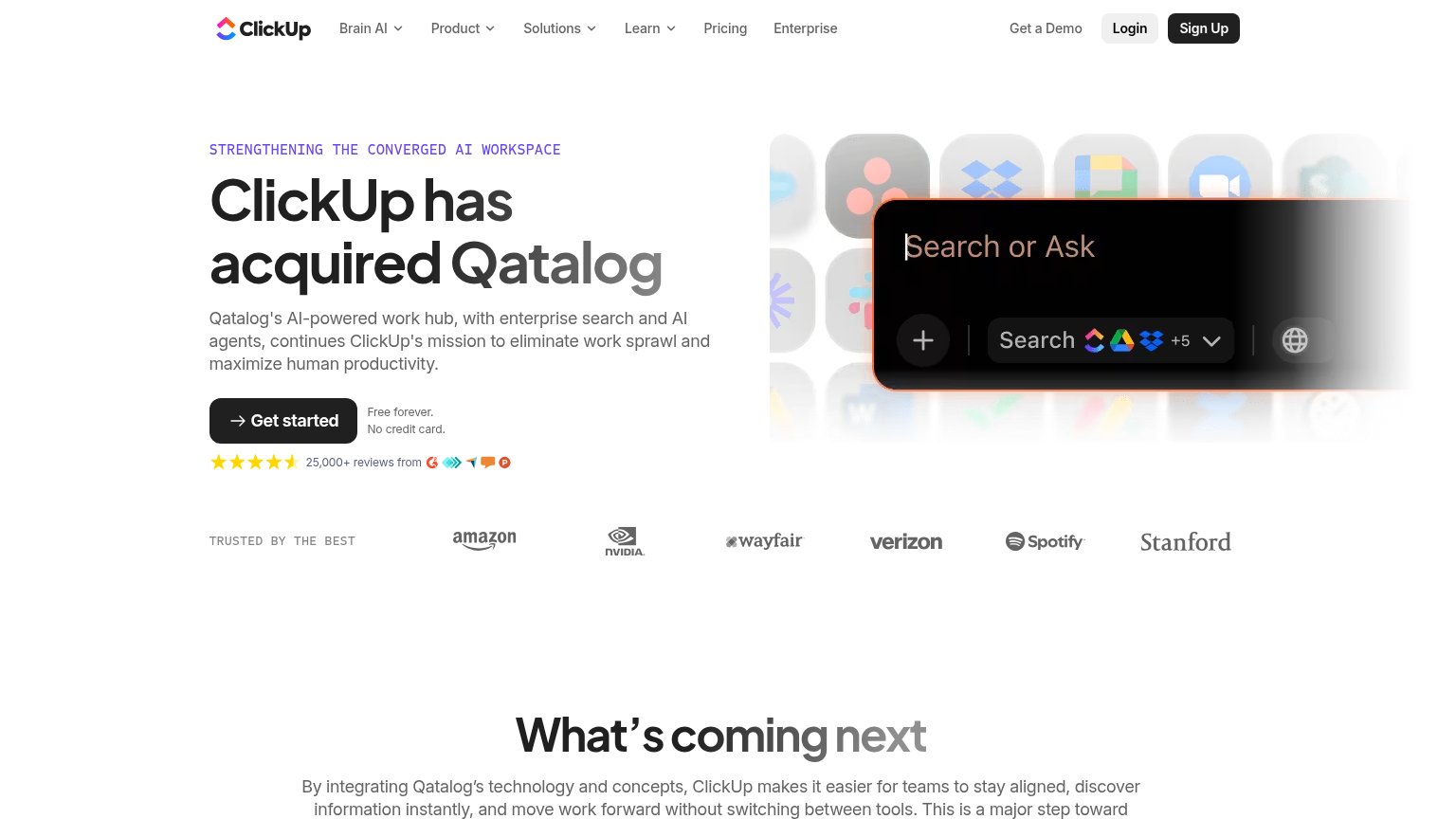
Qatalog76
- 3.
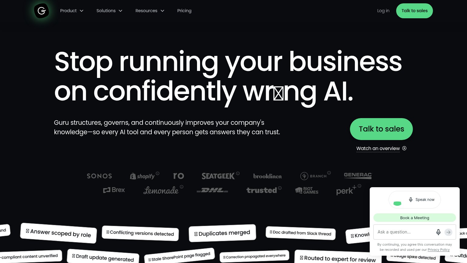
Guru71
- 4.
her labs65
- 5.
Dashworks61
65Growth scoreupdated
category scores
category scoresShowHide
 Lazyweb ProAI Growth PMTurn this score into growth.Analyze your site and propose fixes across conversion, SEO, and AEOMonitor competitors’ in-product UX and A/B testsLearn from growth experiments across 10,000+ top productsTry Pro Free →
Score over time
Value props
47PoorTitle, subtitle, hero — do they sell the product's true value?
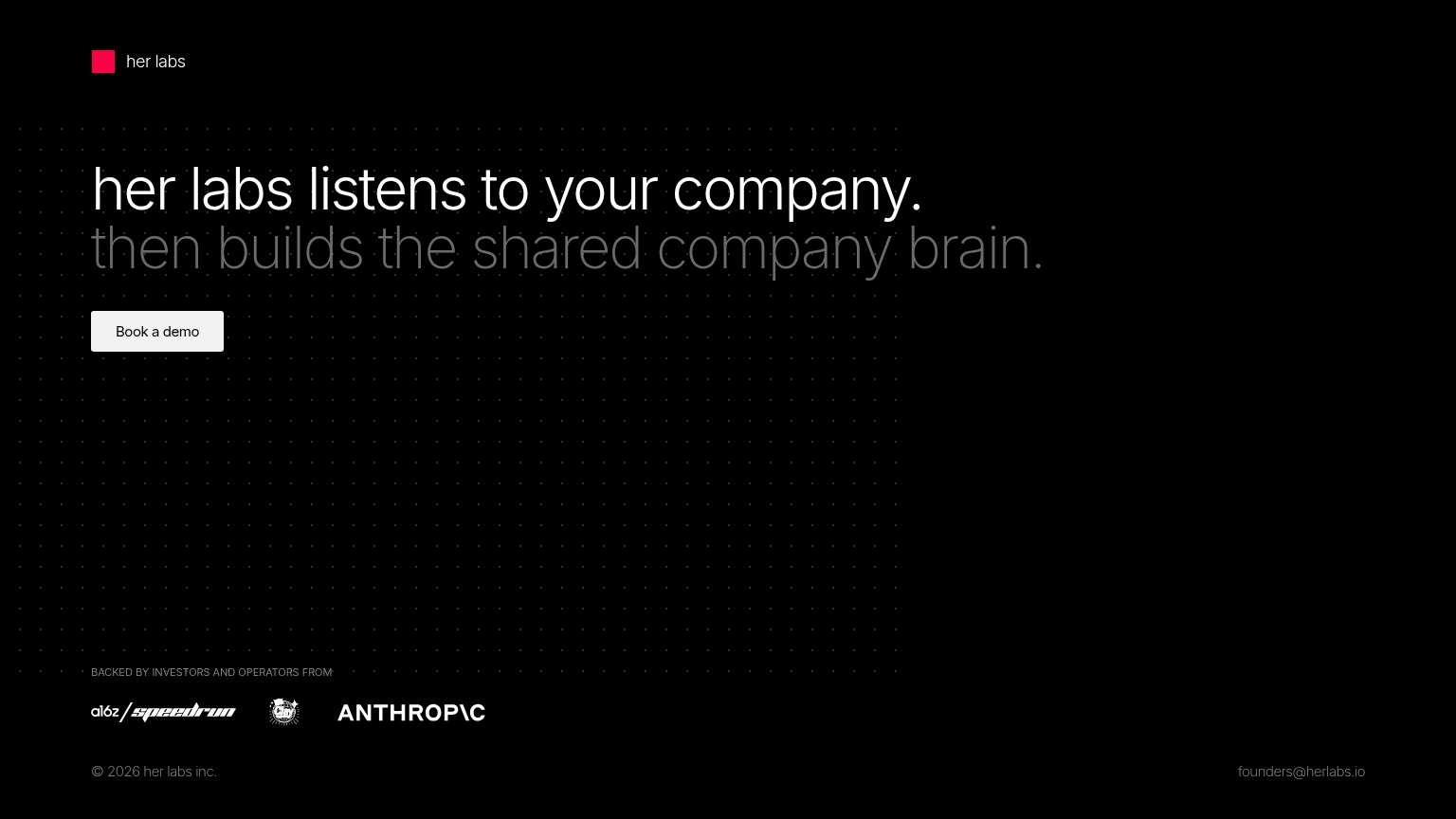
her labs’s headline vague
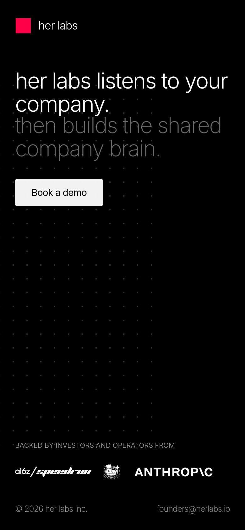
her labs listens to your company.
then builds the shared company brain.
Working
- Memorable two-beat rhythm in the hero
- 'Company brain' hints at real outcome
- Strong investor logos back the claim
Could improve
- No concrete mechanism for 'listens'
- Zero numbers or specific outcomes
- Empty fold — no product demonstration
Trust
48PoorProof that the product is real, competent, and safe to try.
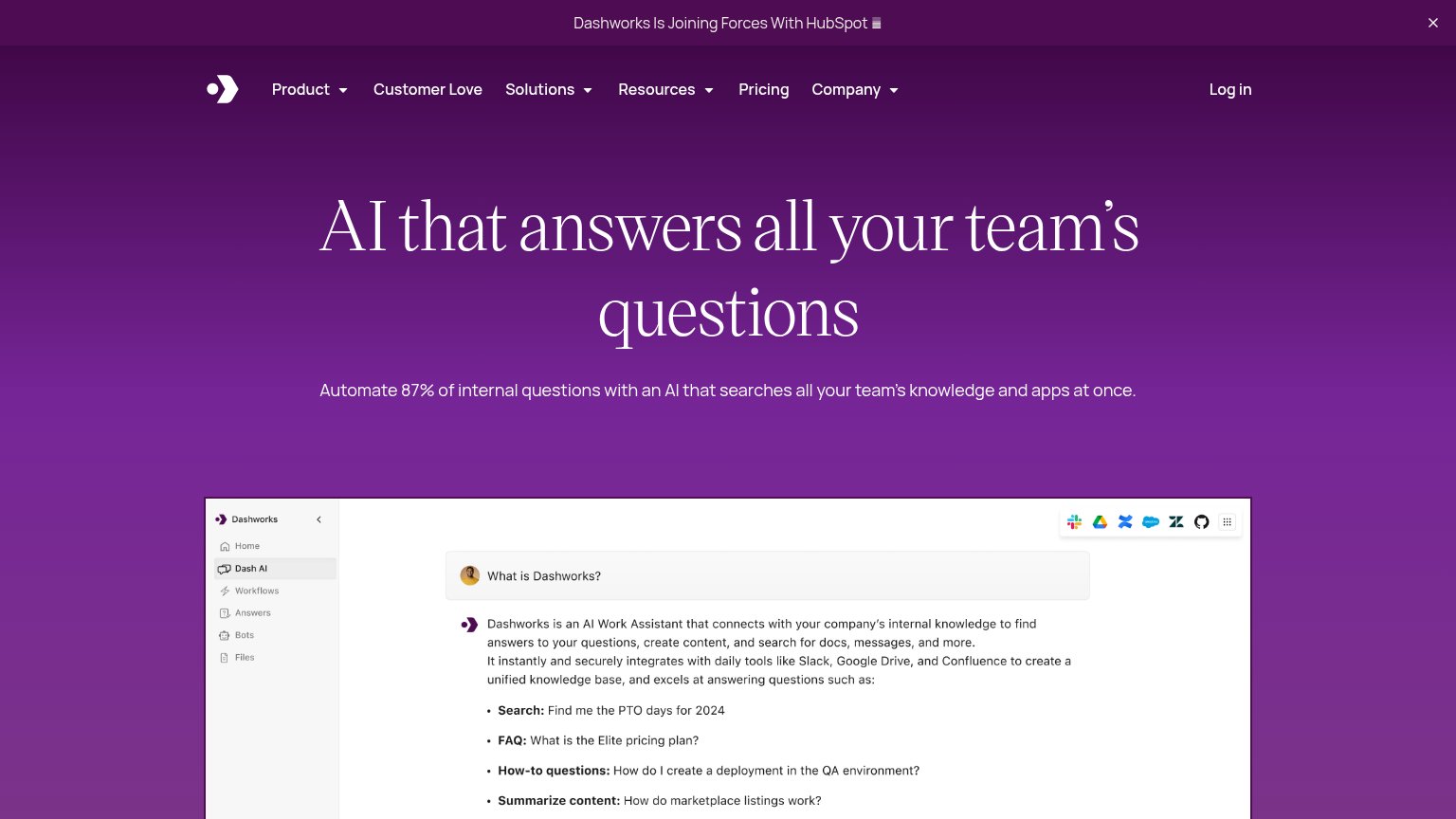
| Trust read | |
|---|---|
| her labs | "BACKED BY INVESTORS AND OPERATORS FROM" logo strip (a16z speedrun, Clay, Anthropic) |
| Customer logo wall: Sonos, Shopify, SeatGeek, Brooklinen, DHL, Brex, Riot Games, Lemonade | |
| Announcement bar: "Dashworks Is Joining Forces With HubSpot" | |
| G2 badge "Rated 4.8 / 5" with "GDPR, SOC2, More" compliance markers | |
| "25,000+ reviews from" with 4.5-star rating and G2/review-site badges under the Get started CTA |
CTA
68FairCopy, size, verb, cost-feel — does the primary CTA earn the click?
Problems
- 'Book' frames click as sales call
- small footprint vs huge headline
- no zero-commitment path on fold
Information hierarchy
80StrongDoes the design help or inhibit what the page is trying to say?
123- Second headline line — "then builds the shared company brain." is set in such low-contrast gray that the actual product payoff is nearly unreadable.
- Book a demo button — Tiny footprint relative to the oversized headline, so the only action on the page carries the least visual weight.
- Clay logo mark — Rendered too small to identify, weakening the credibility the investor row exists to deliver.
Mobile web
80StrongThe phone experience as a first-class citizen.
 12
12- Book a demo button — Desktop-proportioned button floats at under half the column width instead of a full-bleed thumb target.
- Gray subheadline text — "then builds the shared company brain." is so low-contrast against the black background it nearly vanishes on a phone screen.
Competitors
closest by platform, customer profile, and value propGraded against Lazyweb’s growth rubrics.