Your landing page’s weakest score is Value props.
How Hoid ranks
66Growth scoreupdated
category scores
category scoresShowHide
 Lazyweb ProAI Growth PMTurn this score into growth.Analyze your site and propose fixes across conversion, SEO, and AEOMonitor competitors’ in-product UX and A/B testsLearn from growth experiments across 10,000+ top productsTry Pro Free →
Score over time
Value props
34PoorTitle, subtitle, hero — do they sell the product's true value?
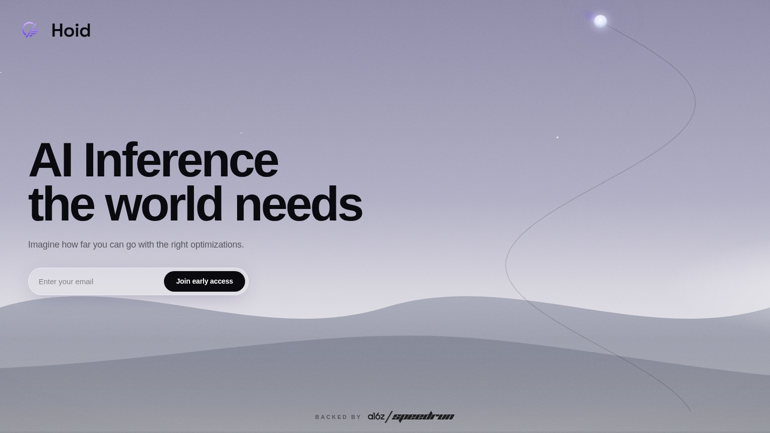
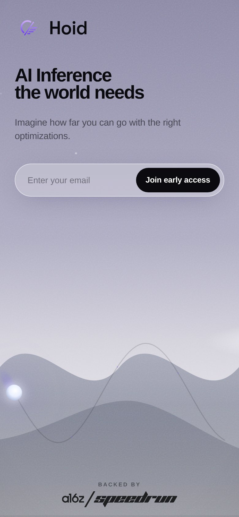
Hoid’s headline vague
AI Inference the world needs
Imagine how far you can go with the right optimizations.
Working
- Names the category: AI inference
- a16z Speedrun badge adds credibility
- Clean, single-CTA waitlist ask
Could improve
- Headline could caption any AI infra company
- Subhead has zero specifics or numbers
- Hero art decorates instead of demonstrates
Trust
48PoorProof that the product is real, competent, and safe to try.
| Trust read | |
|---|---|
| Hoid | "BACKED BY a16z speedrun" badge |
| implicit context Fireworks AI may benefit from pre-existing familiarity among its target audience. | |
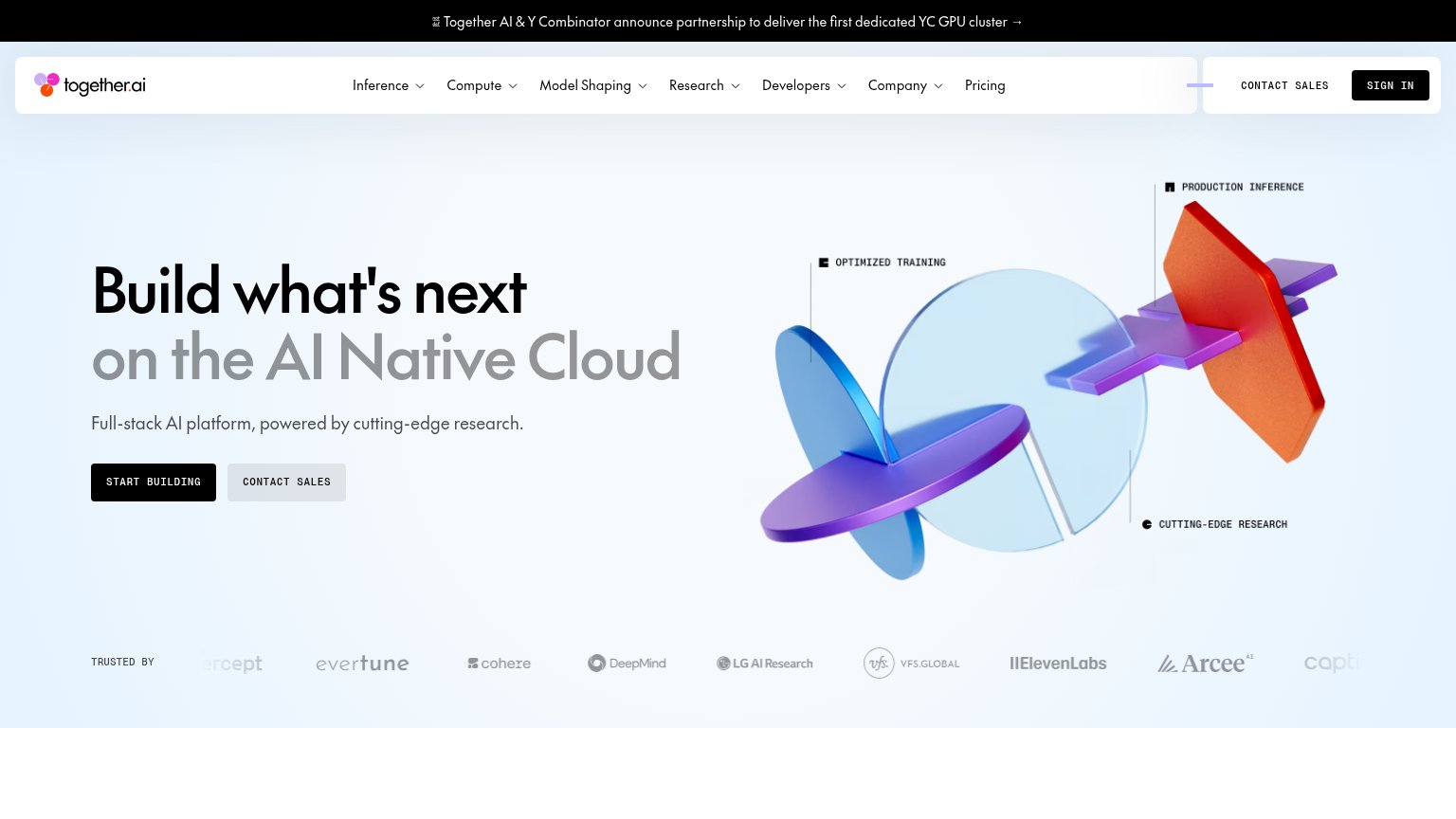
| "TRUSTED BY" logo strip with Cohere, DeepMind, LG AI Research, VFS.Global, ElevenLabs | |
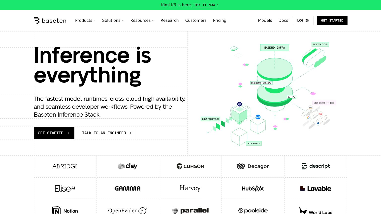
| Customer logo wall featuring Cursor, Notion, HubSpot, Harvey, Descript, and Lovable | |
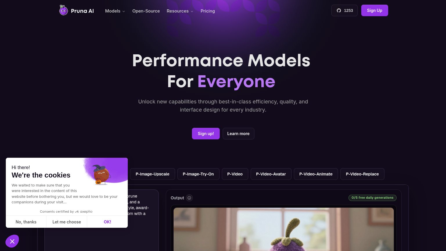
| Live playground with model tabs (P-Image-Upscale, P-Video-Avatar) and an 'Output' panel labeled '0/5 free daily generati |
CTA
72FairCopy, size, verb, cost-feel — does the primary CTA earn the click?
Problems
- 'Join' feels like commitment, not value
- waitlist click delivers no named payoff
- button small next to oversized headline
Information hierarchy
88StrongDoes the design help or inhibit what the page is trying to say?
12- Subheadline text — Small light-gray copy nearly dissolves into the gradient, weakening the only supporting explanation of the headline.
- Email input field — Translucent fill and pale placeholder blend into the background, making the capture surface easy to scan past.
Mobile web
88StrongThe phone experience as a first-class citizen.
 1
1- Email input field — Translucent fill and pale placeholder blend into the lavender background, making the required first step easy to miss.
Competitors
closest by platform, customer profile, and value propGraded against Lazyweb’s growth rubrics.