Your landing page’s weakest score is Trust.
How Infragrid ranks
- 1.
Luminai70
- 2.
Infragrid69
- 3.
Basepilot68
- 4.
Autotab64
- 5.
Orby AI43
69Growth scoreupdated
category scores
category scoresShowHide
 Lazyweb ProAI Growth PMTurn this score into growth.Analyze your site and propose fixes across conversion, SEO, and AEOMonitor competitors’ in-product UX and A/B testsLearn from growth experiments across 10,000+ top productsTry Pro Free →
Score over time
Trust
45PoorProof that the product is real, competent, and safe to try.
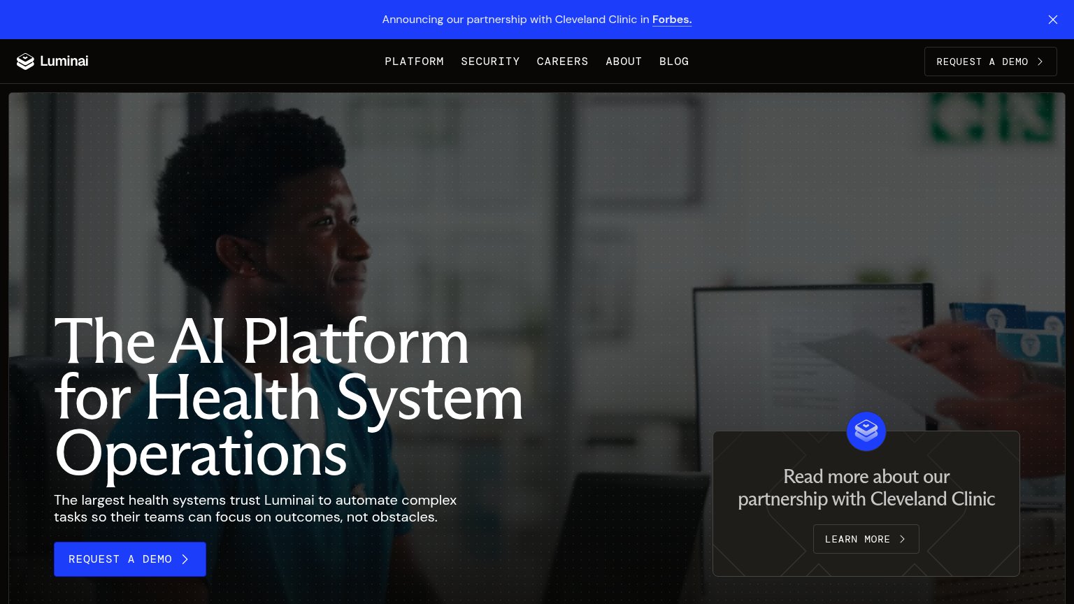
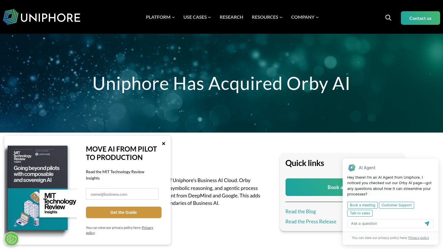
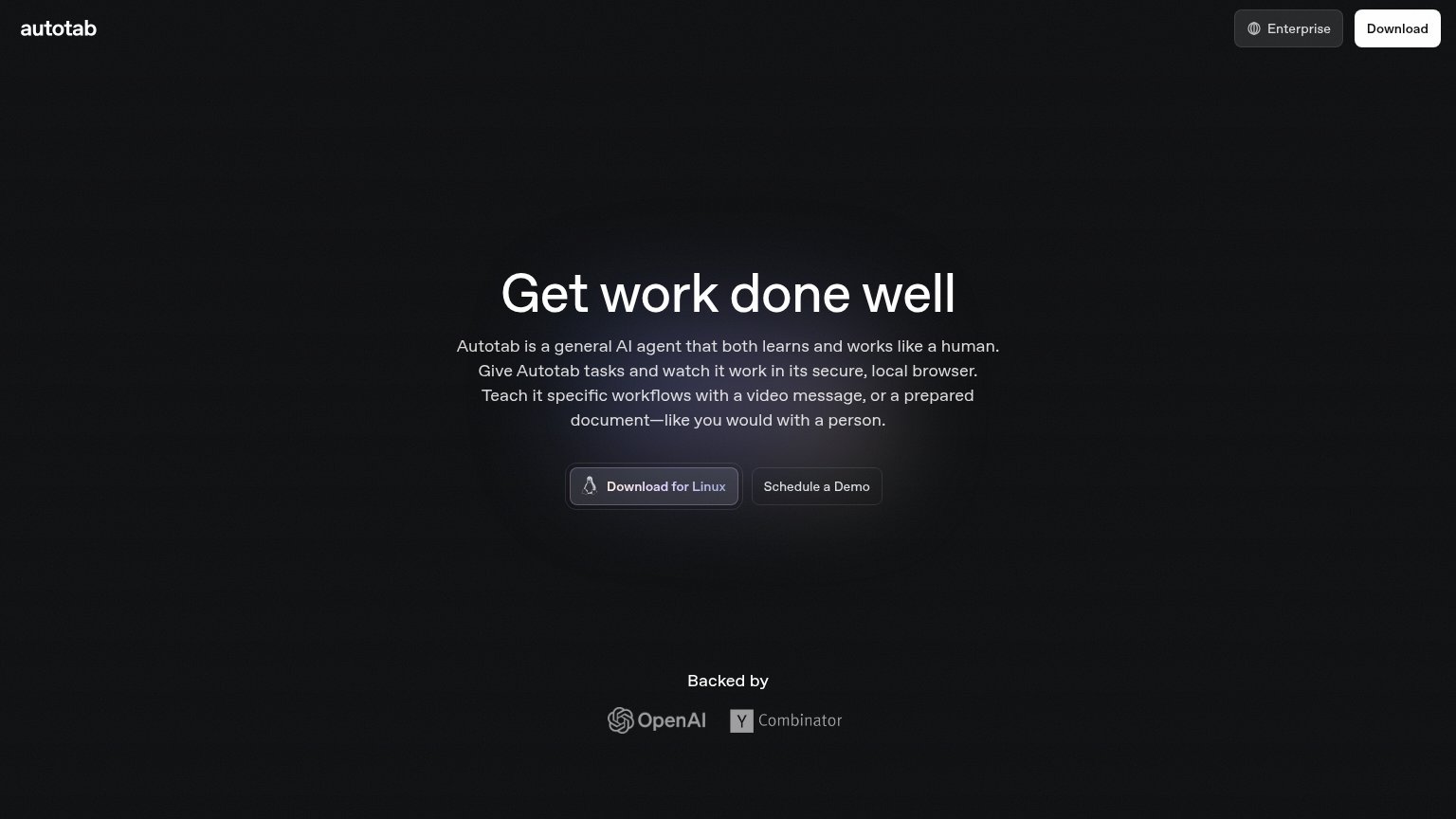
| Trust read | |
|---|---|
| Infragrid | No visible trust signal identified. |
| MIT Technology Review Insights report cover: "Going beyond pilots with composable and sovereign AI" | |
| "Backed by" OpenAI and Y Combinator investor logos | |
| Announcing our partnership with Cleveland Clinic in Forbes. | |
| No visible trust signal identified. |
CTA
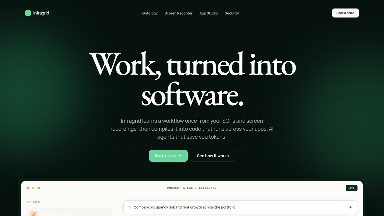
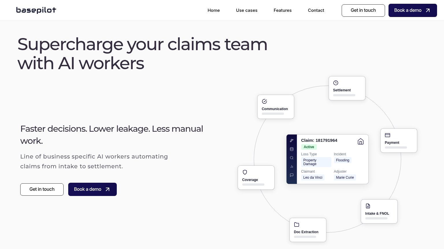
68FairCopy, size, verb, cost-feel — does the primary CTA earn the click?
Problems
- 'Book' makes click feel costly
- no self-serve or free path
- product mock isn't interactive
Value props
68FairTitle, subtitle, hero — do they sell the product's true value?
Infragrid’s headline undersells
Work, turned into software.
Infragrid learns a workflow once from your SOPs and screen recordings, then compiles it into code that runs across your apps. AI agents that save you tokens.
Working
- Subhead names concrete inputs: SOPs, recordings
- Mechanism is clear: compiles workflows to code
- Hero demo shows real product in action
Could improve
- H1 is an abstraction any tool could claim
- "Save Infragrid tokens" is insider jargon, not a buyer outcome
- No numbers or proof points in the fold
Information hierarchy
82StrongDoes the design help or inhibit what the page is trying to say?
123- Hero Book a demo — Green text on pale-green fill gives the primary CTA weaker contrast than the white nav pill, muting the page's one action.
- Demo panel file labels — Source names like "Investment memo.pdf" render in washed-out low-contrast text, making the proof panel harder to parse.
- Nav Book a demo — Styled at equal or stronger weight than the hero CTA, splitting attention between two identical actions.
Mobile web
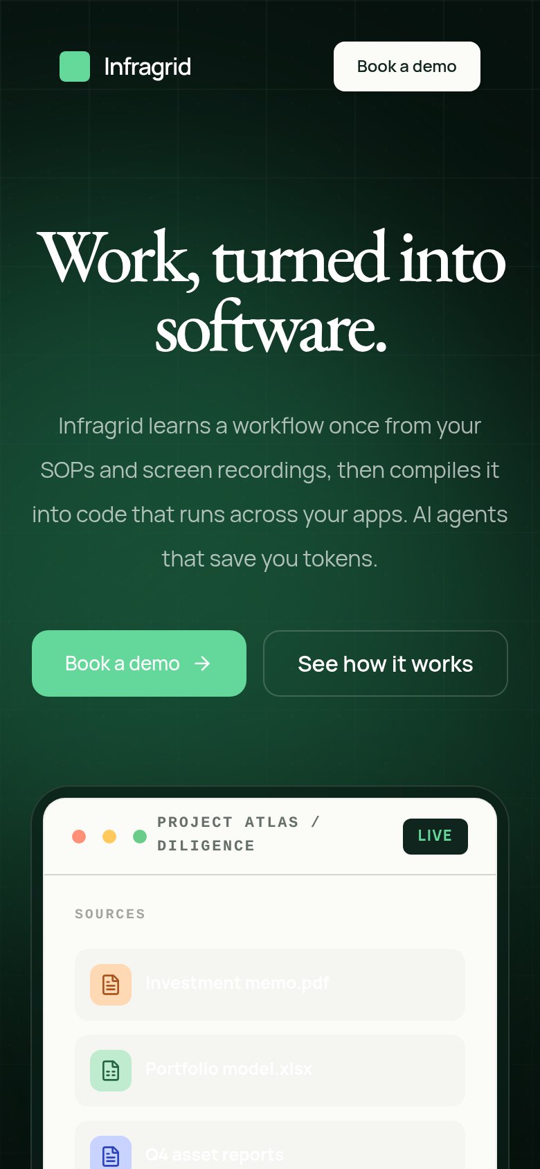
83StrongThe phone experience as a first-class citizen.
 12
12- Paired CTA row — Two buttons split the row, shrinking "Book a demo" to a half-width tap target instead of full-bleed.
- Source file list — Filenames like "Investment memo.pdf" are near-illegible light text on a light card.
Competitors
closest by platform, customer profile, and value propGraded against Lazyweb’s growth rubrics.