Your landing page’s weakest score is CTA.
How KIRA ranks
55Growth scoreupdated
category scores
category scoresShowHide
 Lazyweb ProAI Growth PMTurn this score into growth.Analyze your site and propose fixes across conversion, SEO, and AEOMonitor competitors’ in-product UX and A/B testsLearn from growth experiments across 10,000+ top productsTry Pro Free →
Score over time
CTA
42PoorCopy, size, verb, cost-feel — does the primary CTA earn the click?
Problems
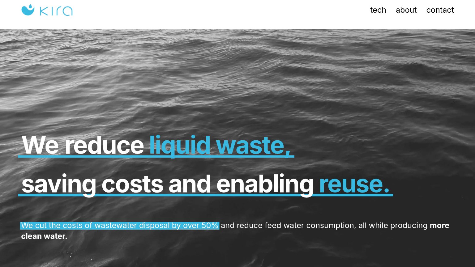
- no CTA anywhere in the fold
- nav links are the only actions
- 50% savings claim has no next step
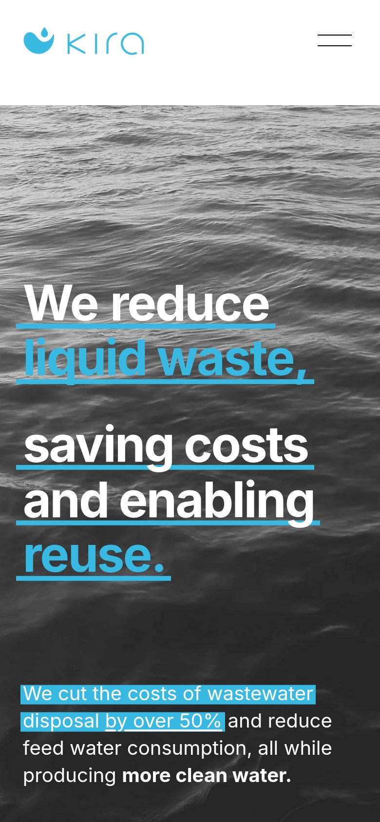
- mobile fold also ends with no action
Trust
42PoorProof that the product is real, competent, and safe to try.
| Trust read | |
|---|---|
| KIRA | "We cut the costs of wastewater disposal by over 50%" |
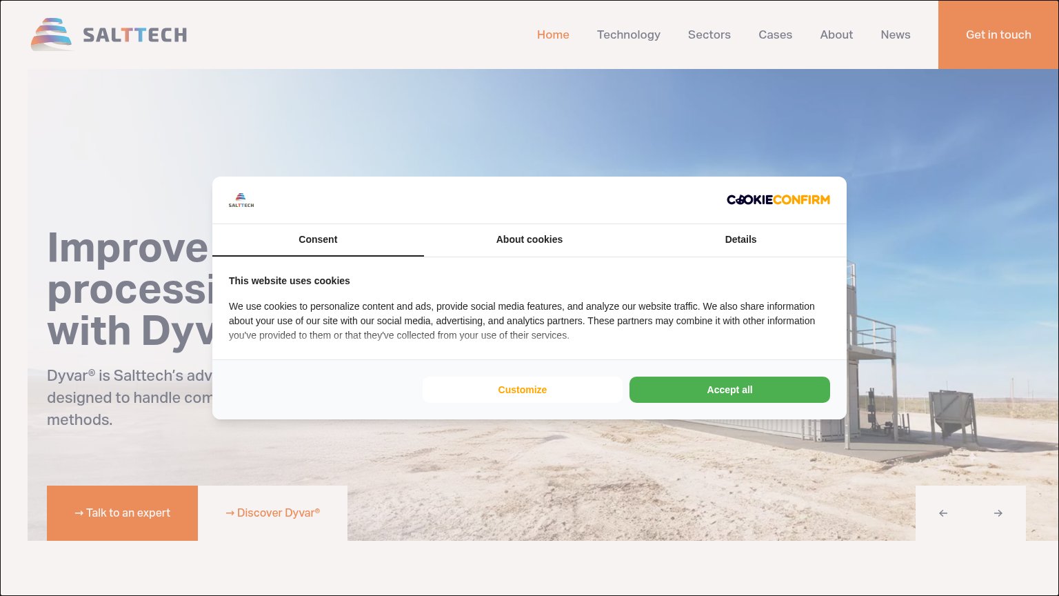
| No visible trust signal identified. | |
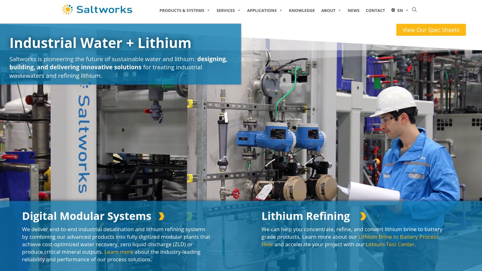
| No visible trust signal identified. | |
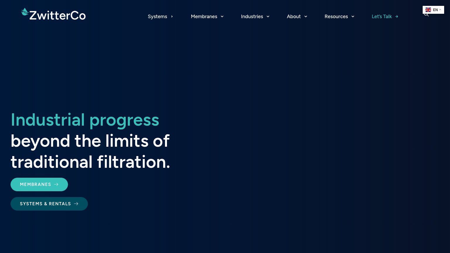
| No visible trust signal identified. | |
| No visible trust signal identified. | |
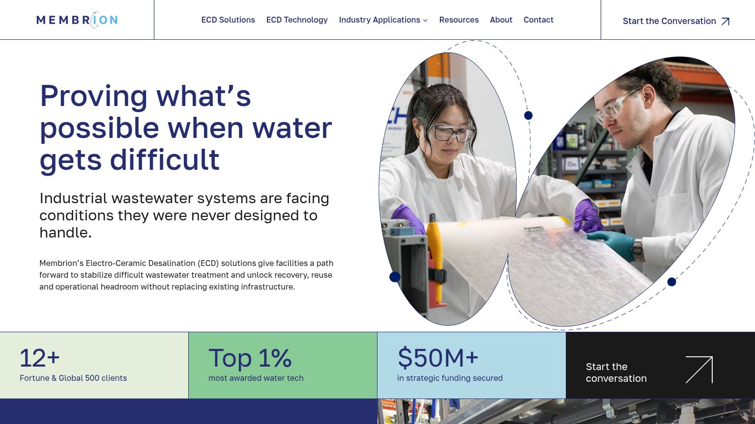
| 12+ Fortune & Global 500 clients |
Mobile web
54FairThe phone experience as a first-class citizen.
 12
12- Hero headline block — Barely scaled from desktop, it wraps into six underlined lines that fill the whole viewport and leave no room for a CTA.
- Highlighted subtext claim — The blue highlight and underline on "by over 50%" mimics a tappable link but leads nowhere, wasting the fold's only action-shaped element.
Information hierarchy
58FairDoes the design help or inhibit what the page is trying to say?
123- Hero headline block — The fold's focal message has no adjacent CTA, leaving visitors with nothing to click after reading the promise.
- Nav links row — tech, about, and contact are the only clickable elements in the fold, so all intent leaks into secondary pages.
- Underlined headline text — Blue underlines mimic hyperlinks and invite dead clicks on non-interactive headline copy.
Value props
80StrongTitle, subtitle, hero — do they sell the product's true value?
KIRA’s headline sells
We reduce liquid waste, saving costs and enabling reuse.
We cut the costs of wastewater disposal by over 50% and reduce feed water consumption, all while producing more clean water.
Working
- Concrete 50% cost-cut claim
- Outcome-first headline, not features
- Highlight styling flags the key claims
Could improve
- No target audience named
- Hero image decorates, not demonstrates
- No mention of how the tech works
Competitors
closest by platform, customer profile, and value propGraded against Lazyweb’s growth rubrics.