Your landing page’s weakest score is CTA.
How Mecone ranks
56Growth scoreupdated
category scores
category scoresShowHide
 Lazyweb ProAI Growth PMTurn this score into growth.Analyze your site and propose fixes across conversion, SEO, and AEOMonitor competitors’ in-product UX and A/B testsLearn from growth experiments across 10,000+ top productsTry Pro Free →
Score over time
CTA
48PoorCopy, size, verb, cost-feel — does the primary CTA earn the click?
Problems
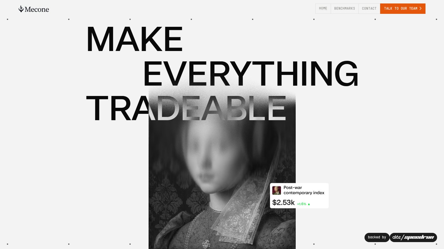
- high-commitment sales-call ask
- tiny nav button, no hero CTA
- absent on mobile fold (hamburger)
- mentions 'our team', not the visitor
Value props
48PoorTitle, subtitle, hero — do they sell the product's true value?
Mecone’s headline vague
MAKE EVERYTHING TRADEABLE
Working
- Bold, memorable three-word manifesto
- Index widget shows real product data
- a16z speedrun badge adds credibility
Could improve
- No subhead explaining what Mecone is
- Headline could caption any marketplace
- Image chip carries all the specificity
Trust
52FairProof that the product is real, competent, and safe to try.
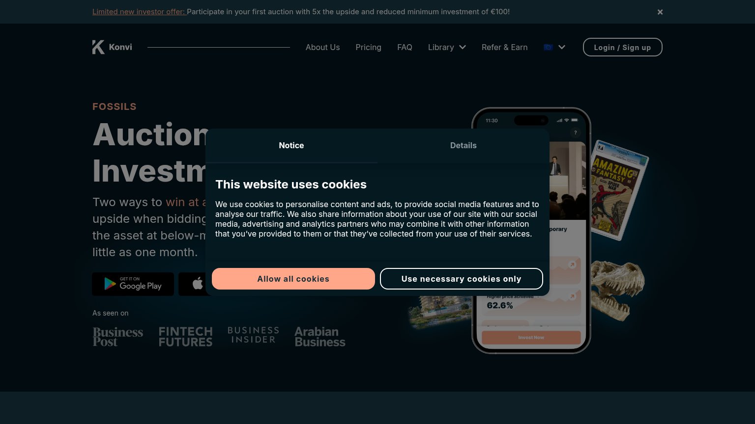
| Trust read | |
|---|---|
| Mecone | 'backed by a16z speedrun' badge |
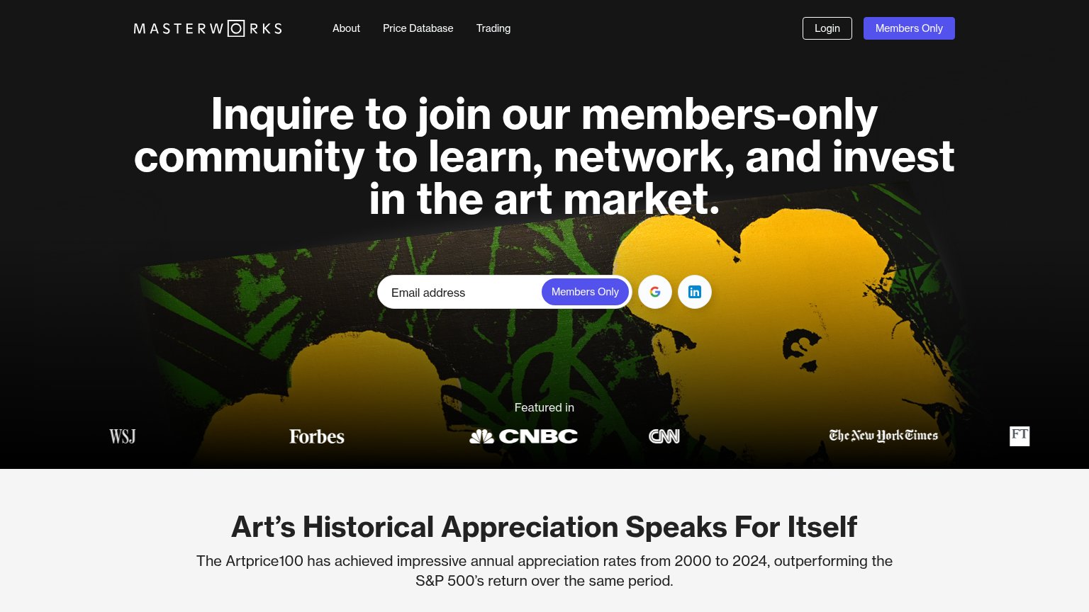
| "Featured in" press bar with WSJ, Forbes, CNBC, CNN, The New York Times, and FT logos | |
| No visible trust signal identified. | |
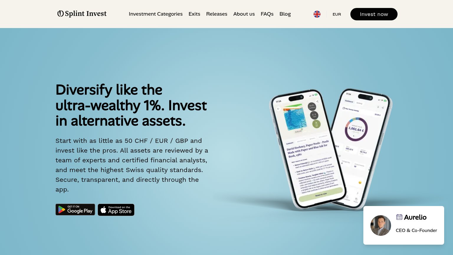
| App screenshots showing a real asset listing ("David Hockney, Paper Pools") and portfolio dashboard UI | |
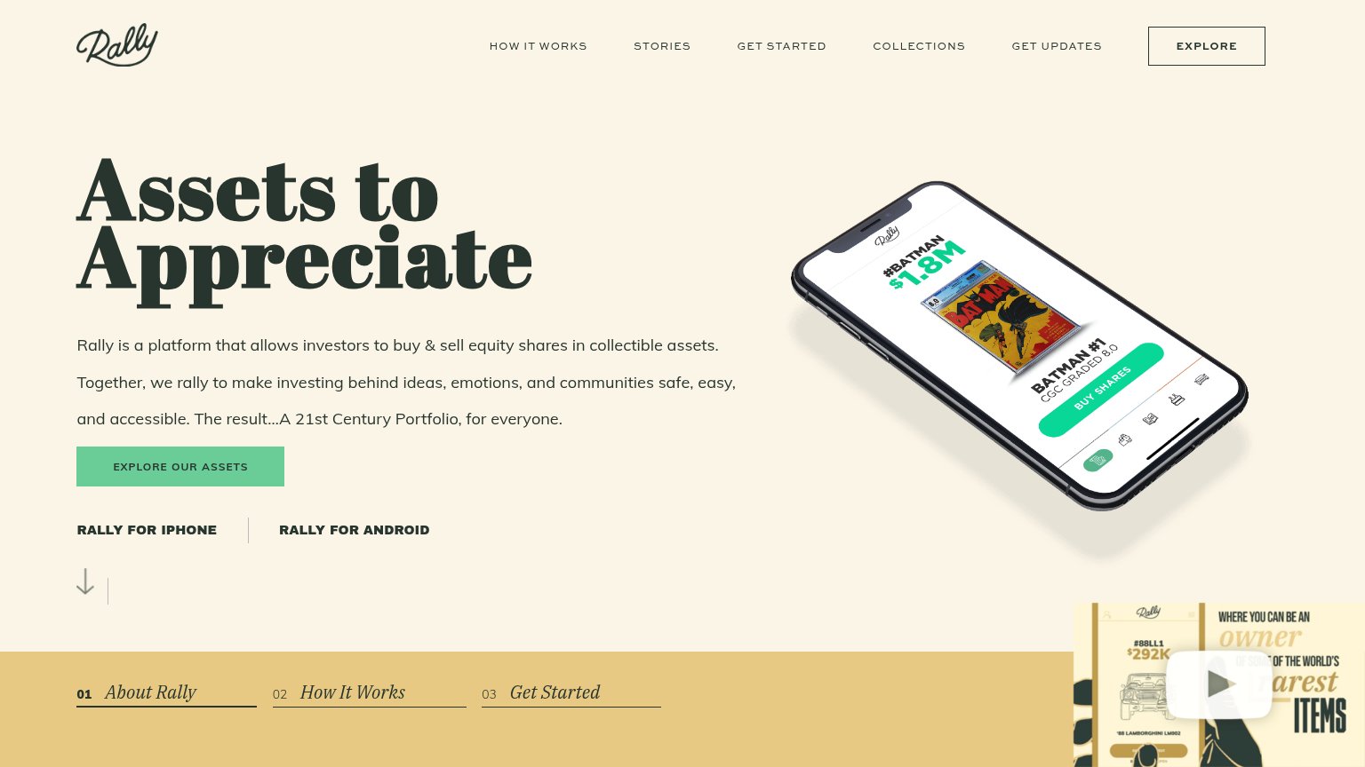
| "As seen on" press strip: Business Post, Fintech Futures, Business Insider, Arabian Business |
Mobile web
56FairThe phone experience as a first-class citizen.
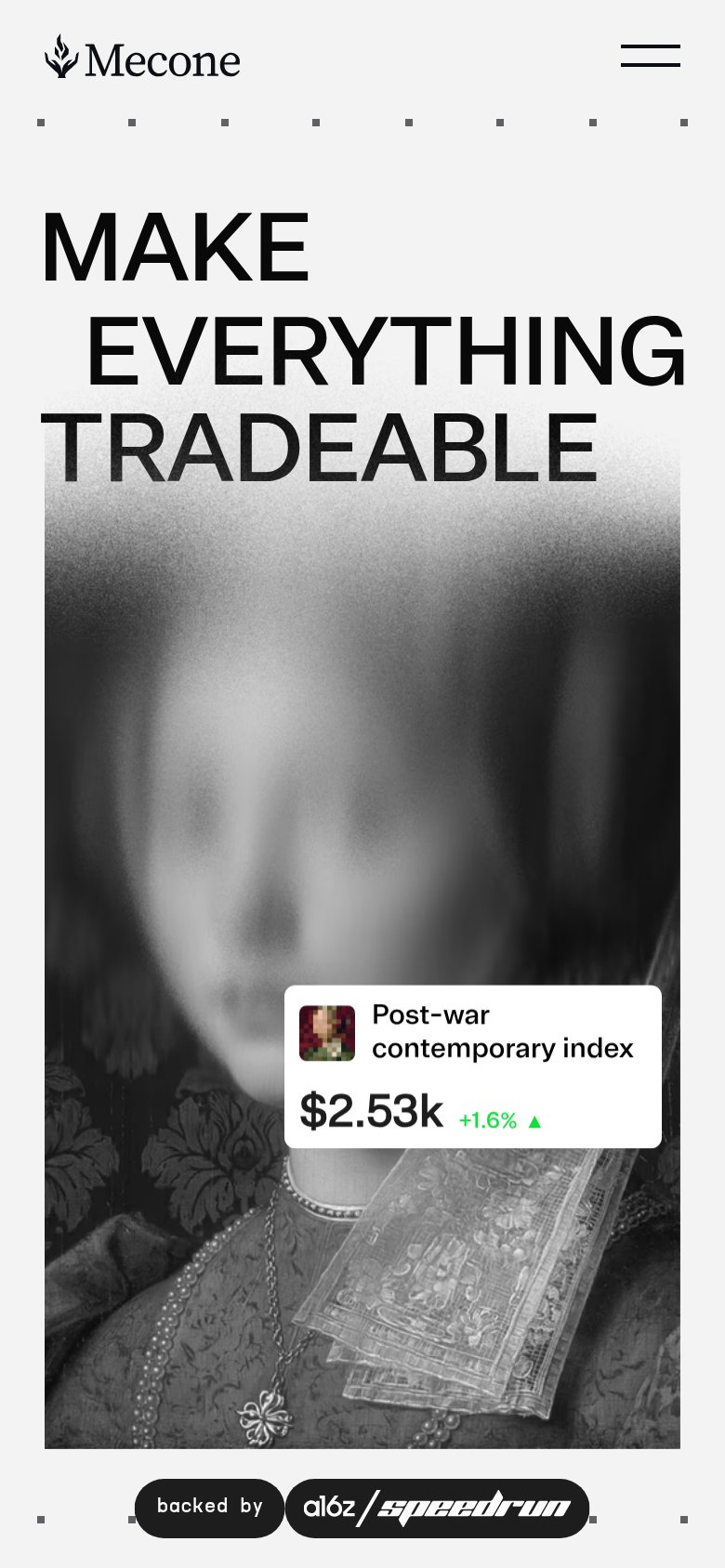 123
123- Hamburger menu icon — It swallows the only CTA — "Talk to our team" is unreachable without an extra tap, leaving the fold with zero conversion action.
- TRADEABLE headline — The word sits directly on the grainy portrait, dropping contrast and legibility compared to the two lines above it.
- Index ticker card — The "$2.53k" card is the most button-like element on screen but is purely decorative, inviting dead taps.
Information hierarchy
76FairDoes the design help or inhibit what the page is trying to say?
123- TRADEABLE headline word — Half the word is washed out where it overlaps the portrait, burying the core message at its payoff.
- TALK TO OUR TEAM — The only conversion button is a small corner element outside the down-center scan path the headline creates.
- Post-war index card — The one proof element sits low-right at small size, easy to miss against the dark portrait.
Competitors
closest by platform, customer profile, and value propGraded against Lazyweb’s growth rubrics.