Your landing page’s weakest score is Trust.
How Philyron ranks
72Growth scoreupdated
category scores
category scoresShowHide
 Lazyweb ProAI Growth PMTurn this score into growth.Analyze your site and propose fixes across conversion, SEO, and AEOMonitor competitors’ in-product UX and A/B testsLearn from growth experiments across 10,000+ top productsTry Pro Free →
Score over time
Trust
42PoorProof that the product is real, competent, and safe to try.
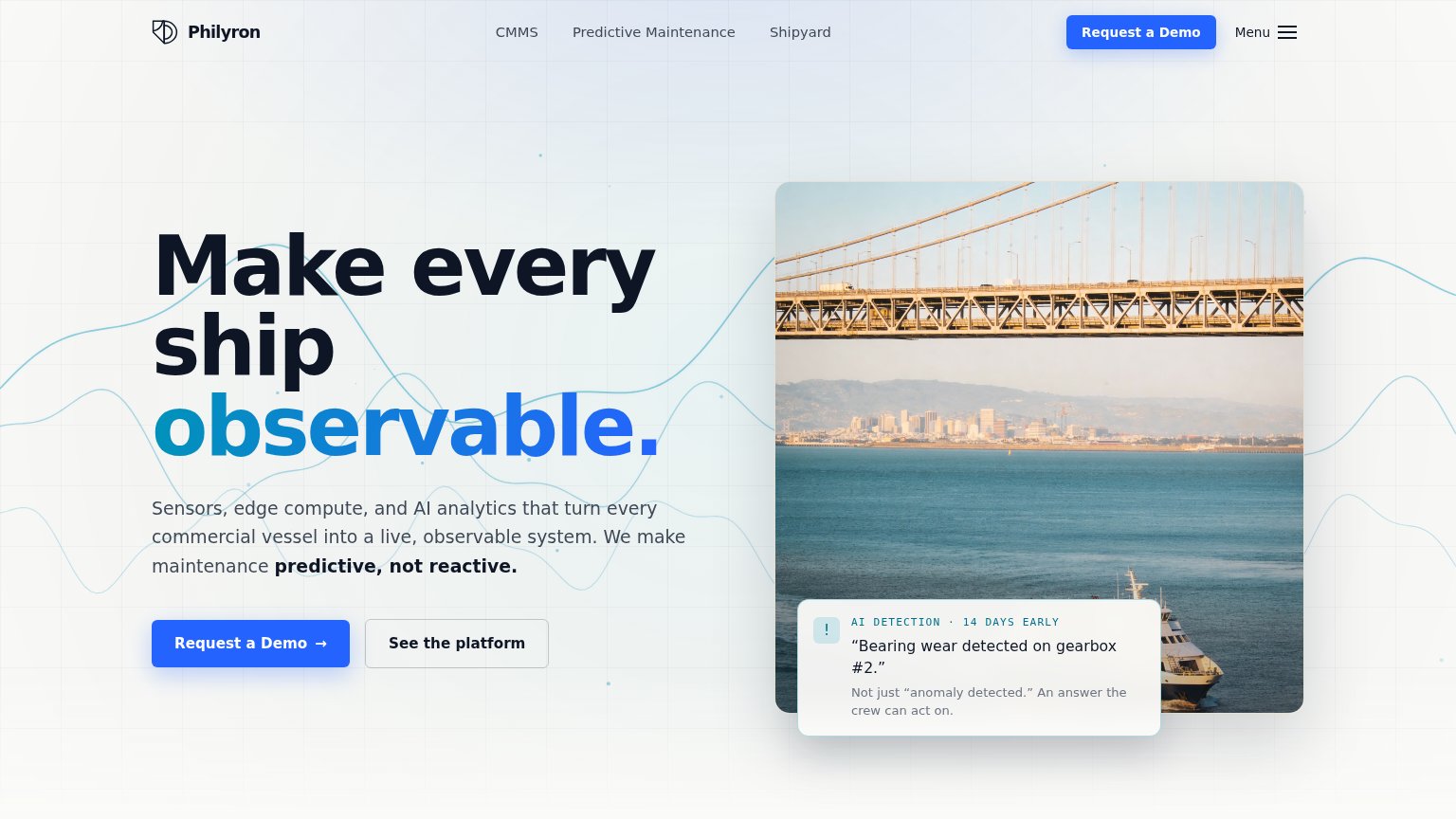
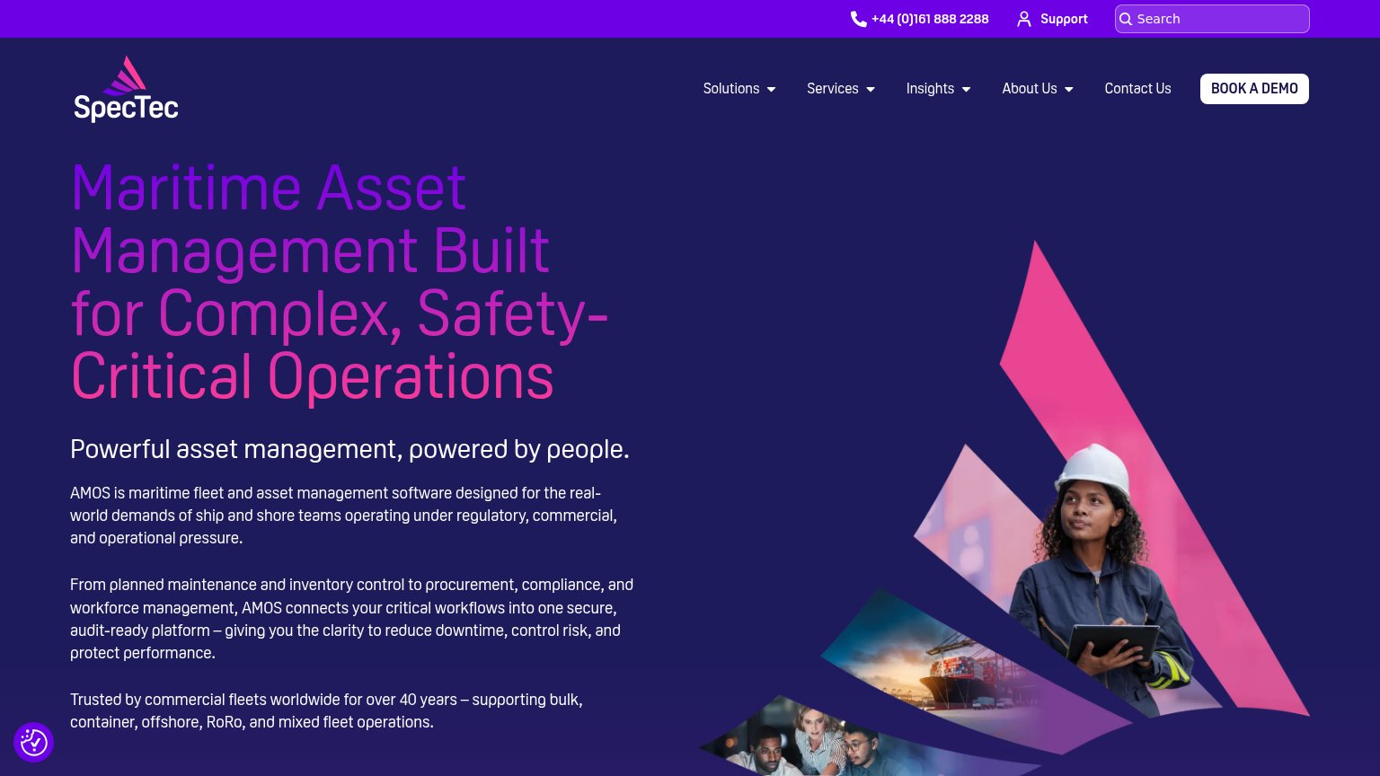
| Trust read | |
|---|---|
| Philyron | "AI DETECTION · 14 DAYS EARLY — 'Bearing wear detected on gearbox #2.'" callout card |
| No visible trust signal identified. | |
| "Kongsberg Digital is now Falkor" rebrand notice with the 'a KONGSBERG company' logo mark | |
| "Trusted by commercial fleets worldwide for over 40 years – supporting bulk, container, offshore, RoRo, and mixed fleet | |
| No visible trust signal identified. |
CTA
73FairCopy, size, verb, cost-feel — does the primary CTA earn the click?
Problems
- 'Request' implies waiting on sales
- click feels committal, not valuable
- secondary CTA feels cheaper than primary
Value props
78FairTitle, subtitle, hero — do they sell the product's true value?
Philyron’s headline sells
Make every ship observable.
Sensors, edge compute, and AI analytics that turn every commercial vessel into a live, observable system. We make maintenance predictive, not reactive.
Working
- "14 days early" card shows product in action
- "predictive, not reactive" names the outcome
- Subhead lists concrete tech: sensors, edge, AI
Could improve
- "Observable" is software jargon for ship operators
- Hero photo is a bridge, not the product
- No fleet, downtime, or savings numbers in copy
Mobile web
82StrongThe phone experience as a first-class citizen.
 123
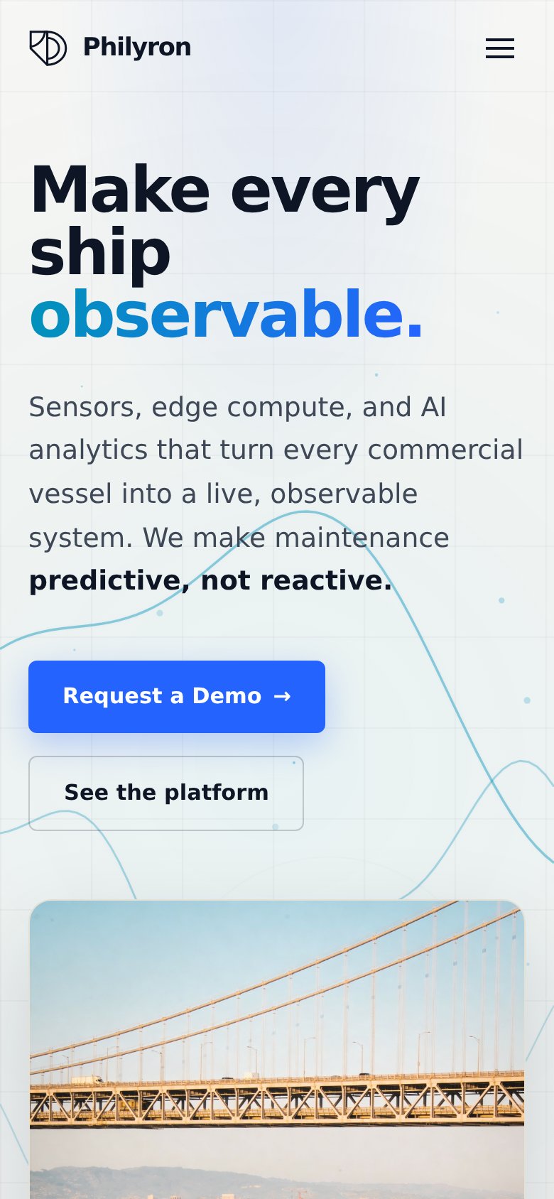
123- Request a Demo button — Desktop-proportioned button floats at roughly half the column width instead of near-full-bleed, shrinking the thumb target.
- See the platform button — Narrower than the primary above it, making the CTA stack look ragged and the secondary action harder to tap.
- Hero body paragraph — Six lines of supporting copy between headline and CTA pushes the primary action toward the bottom of the fold.
Information hierarchy
83StrongDoes the design help or inhibit what the page is trying to say?
123- Hero bridge photo — The image foregrounds a bridge, not a ship — the vessel the headline promises to make observable is a cropped ferry in the corner.
- Menu hamburger toggle — Redundant with the three visible nav links on desktop, adding an extra exit path beside the primary CTA.
- AI detection card — The gray body copy 'Not just anomaly detected...' is small and low-contrast, weakening the fold's best proof element.
Competitors
closest by platform, customer profile, and value propGraded against Lazyweb’s growth rubrics.