Your landing page’s weakest score is Trust.
How Valent ranks
72Growth scoreupdated
category scores
category scoresShowHide
 Lazyweb ProAI Growth PMTurn this score into growth.Analyze your site and propose fixes across conversion, SEO, and AEOMonitor competitors’ in-product UX and A/B testsLearn from growth experiments across 10,000+ top productsTry Pro Free →
Score over time
Trust
44PoorProof that the product is real, competent, and safe to try.
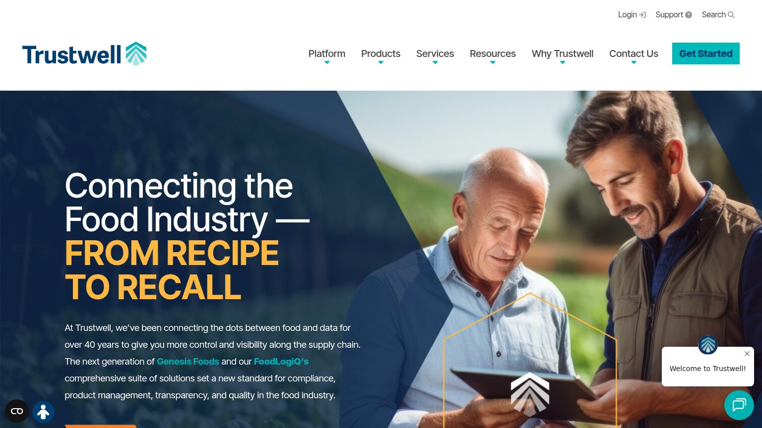
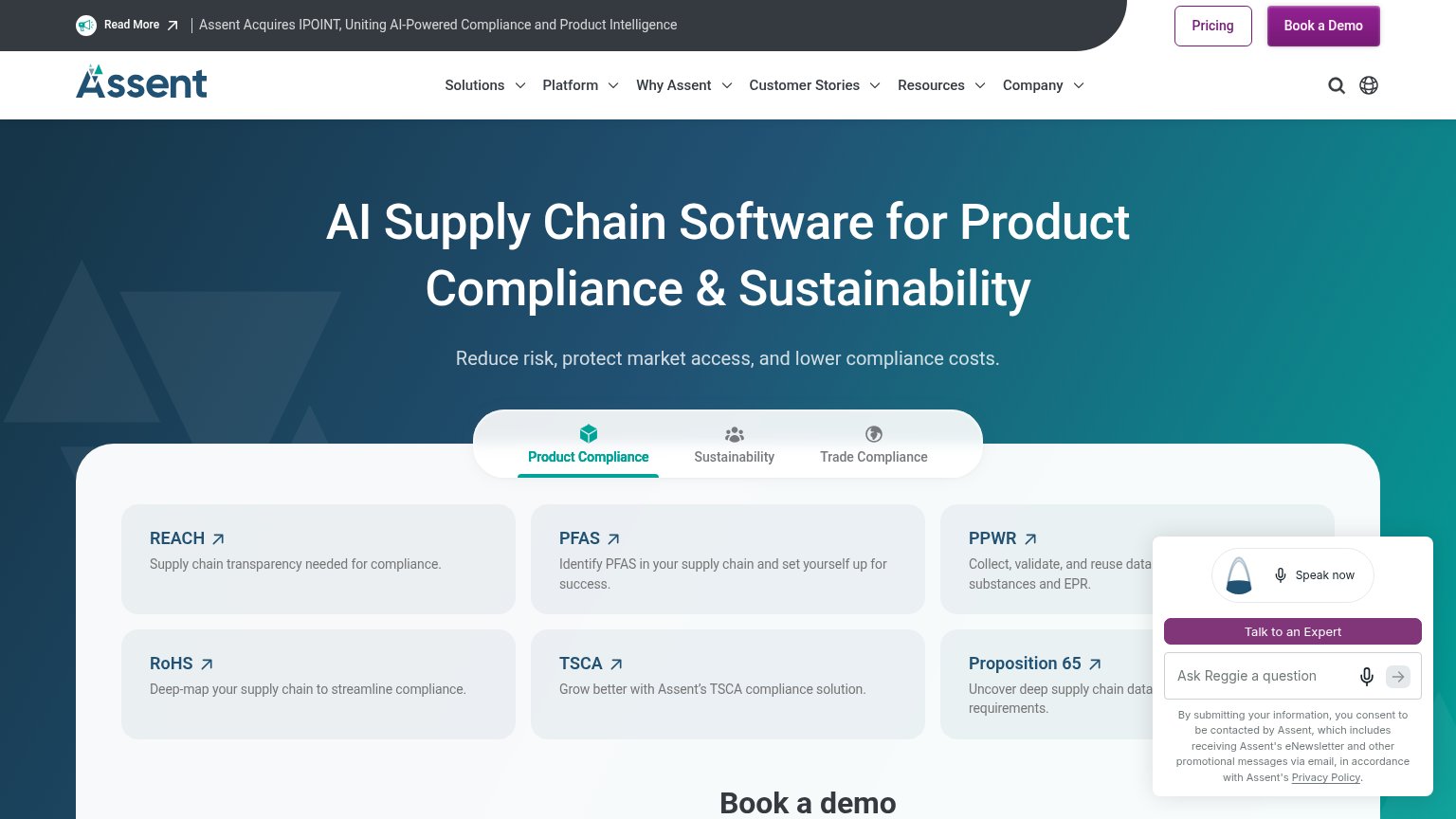
| Trust read | |
|---|---|
| Valent | No visible trust signal identified. |
| No visible trust signal identified. | |
| "Investor Relations" nav link signaling a public company | |
| "we've been connecting the dots between food and data for over 40 years" longevity claim in hero copy | |
| "Assent Acquires IPOINT, Uniting AI-Powered Compliance and Product Intelligence" announcement banner |
CTA
73FairCopy, size, verb, cost-feel — does the primary CTA earn the click?
Problems
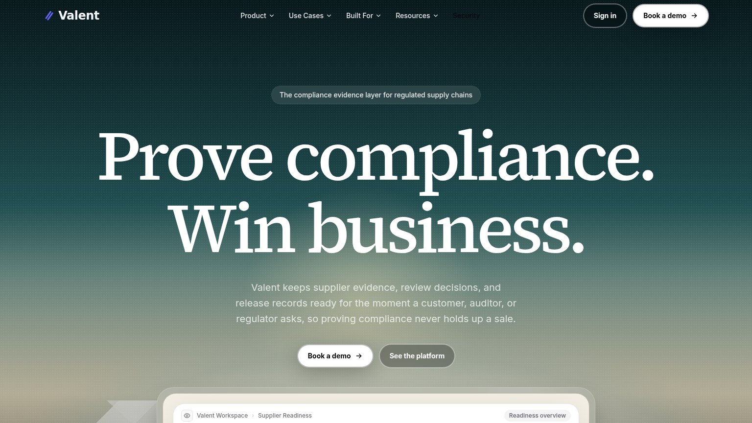
- 'Book' feels like committing time
- demo-gated; no self-serve path
- hero button small vs. giant headline
Mobile web
79FairThe phone experience as a first-class citizen.
 123
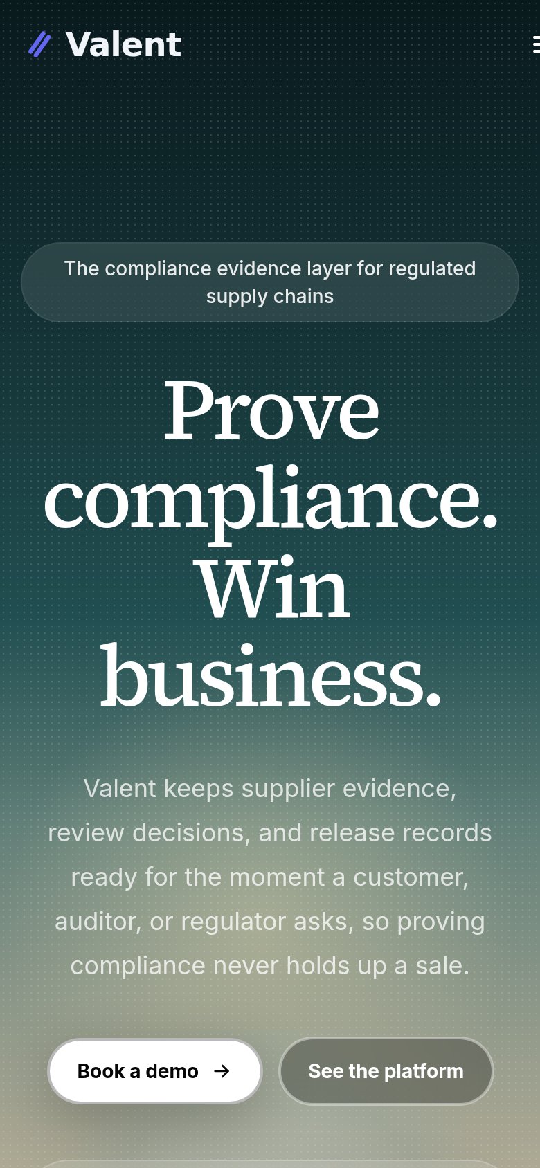
123- Hero headline — Desktop-scale serif wraps into four huge lines, eating half the fold and pushing the CTAs to the viewport's edge.
- Side-by-side CTA pair — "Book a demo" is squeezed to half-width beside "See the platform" instead of a full-bleed primary button.
- Eyebrow badge pill — The tagline pill wraps to two lines and reads like a button, adding bulk before the headline.
Information hierarchy
80StrongDoes the design help or inhibit what the page is trying to say?
123- Security nav link — Dark red text on the dark background is nearly illegible — reads as a rendering bug and erodes trust on a compliance product.
- See the platform button — Styled at almost the same size and weight directly beside the primary CTA, splitting the click instead of subordinating to it.
- Product screenshot strip — Only a header sliver crests the fold, too little to communicate anything — it teases without conveying the product.
Value props
82StrongTitle, subtitle, hero — do they sell the product's true value?
Valent’s headline sells
Prove compliance. Win business.
Valent keeps supplier evidence, review decisions, and release records ready for the moment a customer, auditor, or regulator asks, so proving compliance never holds up a sale.
Working
- Outcome-led headline, not features
- Subhead names buyers, auditors, regulators
- "Never holds up a sale" hits real pain
Could improve
- No numbers or quantified outcome
- No proof points or logos in fold
- Product preview cut off below fold
Competitors
closest by platform, customer profile, and value propGraded against Lazyweb’s growth rubrics.