Complete both scorecards to calculate your growth score.
—Overall growth scoreupdated
Funnel
Graded against Lazyweb’s growth rubrics.
 Lazyweb
Complete both scorecards to calculate your growth score.
Graded against Lazyweb’s growth rubrics.
Your landing page’s weakest score is Information hierarchy.
How ReciPal ranks
category scores
Does the design help or inhibit what the page is trying to say?
 1234
1234Proof that the product is real, competent, and safe to try.
| Trust read | |
|---|---|
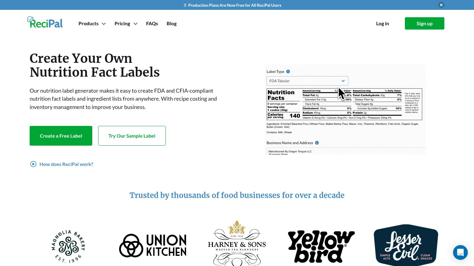
| ReciPal | Customer logo strip (Magnolia Bakery, Union Kitchen, Harney & Sons, Yellow Bird, LesserEvil) under "Trusted by thousands |
| No visible trust signal identified. | |
| "SOC 2 Compliant" AICPA SOC badge placed directly below the Get a Free Label CTA | |
| No visible trust signal identified. | |
| "we've been connecting the dots between food and data for over 40 years" longevity claim in hero copy |
Graded against Lazyweb’s growth rubrics.
SEO / AEO · recipal.com
See your search and AI visibility, agent readiness score, and prioritized fixes with Lazyweb Pro.
Try Pro FreeFree Lazyweb account
Save this exact search or report and continue here. Free—no credit card.
No password. We’ll email a secure link.
Lazyweb MCP
Step 1 of 2 · your login
Where should we send your reports? This email becomes your login on lazyweb.com — everything your agent makes lands in your workspace.
That doesn't look like an email — check it and try again.
No password, no spam — one workspace link now, then your agent command.
Step 2 of 2 · your agent
Paste this into your agent. Claude Code, Codex, Cursor, or another MCP-capable agent opens the link and sets itself up. Data access is plan-dependent.
Generating your agent command...