Complete both scorecards to calculate your growth score.
—Overall growth scoreupdated
Funnel
Graded against Lazyweb’s growth rubrics.
 Lazyweb
Complete both scorecards to calculate your growth score.
Graded against Lazyweb’s growth rubrics.
Your landing page’s weakest score is Information hierarchy.
How Transect ranks
category scores
Does the design help or inhibit what the page is trying to say?
 1234
1234Proof that the product is real, competent, and safe to try.
| Trust read | |
|---|---|
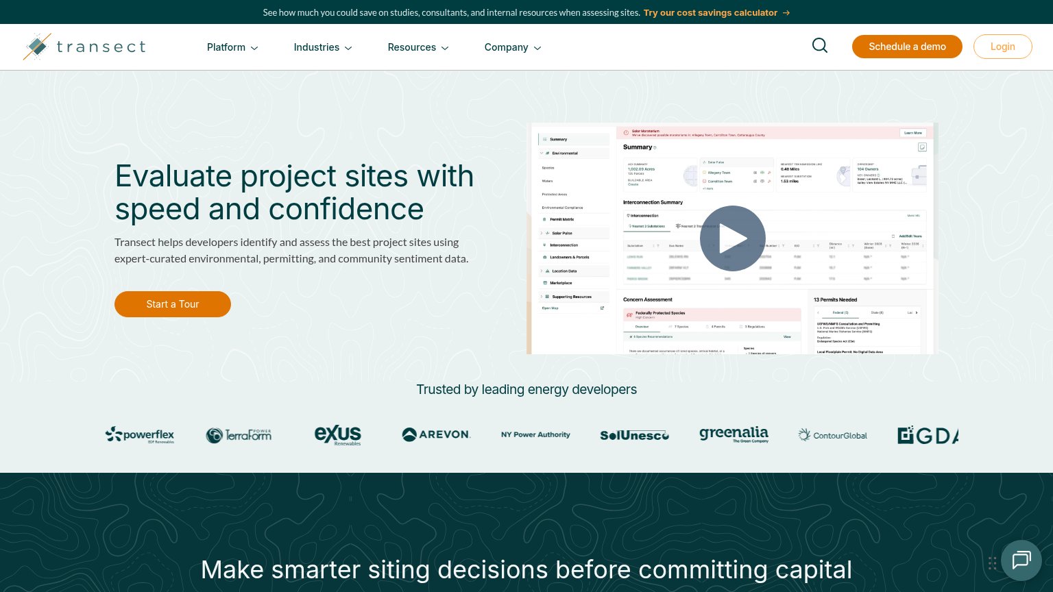
| Transect | "Trusted by leading energy developers" logo strip with Arevon, NY Power Authority, ContourGlobal, TerraForm Power |
| "We raised $1.3 million from a16z Speedrun to build the execution layer for large-load energy" | |
| "Trusted by" logo wall with Ørsted, ENGIE, Invenergy, Brookfield, Pattern, Doral, Avangrid, Scout Clean Energy | |
| "MISO COLLABORATION" navigation item | |
| Banner: "Access the webinar on demand: AI in energy development." |
Graded against Lazyweb’s growth rubrics.
SEO / AEO · transect.com
See your search and AI visibility, agent readiness score, and prioritized fixes with Lazyweb Pro.
Try Pro FreeFree Lazyweb account
Save this exact search or report and continue here. Free—no credit card.
No password. We’ll email a secure link.
Lazyweb MCP
Step 1 of 2 · your login
Where should we send your reports? This email becomes your login on lazyweb.com — everything your agent makes lands in your workspace.
That doesn't look like an email — check it and try again.
No password, no spam — one workspace link now, then your agent command.
Step 2 of 2 · your agent
Paste this into your agent. Claude Code, Codex, Cursor, or another MCP-capable agent opens the link and sets itself up. Data access is plan-dependent.
Generating your agent command...