Your landing page’s weakest score is Trust.
How Baro ranks
61Growth scoreupdated
category scores
category scoresShowHide
 Lazyweb ProAI Growth PMTurn this score into growth.Analyze your site and propose fixes across conversion, SEO, and AEOMonitor competitors’ in-product UX and A/B testsLearn from growth experiments across 10,000+ top productsTry Pro Free →
Score over time
Trust
32PoorProof that the product is real, competent, and safe to try.
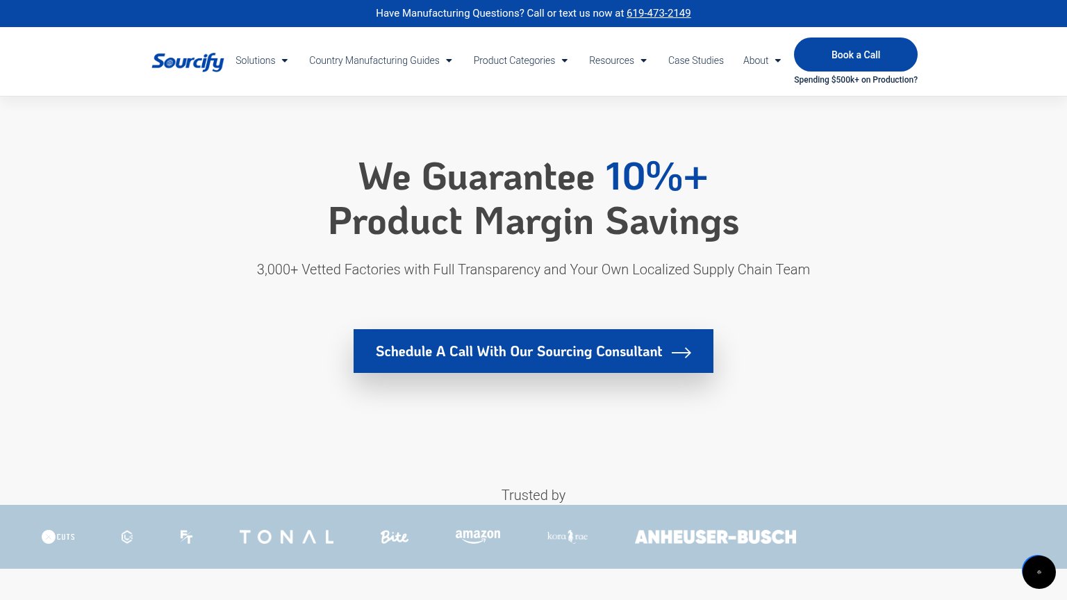
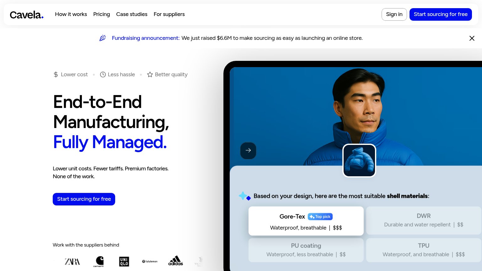
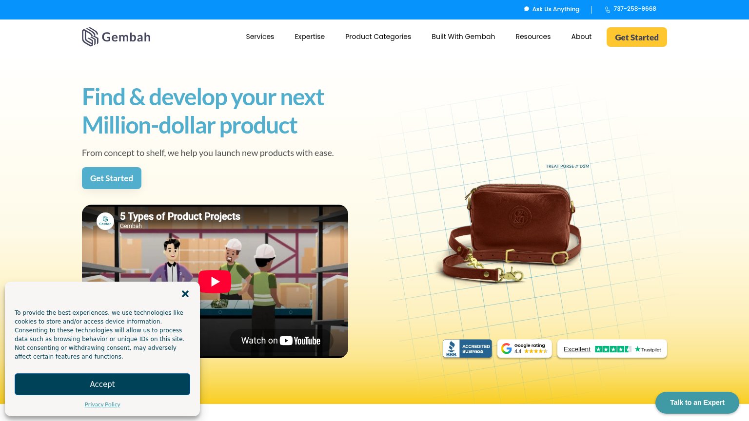
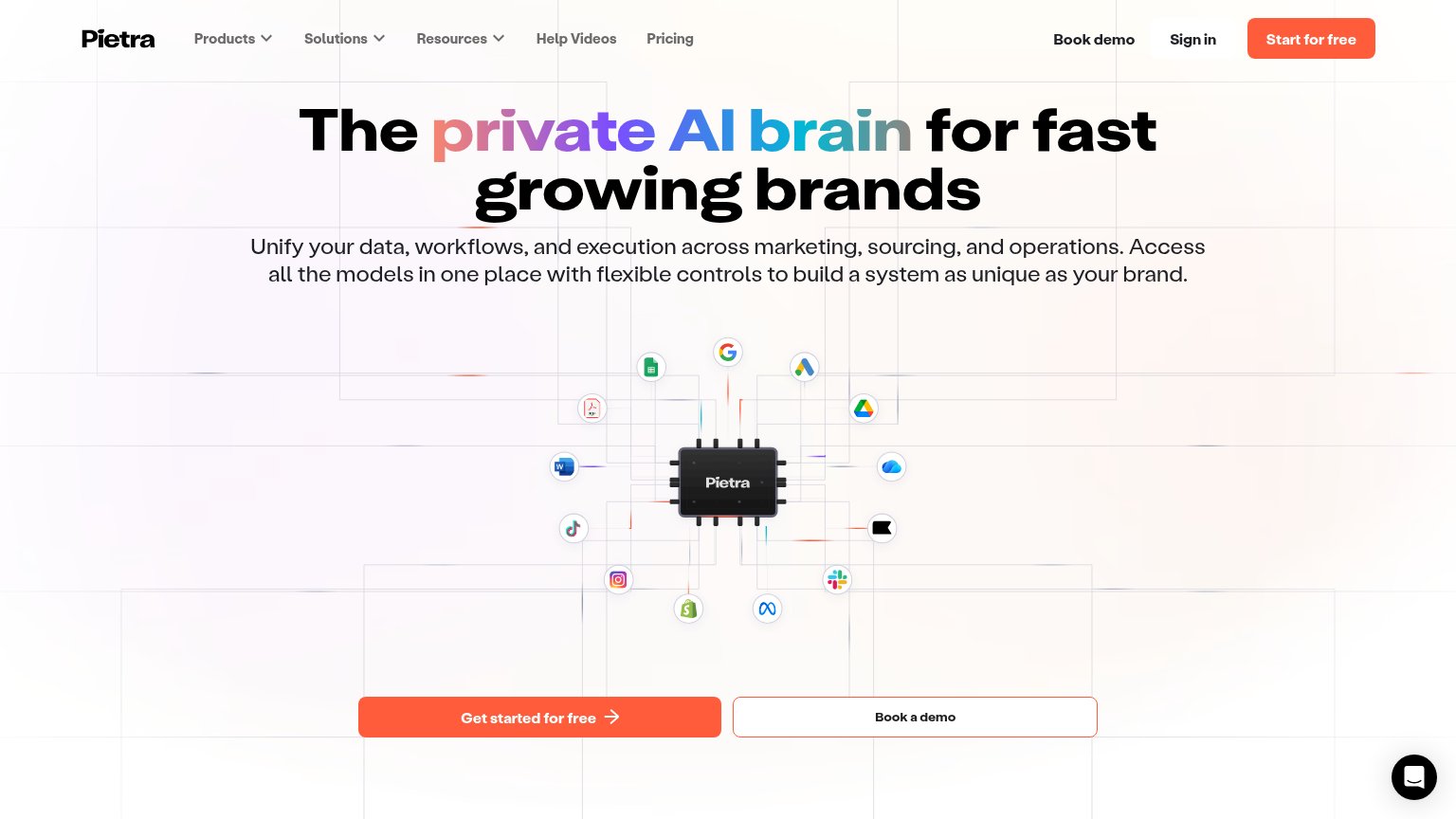
| Trust read | |
|---|---|
| Baro | No visible trust signal identified. |
| Integration icon diagram showing Shopify, Google, Slack, TikTok and Meta connections | |
| Google rating 4.4 badge alongside Trustpilot "Excellent" and BBB Accredited Business badges | |
| 'Trusted by' logo strip featuring Amazon, Anheuser-Busch, Tonal, and Bite | |
| "Work with the suppliers behind" logo strip (ZARA, Carhartt, UNIQLO, lululemon, adidas) |
Value props
44PoorTitle, subtitle, hero — do they sell the product's true value?
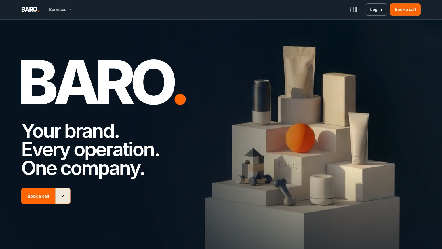
Baro’s headline vague
BARO.
Your brand. Every operation. One company.
Working
- Punchy consolidation angle: one company
- Packaging imagery hints at CPG focus
- Consistent brand confidence in the fold
Could improve
- 'Every operation' names no actual service
- No numbers, clients, or proof points
- Image decorates; doesn't show Baro working
CTA
68FairCopy, size, verb, cost-feel — does the primary CTA earn the click?
Problems
- call feels costly and committal
- no value promised for the click
- no 'free' despite free call
- no low-friction alternative CTA
Mobile web
80StrongThe phone experience as a first-class citizen.
 123
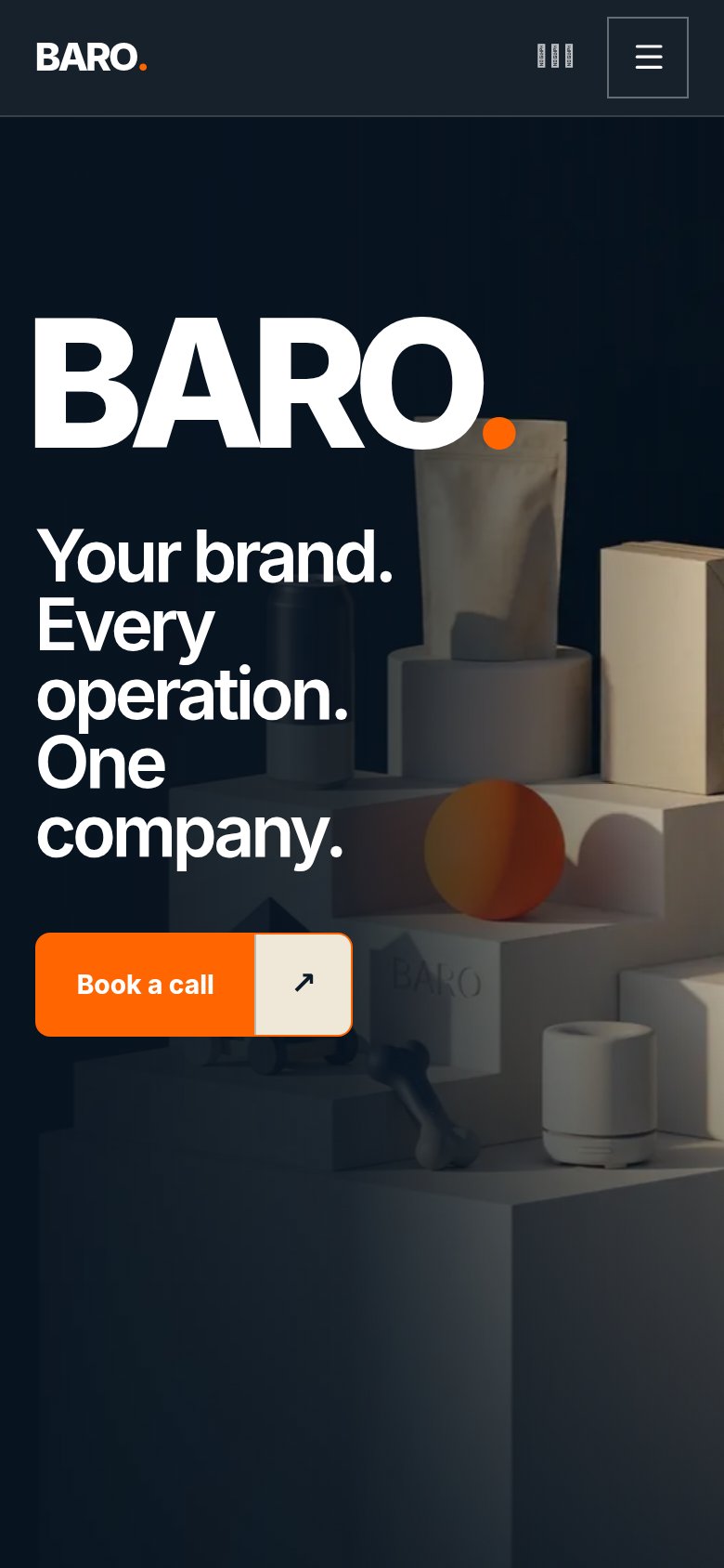
123- Book a call button — Spans only about half the column and the arrow segment splits the tap target; should be near-full-bleed.
- Hero headline — Wraps into five lines with 'operation.' nearly touching the edge, pushing the CTA to the bottom of the fold.
- Header badge icon — Garbled, unreadable vertical-text glyph beside the hamburger adds noise with no function.
Information hierarchy
82StrongDoes the design help or inhibit what the page is trying to say?
123- Giant BARO wordmark — Duplicates the nav logo at hero scale and outranks the value-prop headline, delaying the message.
- Barcode nav icon — Unlabeled, ambiguous element in the nav that draws attention without communicating anything.
- Split Book-a-call button — The detached arrow segment makes the primary CTA read as two separate controls.
Competitors
closest by platform, customer profile, and value propGraded against Lazyweb’s growth rubrics.