Lazyweb
CodosSR007 landing page report.
← Back to the SR007 rankings

Your landing page’s weakest score is Value props.

Fix Value props
Lazyweb ProAI Growth PMTurn this score into growth.Analyze your site and propose fixes across conversion, SEO, and AEOMonitor competitors’ in-product UX and A/B testsLearn from growth experiments across 10,000+ top productsTry Pro Free

Score over time

807060504030Celonis 58 on Jul 28 (Live)Skan AI 67 on Feb 4 (Wayback)Skan AI 66 on Mar 17 (Wayback)Skan AI 68 on Apr 4 (Wayback)Skan AI 73 on Jul 28 (Live)Soroco 37 on Apr 18 (Wayback)Soroco 59 on Jul 20 (Wayback)Soroco 65 on Jul 28 (Live)Distyl AI 47 on Feb 16 (Wayback)Distyl AI 47 on Mar 16 (Wayback)Distyl AI 48 on Apr 17 (Wayback)Distyl AI 60 on Jul 28 (Live)Codos 64 on Feb 3 (Wayback)Codos 66 on Jul 28 (Live)Feb 3Jul 28
Past reportsShow past reportsHide past reports
  1. Jul 28, 202666LiveOverall +2 · Trust +22 · Mobile web −11Viewing
  2. Feb 3, 202664First tracked report — strongest Mobile web 90, weakest Trust 32View →

Value props

47Poor

Title, subtitle, hero — do they sell the product's true value?

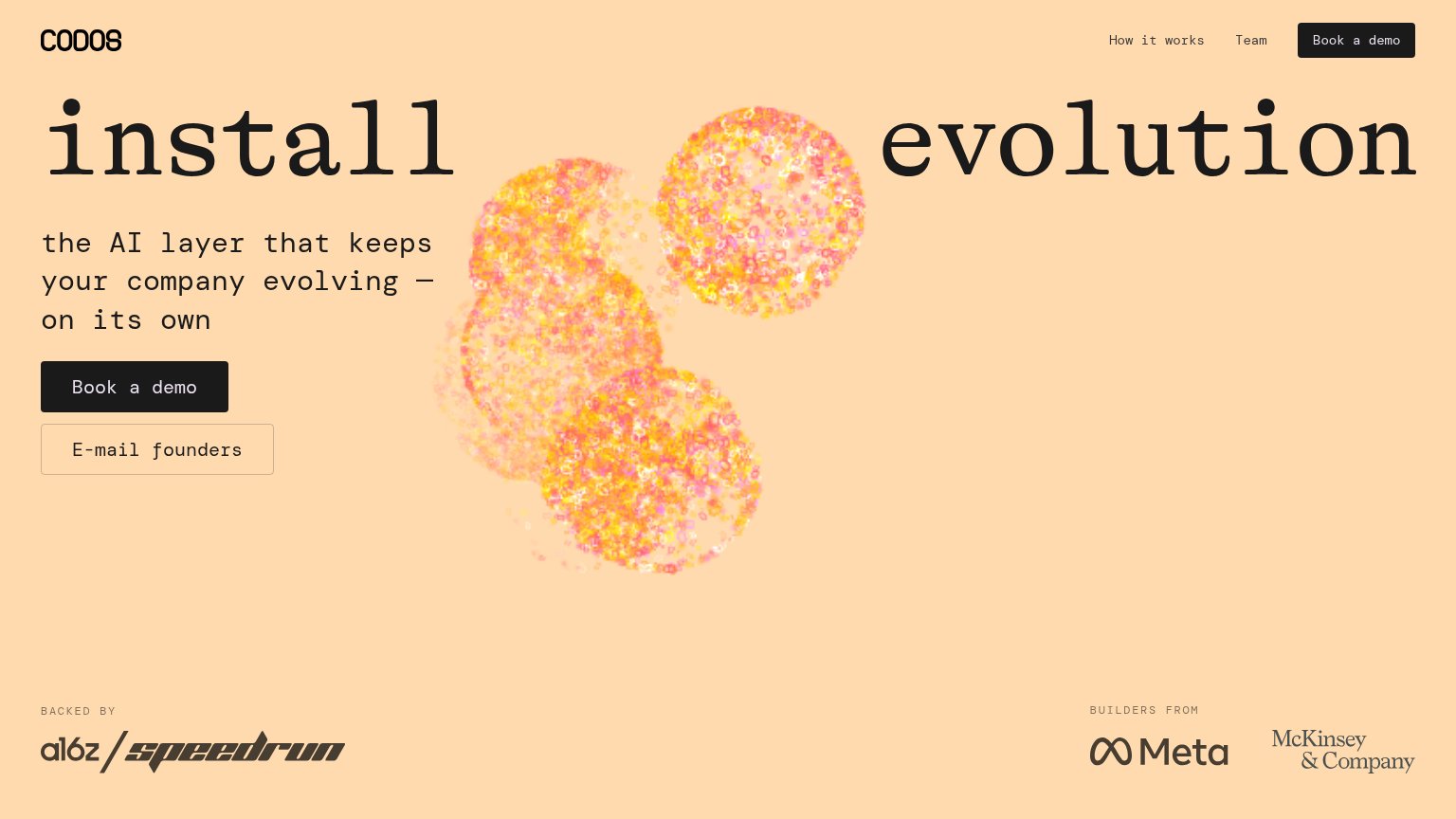
Codos’s headline vagueinstall evolutionthe AI layer that keeps your company evolving — on its own

Working

  • Memorable two-word hook
  • "on its own" hints at autonomy
  • Strong backer logos add credibility

Could improve

  • "AI layer" is an unparseable abstraction
  • Zero numbers or named outcomes
  • Hero art decorates, demonstrates nothing

Trust

54Fair

Proof that the product is real, competent, and safe to try.
Codos
Skan AI
Trust read
Codos"BACKED BY a16z / speedrun" investor logo strip
Celonis"Increase in invoices processed through AI-powered automation 66%" stat card
Skan AI"Trusted by Global Leaders" stat band: "4 in 5 Top US Banks" through "1 in 4 Fortune 50"
SorocoNo visible trust signal identified.
Distyl AINo visible trust signal identified.

CTA

68Fair

Copy, size, verb, cost-feel — does the primary CTA earn the click?

Codos
Skan AI

Problems

  • 'Book' click feels costly/committal
  • secondary CTA rivals primary footprint
  • button small vs. oversized headline
  • no header echo of 'install evolution'

Mobile web

79Fair

The phone experience as a first-class citizen.
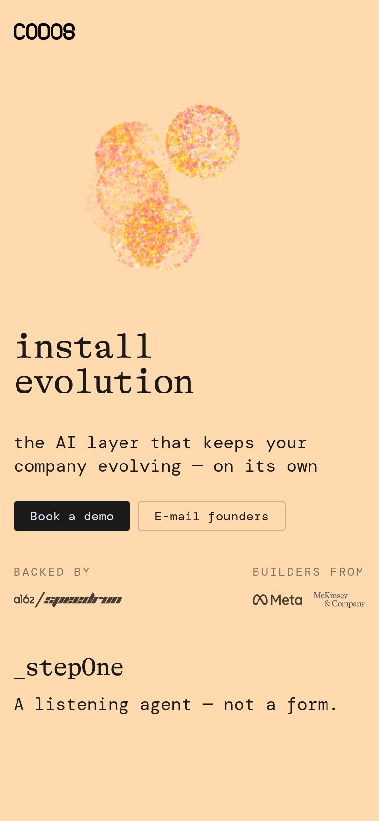
Mobile web annotations on the mobile capture123
  1. Book a demo button — Desktop-proportioned button sharing a row with "E-mail founders" instead of a full-width, thumb-friendly tap target.
  2. Hero particle illustration — Decorative graphic eats the top third of the viewport, pushing the headline and CTA well down the fold.
  3. Header nav row — Desktop links "How it works" and "Team" are dropped entirely with no hamburger menu to reach them.

Information hierarchy

80Strong

Does the design help or inhibit what the page is trying to say?

Information hierarchy annotations on the desktop capture12
  1. Split hero headline — 'install' and 'evolution' sit at opposite viewport edges, so the core message must be assembled across the full-width illustration instead of read in one glance.
  2. E-mail founders button — A second boxed CTA stacked directly under 'Book a demo' offers a lower-commitment escape hatch right in the primary scan path.

Competitors

closest by platform, customer profile, and value prop

Graded against Lazyweb’s growth rubrics.