Your landing page’s weakest score is Trust.
How Flip Labs ranks
- 1.
Flip Labs76
- 2.
Albert72
- 3.
Plum69
- 4.
Bright Money38
76Growth scoreupdated
category scores
category scoresShowHide
 Lazyweb ProAI Growth PMTurn this score into growth.Analyze your site and propose fixes across conversion, SEO, and AEOMonitor competitors’ in-product UX and A/B testsLearn from growth experiments across 10,000+ top productsTry Pro Free →
Score over time
Trust
58FairProof that the product is real, competent, and safe to try.
| Trust read | |
|---|---|
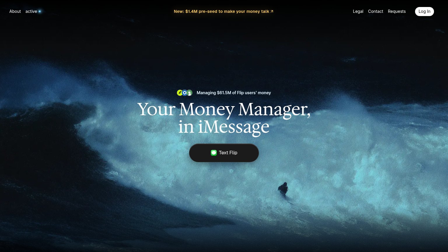
| Flip Labs | Managing $61.5M of Flip users' money |
| No visible trust signal identified. | |
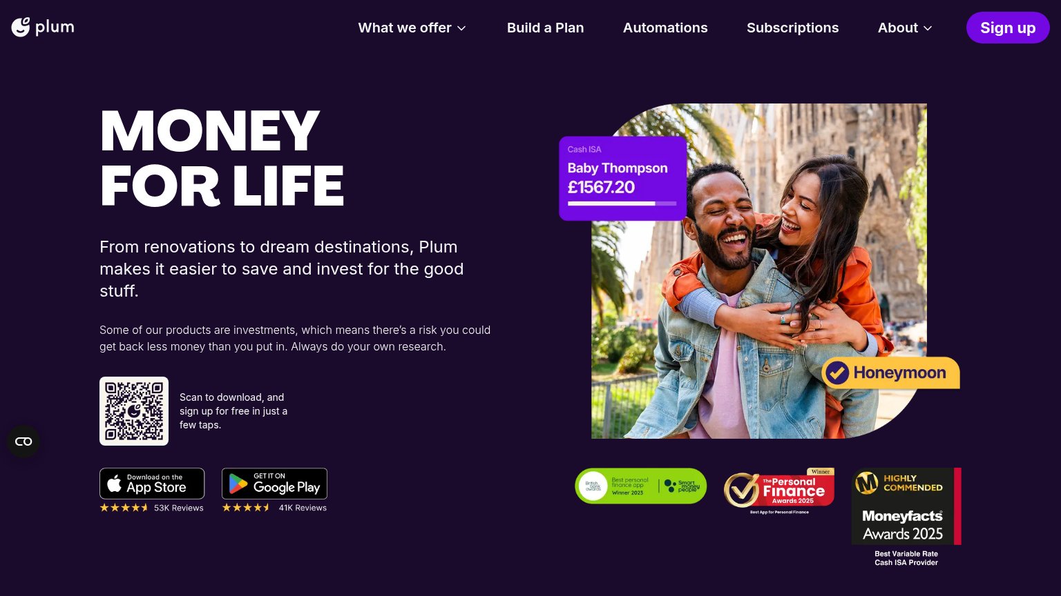
| App Store badge with 4.5-star rating and "53K Reviews" | |
| No visible trust signal identified. |
Value props
74FairTitle, subtitle, hero — do they sell the product's true value?
Flip Labs’s headline sells
Your Money Manager, in iMessage
Managing $61.5M of Flip users' money
Working
- 'in iMessage' is a concrete differentiator
- $61.5M managed is credible proof
- Broker/bank icons signal real accounts
Could improve
- No outcome — what does the manager do?
- Surfer hero decorates, doesn't demo
- 'Money Manager' stays a category label
Information hierarchy
81StrongDoes the design help or inhibit what the page is trying to say?
1234- Yellow funding banner — Brightest element on the fold; it out-contrasts the Text Flip CTA and routes first attention to a press link.
- Text Flip button — Dark charcoal pill against a dark ocean scene reads as part of the backdrop instead of the one action.
- Right nav cluster — Legal, Contact, and Requests sit at equal weight beside Log In, adding four exits before the CTA.
- 'active' nav item — Cryptic lowercase label with a dot communicates nothing and spends scan attention in the prime top-left slot.
CTA
84StrongCopy, size, verb, cost-feel — does the primary CTA earn the click?
Problems
- no 'free' despite frictionless offer
- no payoff hint after the text
Mobile web
85StrongThe phone experience as a first-class citizen.
 12
12- Pre-seed announcement banner — Wraps to two cramped lines and its arrow icon floats detached from the text, making the header look broken.
- Text Flip button — Sits at roughly 60% width; a near-full-bleed button would be a larger, easier thumb target.
Competitors
closest by platform, customer profile, and value propGraded against Lazyweb’s growth rubrics.