Your landing page’s weakest score is Trust.
How Kosha ranks
70Growth scoreupdated
category scores
category scoresShowHide
 Lazyweb ProAI Growth PMTurn this score into growth.Analyze your site and propose fixes across conversion, SEO, and AEOMonitor competitors’ in-product UX and A/B testsLearn from growth experiments across 10,000+ top productsTry Pro Free →
Score over time
Trust
42PoorProof that the product is real, competent, and safe to try.
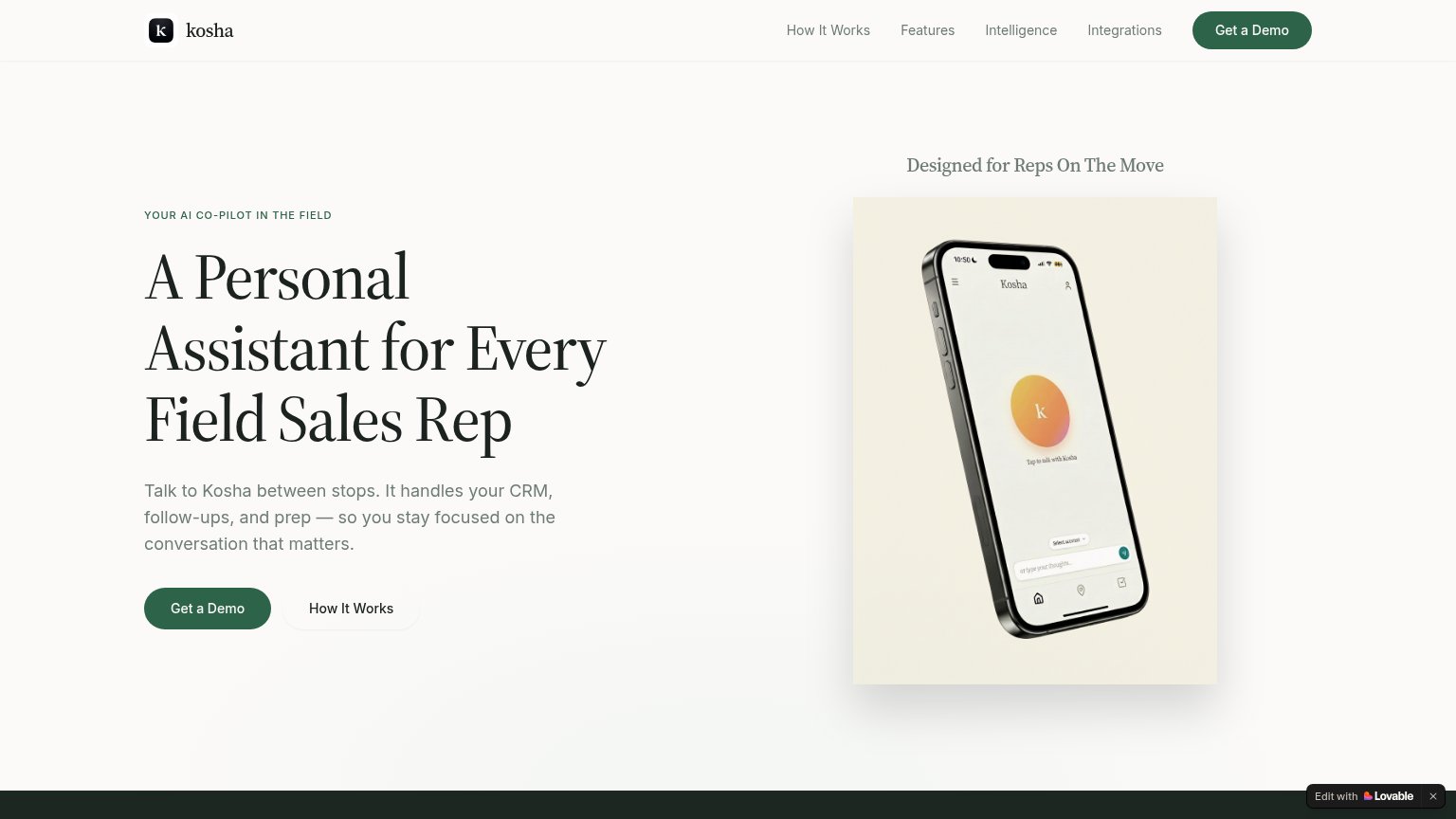
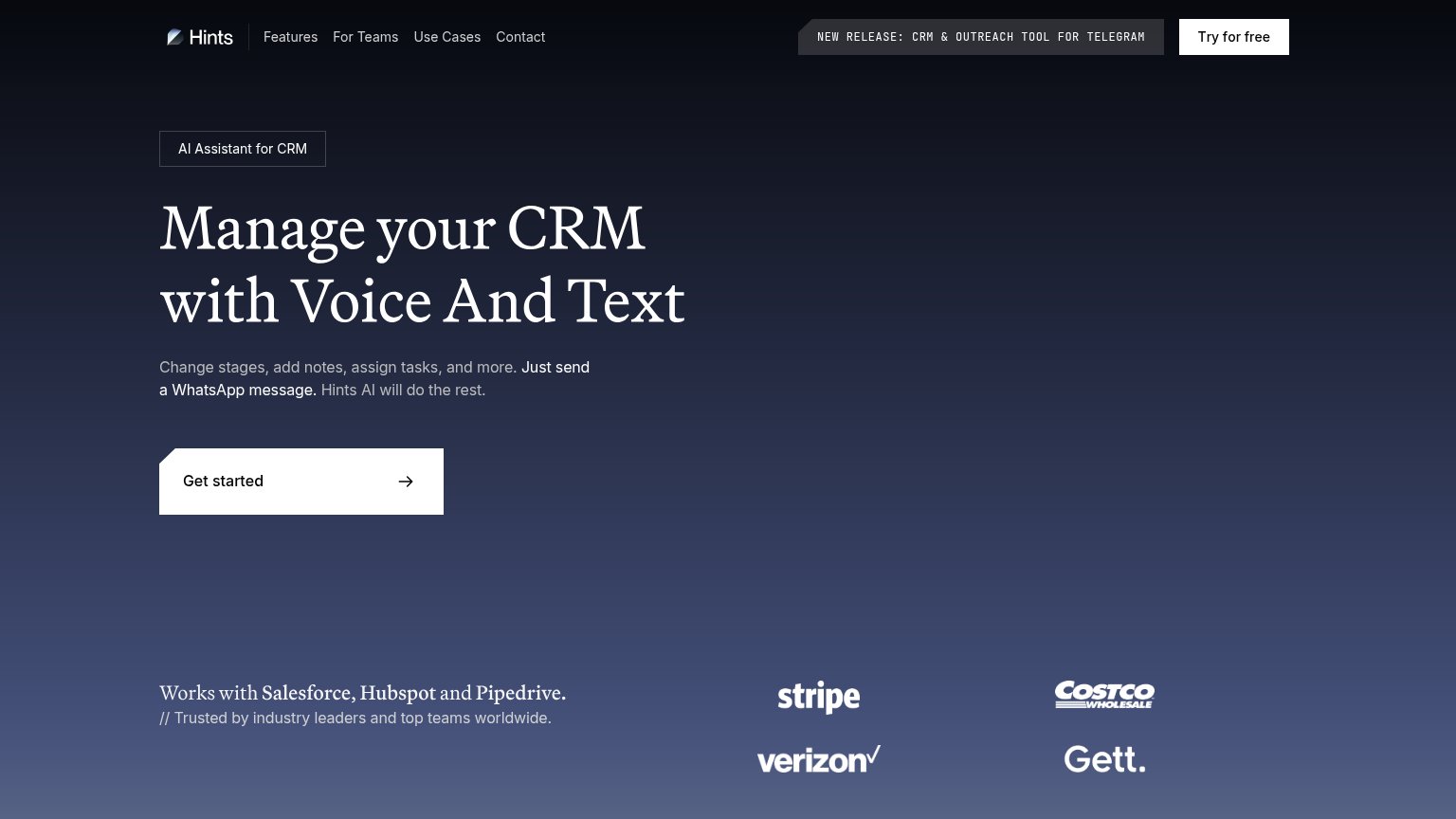
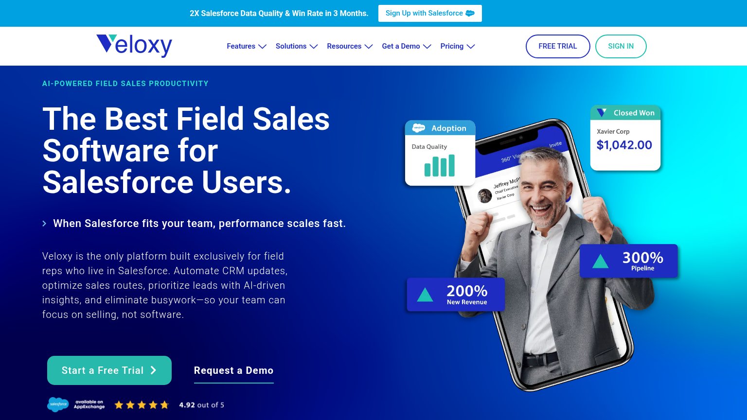
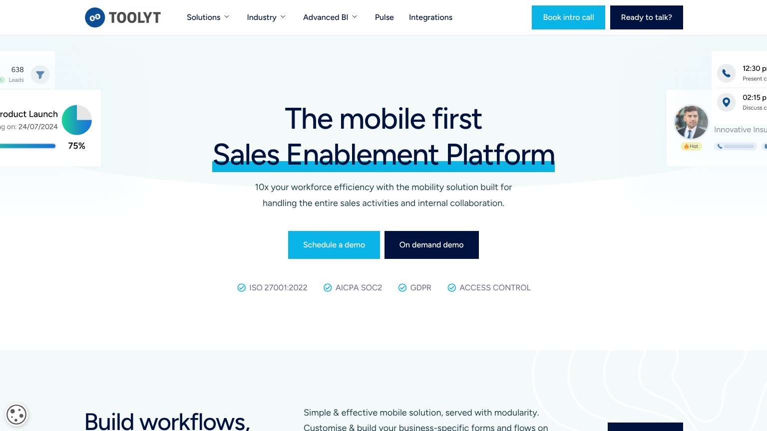
| Trust read | |
|---|---|
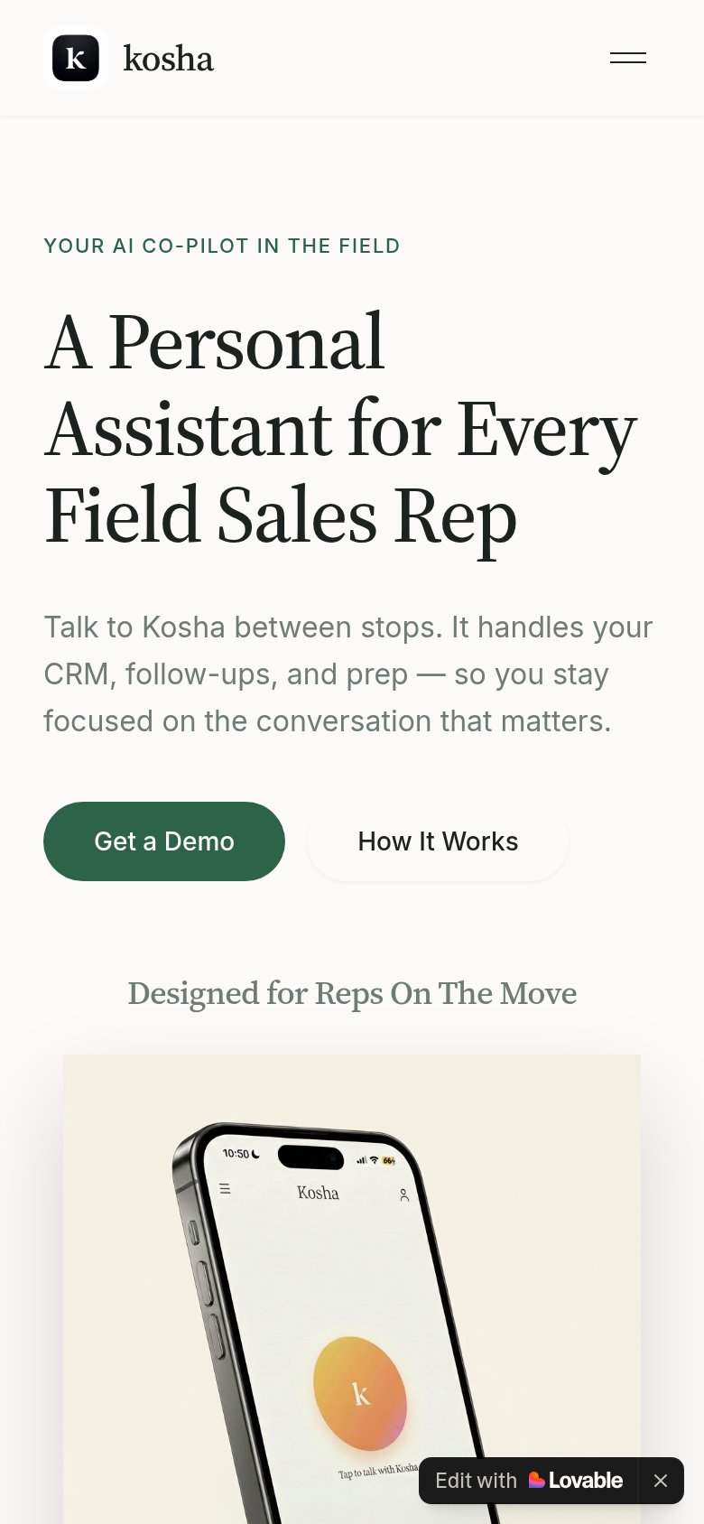
| Kosha | Phone mockup of the Kosha app showing "Tap to talk with Kosha" |
| Salesforce AppExchange rating "4.92 out of 5" with five stars below the CTA | |
| No visible trust signal identified. | |
| Customer logo wall (Stripe, Verizon, Costco Wholesale, Gett) under "Trusted by industry leaders and top teams worldwide. | |
| ISO 27001:2022 / AICPA SOC2 / GDPR / ACCESS CONTROL badge row beneath the CTAs |
CTA
72FairCopy, size, verb, cost-feel — does the primary CTA earn the click?
Problems
- demo implies sales call, not value
- no self-serve or free path shown
- no header-language echo
Value props
73FairTitle, subtitle, hero — do they sell the product's true value?
Kosha’s headline sells
A Personal Assistant for Every Field Sales Rep
Talk to Kosha between stops. It handles your CRM, follow-ups, and prep — so you stay focused on the conversation that matters.
Working
- Names the exact user: field sales reps
- Subhead lists real tasks: CRM, follow-ups, prep
- "Between stops" nails the usage moment
Could improve
- No numbers or quantified outcome anywhere
- Hero orb hints at voice but shows no work done
- Zero proof points or logos in the fold
Information hierarchy
82StrongDoes the design help or inhibit what the page is trying to say?
123- Edit with Lovable badge — Third-party builder badge sits in the fold, signaling a template site and adding an outbound exit right at decision time.
- Phone mockup screen — The in-device UI is illegible at this size — a gradient blob and micro-text tell the visitor nothing about what Kosha actually does.
- How It Works button — Duplicates the nav's 'How It Works' link, giving the secondary path two entrances against one primary CTA.
Mobile web
82StrongThe phone experience as a first-class citizen.
 12
12- Edit with Lovable badge — Dead sticky overlay with zero conversion value that cheapens the brand and covers page content.
- Get a Demo button — Half-width and sharing the row with 'How It Works' instead of being a full-bleed thumb target.
Competitors
closest by platform, customer profile, and value propGraded against Lazyweb’s growth rubrics.