Your landing page’s weakest score is Trust.
How Mirai ranks
62Growth scoreupdated
category scores
category scoresShowHide
 Lazyweb ProAI Growth PMTurn this score into growth.Analyze your site and propose fixes across conversion, SEO, and AEOMonitor competitors’ in-product UX and A/B testsLearn from growth experiments across 10,000+ top productsTry Pro Free →
Score over time
Trust
34PoorProof that the product is real, competent, and safe to try.
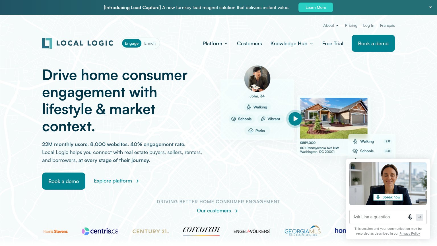
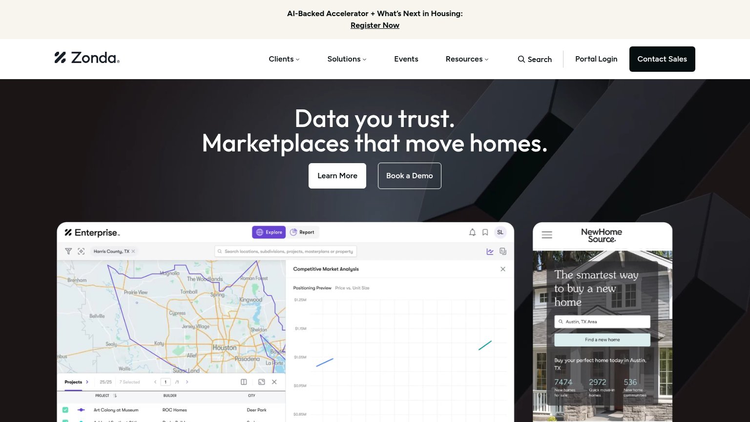
| Trust read | |
|---|---|
| Mirai | No visible trust signal identified. |
| Customer logo row (Century 21, Corcoran, Engel & Völkers, Centris.ca, Georgia MLS) under "Our customers" | |
| No visible trust signal identified. | |
| Enterprise dashboard screenshot showing a Competitive Market Analysis for Harris County, TX with project/builder listing |
Value props
50FairTitle, subtitle, hero — do they sell the product's true value?
Mirai’s headline vague
The next layer of real estate is location.
Mirai is building a new way to help people understand place before they buy, move, or invest.
Working
- Names three specific target audiences
- Subhead hints at pre-purchase decision moment
- Clean, uncluttered single message
Could improve
- Headline is a tautology about location
- No numbers, proof, or product nouns
- Hero art decorates instead of demonstrating
CTA
70FairCopy, size, verb, cost-feel — does the primary CTA earn the click?
Problems
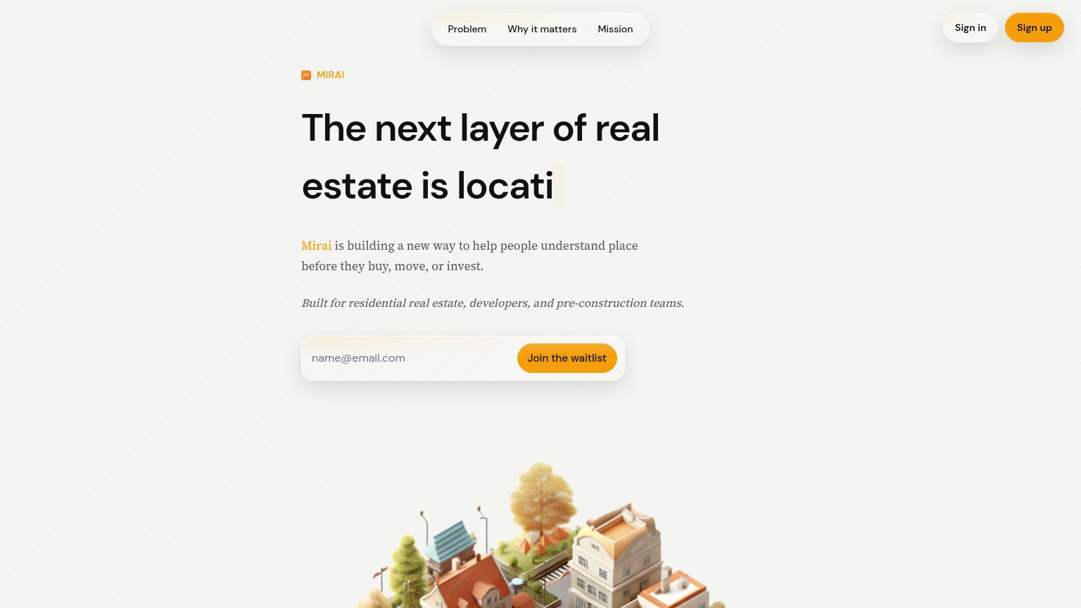
- conflicts with nav 'Sign up' button
- click promises waiting, not value
- placeholder 'name@email.com' is generic
Information hierarchy
78FairDoes the design help or inhibit what the page is trying to say?
123- Sign up button — Identical orange weight to Join the waitlist, splitting the fold's one primary action.
- Typewriter headline — Renders mid-word ('is locati'), so the core promise reads incomplete at a glance.
- Top nav pill — Three anchor links plus two auth buttons give five exits before the value prop lands.
Mobile web
79FairThe phone experience as a first-class citizen.
 123
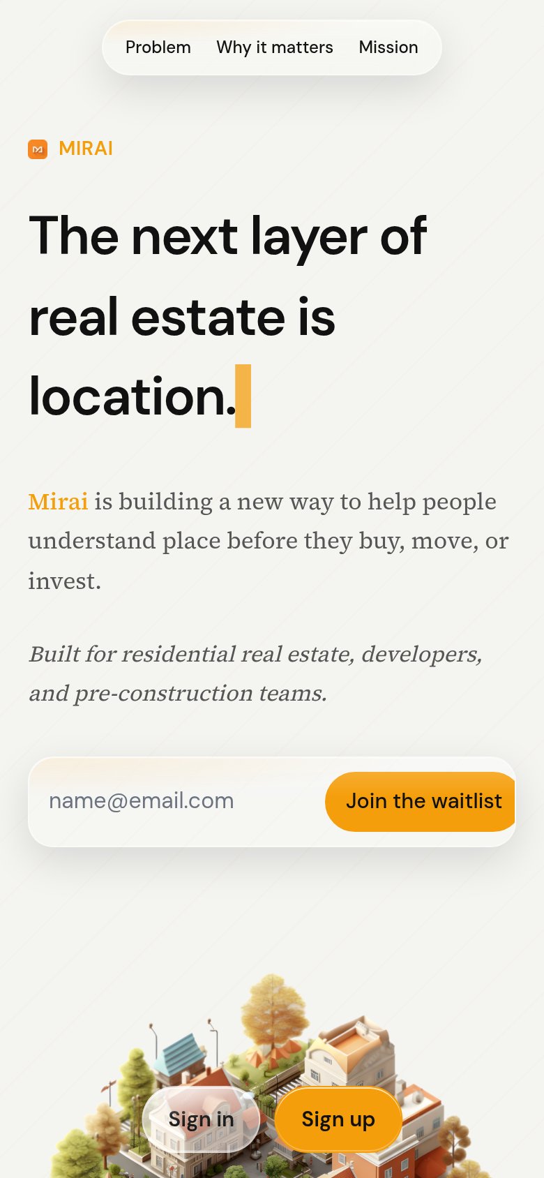
123- Sign in/Sign up buttons — Detached from the header, they float over the illustration and compete with the waitlist CTA.
- Join the waitlist button — Button eats most of the form width, leaving the email input cramped for typing.
- Top nav pill — Desktop link row kept instead of a collapsed menu, which is why the auth buttons got displaced.
Competitors
closest by platform, customer profile, and value propGraded against Lazyweb’s growth rubrics.