Your landing page’s weakest score is Trust.
How Nimble ranks
69Growth scoreupdated
category scores
category scoresShowHide
 Lazyweb ProAI Growth PMTurn this score into growth.Analyze your site and propose fixes across conversion, SEO, and AEOMonitor competitors’ in-product UX and A/B testsLearn from growth experiments across 10,000+ top productsTry Pro Free →
Score over time
Trust
38PoorProof that the product is real, competent, and safe to try.
| Trust read | |
|---|---|
| Nimble | No visible trust signal identified. |
| No visible trust signal identified. | |
| No visible trust signal identified. | |
| No visible trust signal identified. | |
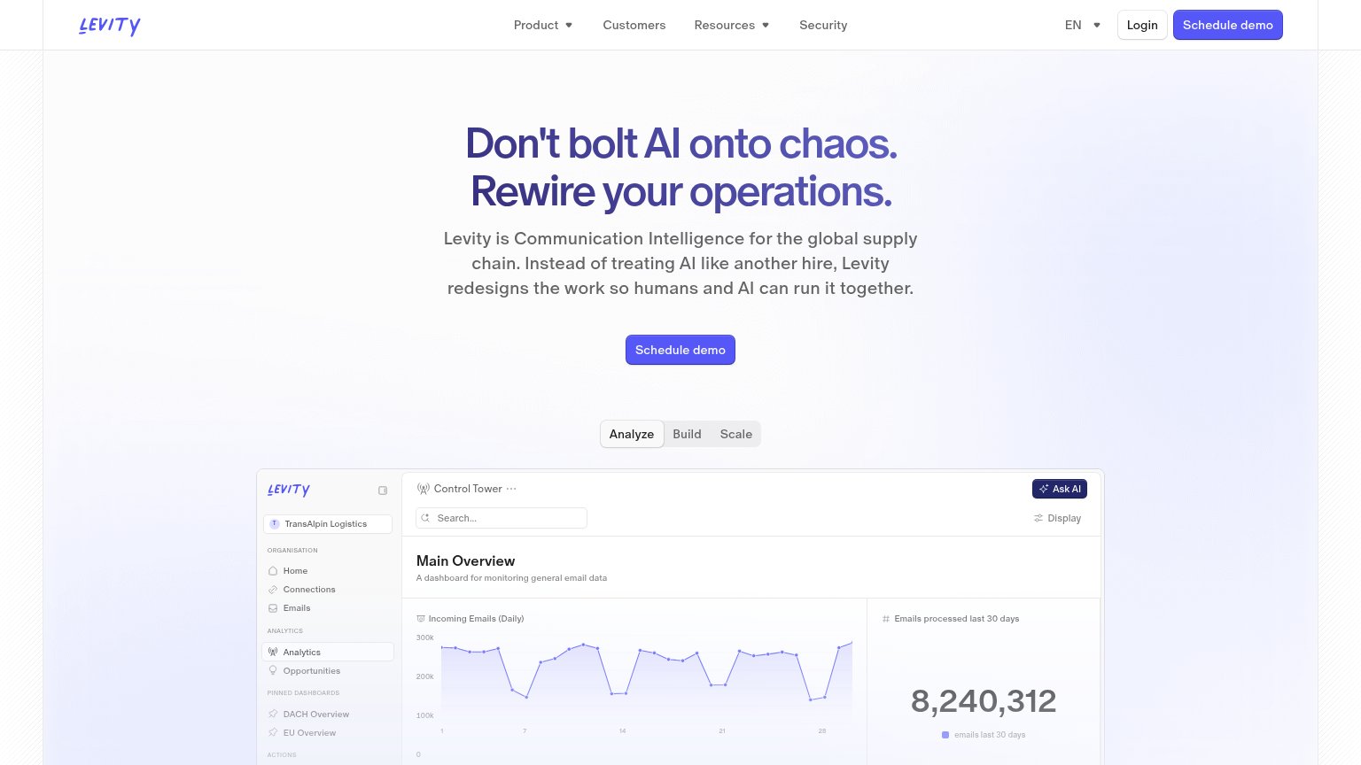
| 'Control Tower' product dashboard showing 'Incoming Emails (Daily)' chart and 'Emails processed last 30 days' panel |
CTA
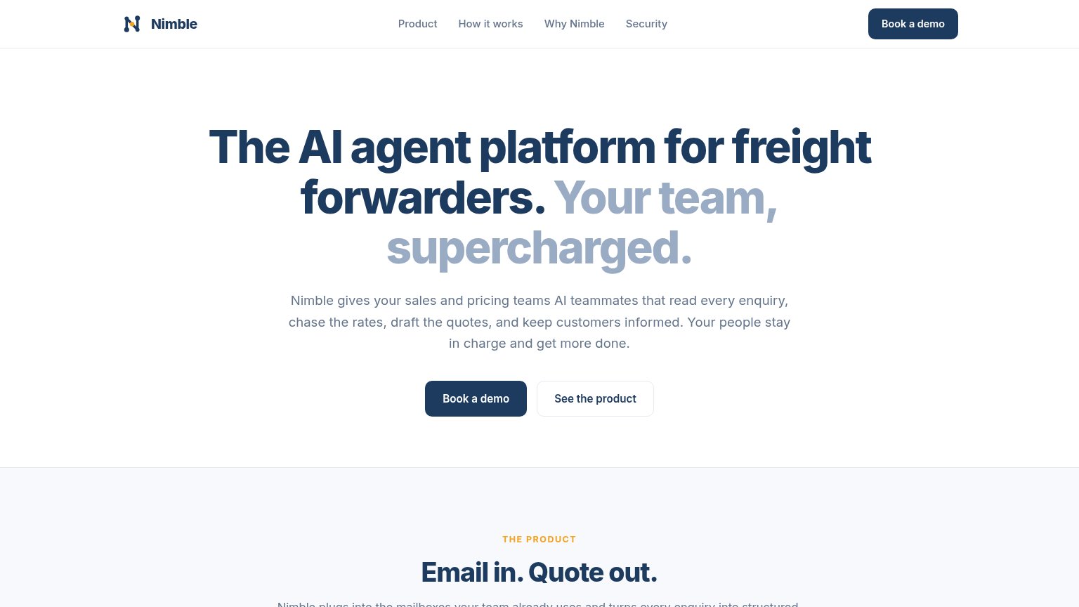
72FairCopy, size, verb, cost-feel — does the primary CTA earn the click?
Problems
- 'Book' feels like a calendar commitment
- no self-serve or product-first path
- generic label, no value promise
Value props
78FairTitle, subtitle, hero — do they sell the product's true value?
Nimble’s headline sells
The AI agent platform for freight forwarders. Your team, supercharged.
Nimble gives your sales and pricing teams AI teammates that read every enquiry, chase the rates, draft the quotes, and keep customers informed. Your people stay in charge and get more done.
Working
- Names the exact niche: freight forwarders
- Subhead lists the concrete jobs agents do
- 'People stay in charge' defuses AI fear
Could improve
- 'Nimble's team, supercharged' is generic filler
- Zero numbers anywhere in the fold
- No hero visual demonstrating the product
Mobile web
78FairThe phone experience as a first-class citizen.
 123
123- Hero headline — Desktop-scale type wraps into six lines and eats most of the fold before the CTA.
- Subhead paragraph — Six lines of dense body copy push the CTA buttons to the fold's edge.
- Side-by-side CTA row — "Book a demo" is squeezed to half width instead of a full-bleed thumb target.
Information hierarchy
80StrongDoes the design help or inhibit what the page is trying to say?
123- Pale headline phrase — 'Nimble's team, supercharged' is rendered in low-contrast light blue and visually fades, weakening half the value proposition.
- See the product button — Sits at the same size directly beside the primary CTA, splitting the click between demo and browse.
- Nav Book a demo — Repeats the hero Book a demo CTA at equal visual weight, giving one action two competing targets.
Competitors
closest by platform, customer profile, and value propGraded against Lazyweb’s growth rubrics.