Your landing page’s weakest score is Trust.
How Ontem ranks
73Growth scoreupdated
category scores
category scoresShowHide
 Lazyweb ProAI Growth PMTurn this score into growth.Analyze your site and propose fixes across conversion, SEO, and AEOMonitor competitors’ in-product UX and A/B testsLearn from growth experiments across 10,000+ top productsTry Pro Free →
Score over time
Trust
40PoorProof that the product is real, competent, and safe to try.
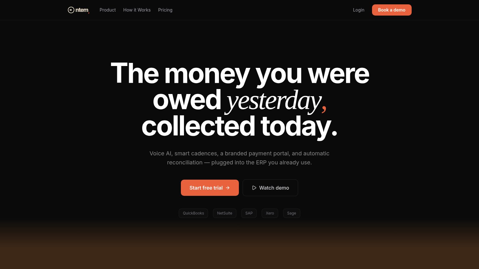
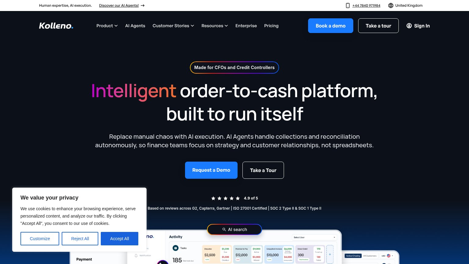
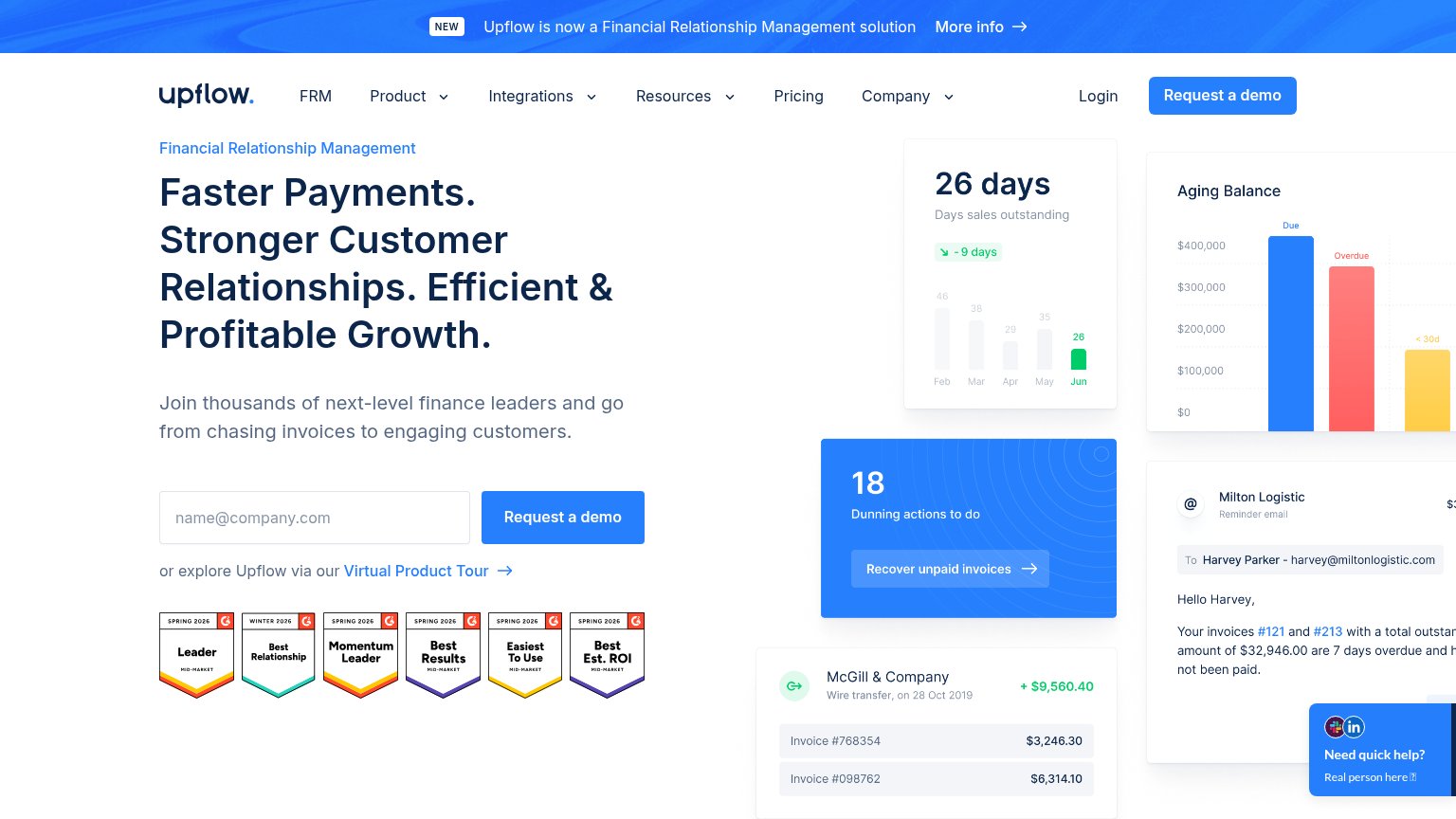
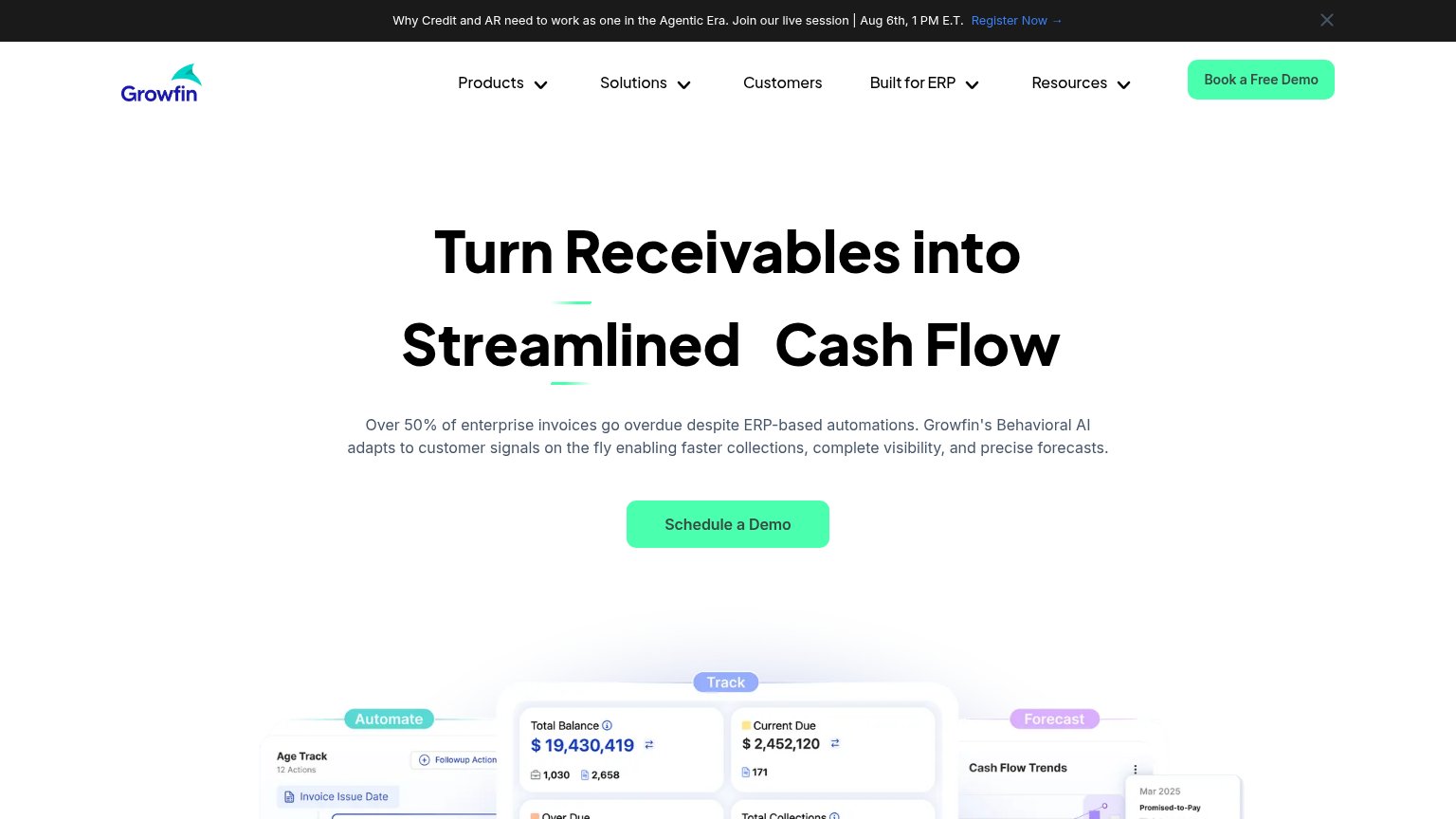
| Trust read | |
|---|---|
| Ontem | Integration badge row: QuickBooks, NetSuite, SAP, Xero, Sage |
| Row of six G2 badges: Leader, Best Relationship, Momentum Leader, Best Results, Easiest To Use, Best Est. ROI | |
| No visible trust signal identified. | |
| 4.9 of 5 — Based on reviews across G2, Capterra, Gartner | ISO 27001 Certified | SOC 2 Type II & SOC 1 Type II | |
| Product dashboard UI showing "Total Balance $19,430,419" with Track/Automate/Forecast panels | |
| No visible trust signal identified. |
Value props
78FairTitle, subtitle, hero — do they sell the product's true value?
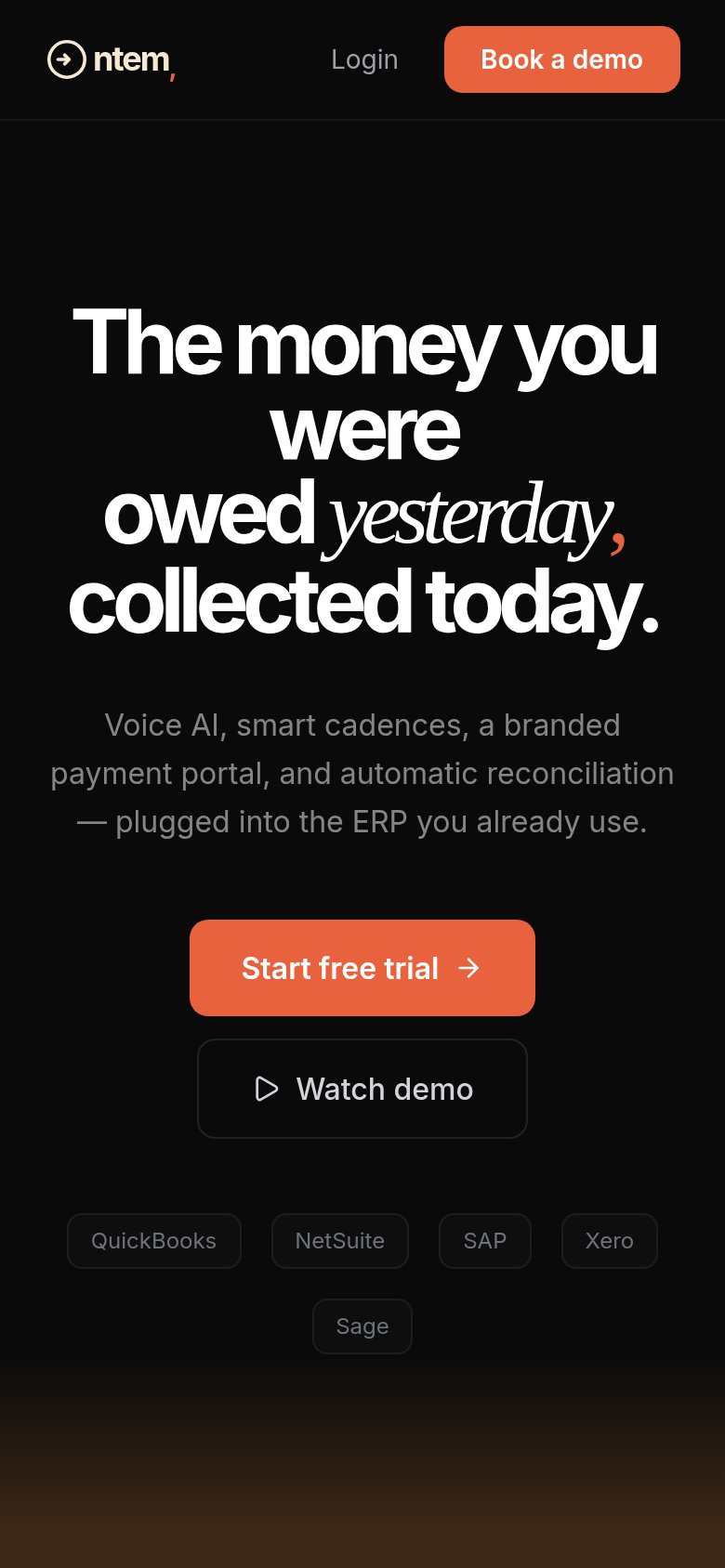
Ontem’s headline sells
The money you were owed yesterday, collected today.
Voice AI, smart cadences, a branded payment portal, and automatic reconciliation — plugged into the ERP you already use.
Working
- Outcome-led headline, not features
- Subhead names four concrete capabilities
- ERP badges ground the integration claim
Could improve
- No numbers anywhere in the fold
- No hero visual demonstrating the product
- No customer proof or social validation
Information hierarchy
81StrongDoes the design help or inhibit what the page is trying to say?
12- Book a demo button — Same orange fill and weight as "Start free trial", splitting the primary action across two competing conversion paths.
- Watch demo button — A third demo-adjacent choice beside the trial CTA; overlaps with the nav's "Book a demo" and dilutes the single next step.
Mobile web
82StrongThe phone experience as a first-class citizen.
 123
123- Start free trial button — Floats at roughly half the column width instead of full-bleed; the thumb target should own the whole row.
- Book a demo button — Header CTA pushes a different action than the hero's "Start free trial", splitting the first tap between two funnels.
- Sage chip — Orphaned alone on a second row, leaving the integration strip ragged and unfinished-looking.
CTA
85StrongCopy, size, verb, cost-feel — does the primary CTA earn the click?
Problems
- nav 'Book a demo' competes with hero
- two demo labels split intent
- no headline echo in copy
Competitors
closest by platform, customer profile, and value propGraded against Lazyweb’s growth rubrics.