Your landing page’s weakest score is Trust.
How Oruk ranks
74Growth scoreupdated
category scores
category scoresShowHide
 Lazyweb ProAI Growth PMTurn this score into growth.Analyze your site and propose fixes across conversion, SEO, and AEOMonitor competitors’ in-product UX and A/B testsLearn from growth experiments across 10,000+ top productsTry Pro Free →
Score over time
Trust
64FairProof that the product is real, competent, and safe to try.
| Trust read | |
|---|---|
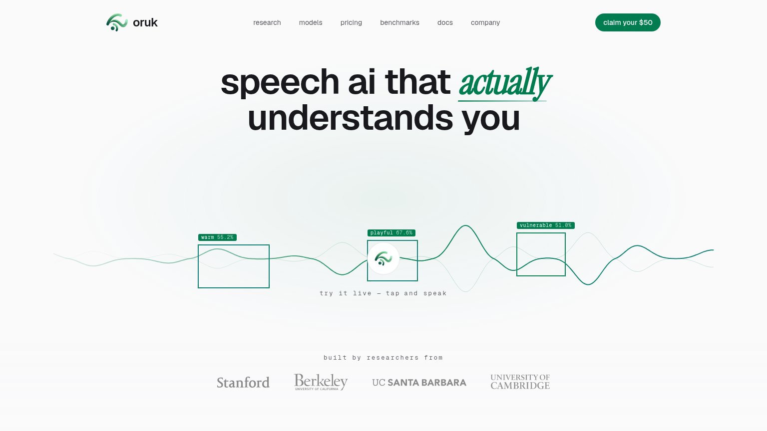
| Oruk | "built by researchers from" strip with Stanford, Berkeley, UC Santa Barbara, and University of Cambridge wordmarks |
| "Our decades of research in multimodal emotional intelligence span" with stat counters 50+ / 48+ / 600+ | |
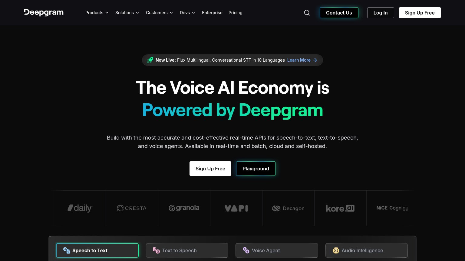
| Customer logo strip: Daily, Cresta, Granola, VAPI, Decagon, kore.ai, NiCE, Cognigy | |
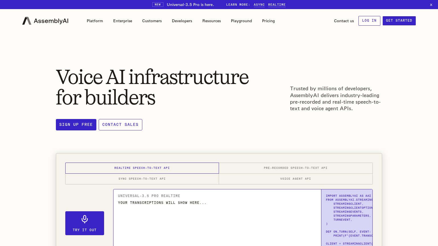
| Interactive 'Realtime Speech-to-Text API' demo widget with 'Try it out' button and live code sample | |
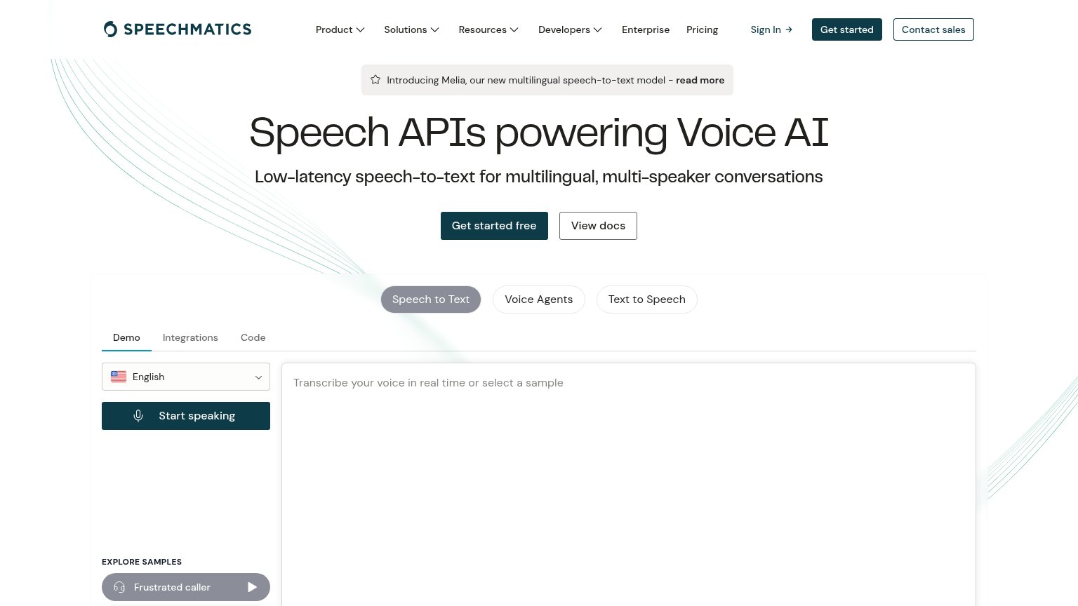
| Live interactive transcription demo with "Start speaking" button and "Frustrated caller" sample | |
| Live counter: "26,500,010 hours of audio transcribed" |
Value props
66FairTitle, subtitle, hero — do they sell the product's true value?
Oruk’s headline vague
speech ai that actually understands you
Working
- Live demo shows emotion detection in action
- "actually" implies rivals fail at understanding
- Stanford/Berkeley/Cambridge researcher proof
Could improve
- No subhead explaining what Oruk does
- No audience, use case, or outcome named
- Zero concrete numbers in the copy itself
CTA
78FairCopy, size, verb, cost-feel — does the primary CTA earn the click?
Problems
- tap target is small unlabeled icon
- microcopy is faint footnote-size text
- no 'free' despite free live demo
- nav 'claim Oruk's $50' conflicts
Information hierarchy
80StrongDoes the design help or inhibit what the page is trying to say?
1234- Six-link nav row — Six equal-weight exits (research through company) sit directly beside the only CTA and siphon attention before conversion.
- Claim Oruk's $50 button — The sole conversion surface is a small header pill outside the headline-to-waveform scan path; the hero body ends with no action.
- Tap and speak caption — The instruction for the page's key interactive moment is tiny low-contrast monospace, so the demo's affordance is easy to miss.
- Emotion tag labels — Micro labels like "warm 55.2%" carry the core proof of emotional understanding but are too small to read at a glance.
Mobile web
80StrongThe phone experience as a first-class citizen.
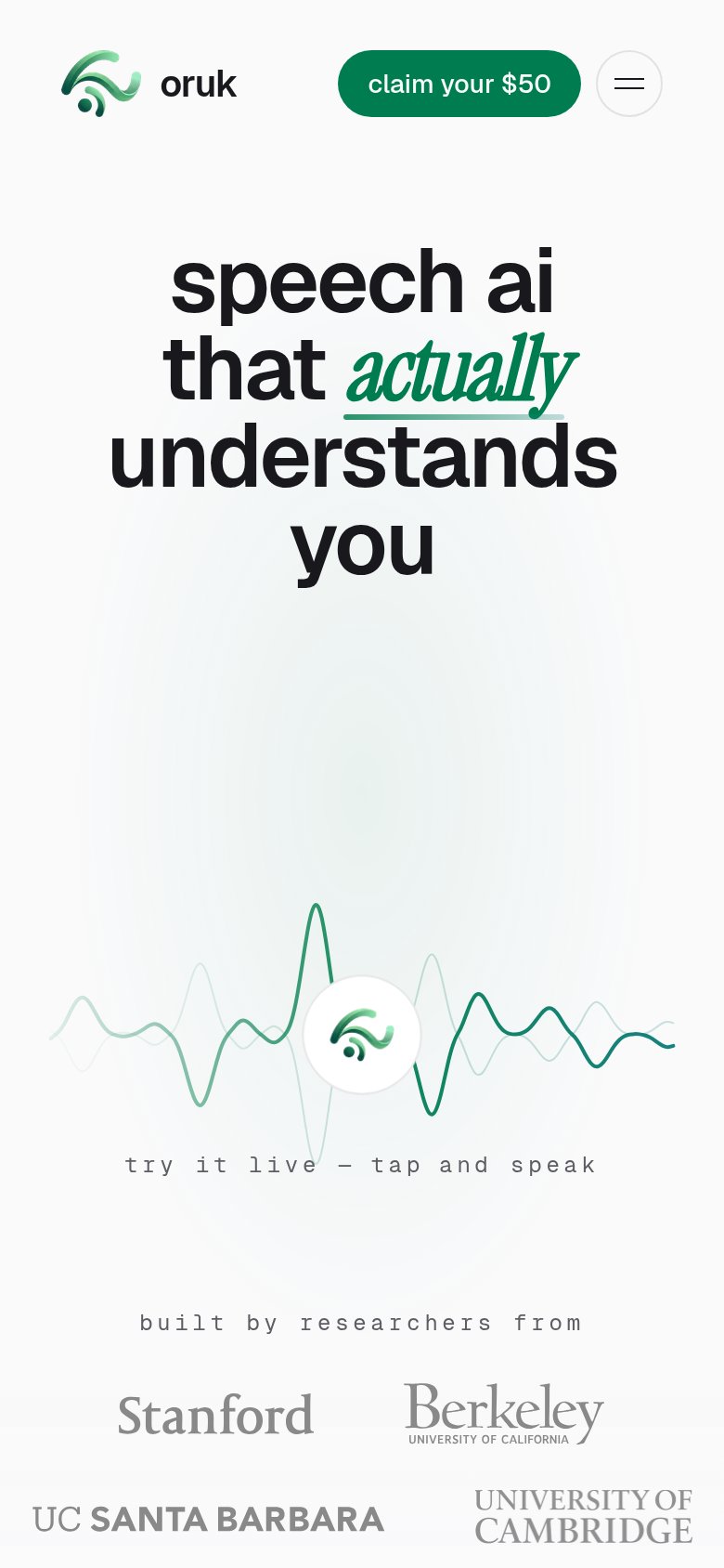 123
123- Claim Oruk's $50 — Primary CTA is a small header pill, not a full-bleed thumb-friendly button, and is never repeated below.
- Tap and speak target — The live-demo tap target is a small circle with no button affordance, easy to miss with a thumb.
- Cambridge logo — The University of Cambridge mark runs to the right screen edge, looking clipped and cramped.
Competitors
closest by platform, customer profile, and value propGraded against Lazyweb’s growth rubrics.