Your landing page’s weakest score is Trust.
How Parca ranks
70Growth scoreupdated
category scores
category scoresShowHide
 Lazyweb ProAI Growth PMTurn this score into growth.Analyze your site and propose fixes across conversion, SEO, and AEOMonitor competitors’ in-product UX and A/B testsLearn from growth experiments across 10,000+ top productsTry Pro Free →
Score over time
Trust
47PoorProof that the product is real, competent, and safe to try.
| Trust read | |
|---|---|
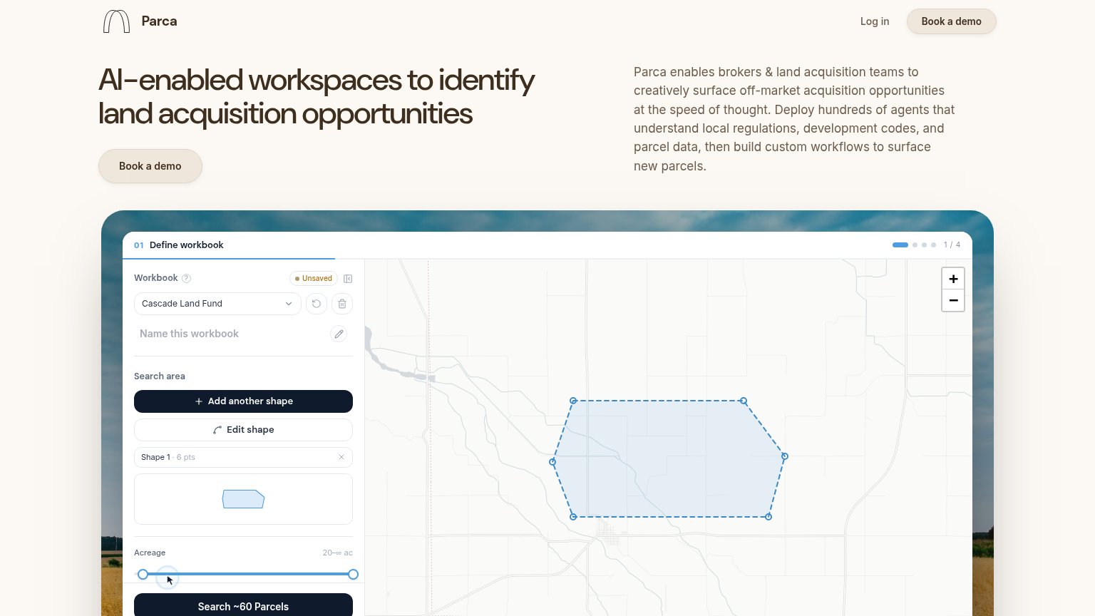
| Parca | Detailed product UI screenshot showing the workbook panel, map with drawn search polygon, and "Search ~60 Parcels" butto |
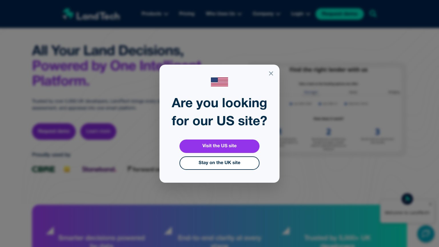
| "Proudly used by" customer logo strip including CBRE | |
| No visible trust signal identified. | |
| 3D feasibility map demo with highlighted parcels and a data chart panel (mobile) | |
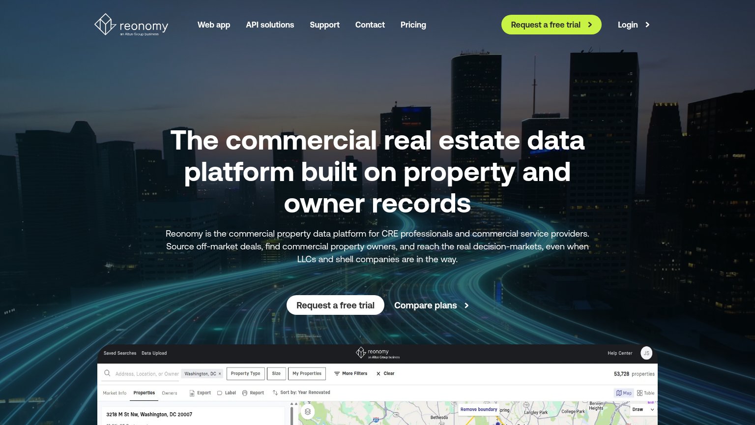
| Embedded product UI screenshot showing property search with map and "53,728 properties" |
CTA
68FairCopy, size, verb, cost-feel — does the primary CTA earn the click?
Problems
- demo booking feels costly/committal
- low-contrast beige fill blends into page
- no self-serve or in-product path shown
Value props
74FairTitle, subtitle, hero — do they sell the product's true value?
Parca’s headline sells
AI-enabled workspaces to identify land acquisition opportunities
Parca enables brokers & land acquisition teams to creatively surface off-market acquisition opportunities at the speed of thought. Deploy hundreds of agents that understand local regulations, development codes, and parcel data, then build c
Working
- Headline names the real outcome and niche
- Subhead cites regulations, codes, parcel data
- Hero screenshot shows the actual workflow
Could improve
- No concrete metrics or proof points
- 'Speed of thought' is empty filler
- No emotional hook on the manual pain
Information hierarchy
78FairDoes the design help or inhibit what the page is trying to say?
123- Book a demo CTA — Beige button on cream background barely registers; the primary action fails the one-second find test.
- Hero paragraph block — Six lines of dense jargon at near-headline weight force reading before the CTA can land.
- Search ~60 Parcels — The dark high-contrast button inside the screenshot outranks the real CTA and draws clicks to a non-interactive image.
Mobile web
81StrongThe phone experience as a first-class citizen.
 123
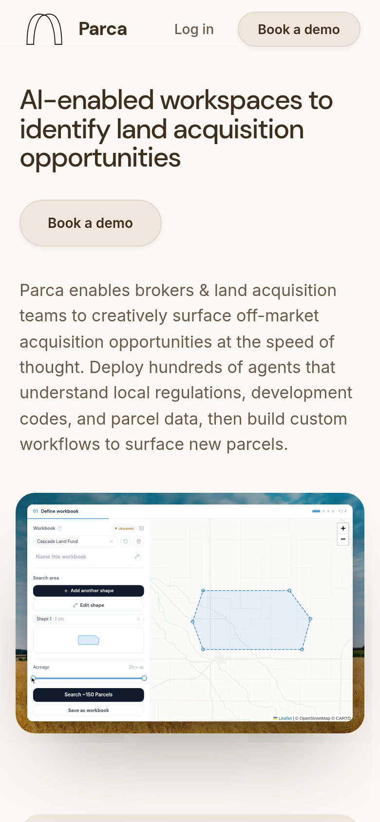
123- Book a demo button — Desktop-proportioned pill at ~40% width instead of a full-bleed thumb target.
- Product screenshot — Desktop workbook UI shrunk to phone width; sidebar labels and map controls are illegible.
- Intro paragraph — Eight unbroken lines of body copy stack between the CTA and the product visual.
Competitors
closest by platform, customer profile, and value propGraded against Lazyweb’s growth rubrics.