Your landing page’s weakest score is CTA.
How PhotonSpear ranks
48Growth scoreupdated
category scores
category scoresShowHide
 Lazyweb ProAI Growth PMTurn this score into growth.Analyze your site and propose fixes across conversion, SEO, and AEOMonitor competitors’ in-product UX and A/B testsLearn from growth experiments across 10,000+ top productsTry Pro Free →
Score over time
CTA
42PoorCopy, size, verb, cost-feel — does the primary CTA earn the click?
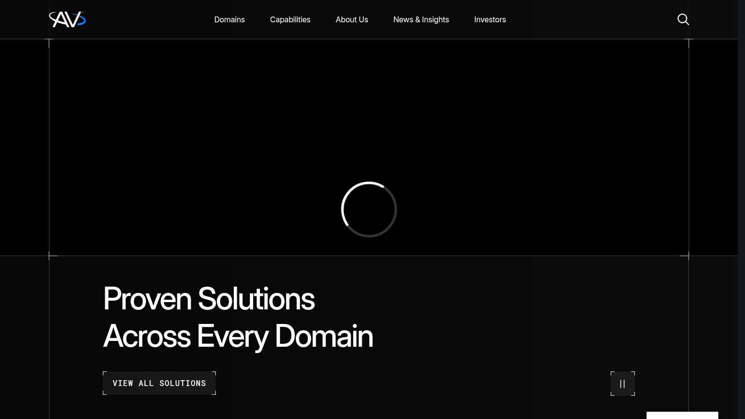
Problems
- no primary CTA anywhere in hero
- only tiny nav links on desktop
- mobile fold has zero clickable action
- no path to demo, contact, or product
Value props
42PoorTitle, subtitle, hero — do they sell the product's true value?
PhotonSpear’s headline vague
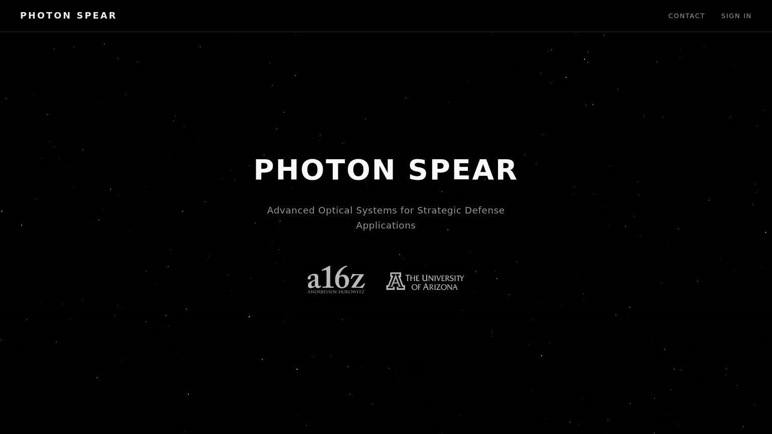
PHOTON SPEAR
Advanced Optical Systems for Strategic Defense Applications
Working
- a16z + University of Arizona logos lend credibility
- Subhead names the defense sector clearly
- Stark aesthetic fits defense-tech positioning
Could improve
- Headline is just the brand name
- No outcome, capability, or metric stated
- Hero visual decorates instead of demonstrates
Trust
46PoorProof that the product is real, competent, and safe to try.
| Trust read | |
|---|---|
| PhotonSpear | a16z (Andreessen Horowitz) and University of Arizona logos beneath the hero tagline |
| No visible trust signal identified. | |
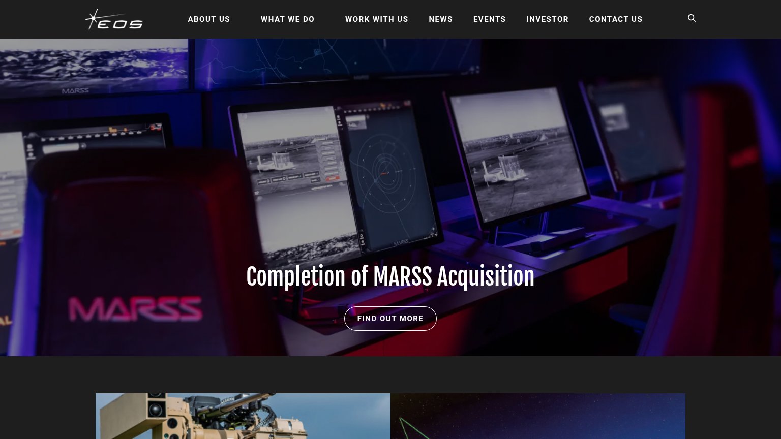
| Real photo of an EOS remote weapon station mounted on a vehicle below the hero | |
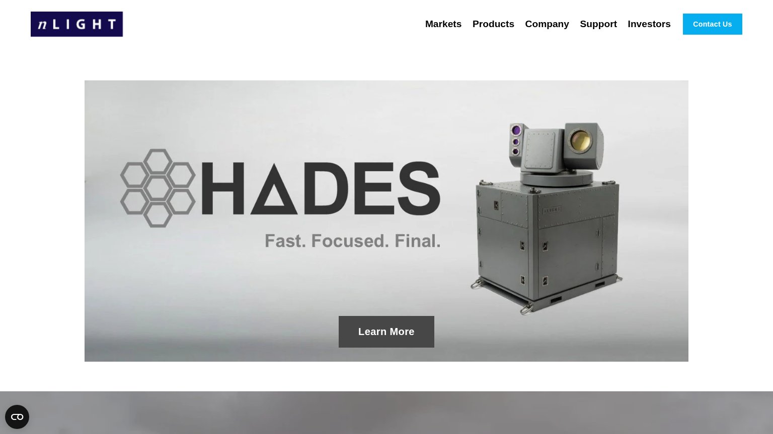
| Real photograph of the HADES laser hardware unit in the hero | |
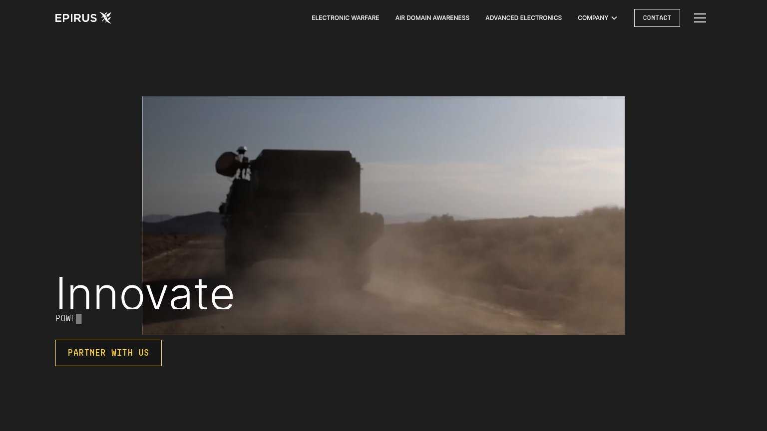
| Hero field footage of a military vehicle carrying mounted hardware on a desert road |
Mobile web
50FairThe phone experience as a first-class citizen.
 123
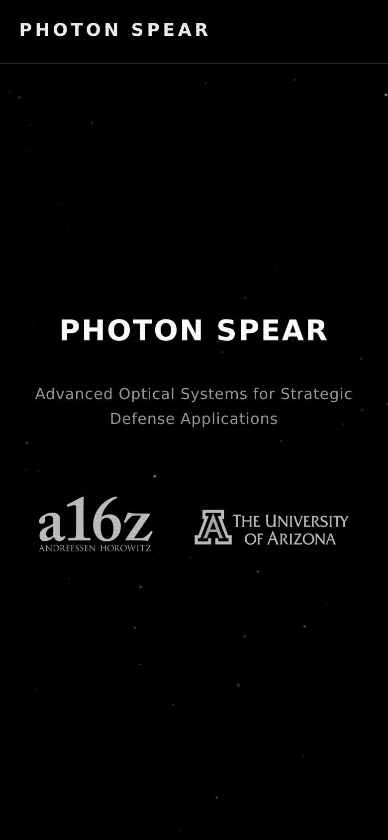
123- Hero text block — The hero ends at the subheadline with no CTA button — a mobile visitor has nothing to tap.
- Mobile header bar — Desktop's CONTACT and SIGN IN links are dropped entirely with no hamburger replacement, removing all navigation.
- Investor logo row — The a16z and Arizona logos are the last element in the fold and act as a dead end where an action button should sit.
Information hierarchy
58FairDoes the design help or inhibit what the page is trying to say?
123- CONTACT nav link — The only conversion path is a small, low-contrast nav link — invisible in a one-second scan and absent from the hero.
- SIGN IN link — Styled at identical weight to Contact, so the sole exit path competes equally with the sole conversion path.
- Hero subheadline — Dim gray text on black underweights the value proposition relative to the wordmark headline above it.
Competitors
closest by platform, customer profile, and value propGraded against Lazyweb’s growth rubrics.