Your landing page’s weakest score is Trust.
How Primitive Labs ranks
- 1.
LogRocket80
- 2.
PostHog72
- 3.
FullStory69
- 4.
Primitive Labs61
61Growth scoreupdated
category scores
category scoresShowHide
 Lazyweb ProAI Growth PMTurn this score into growth.Analyze your site and propose fixes across conversion, SEO, and AEOMonitor competitors’ in-product UX and A/B testsLearn from growth experiments across 10,000+ top productsTry Pro Free →
Score over time
Trust
32PoorProof that the product is real, competent, and safe to try.
| Trust read | |
|---|---|
| Primitive Labs | No visible trust signal identified. |
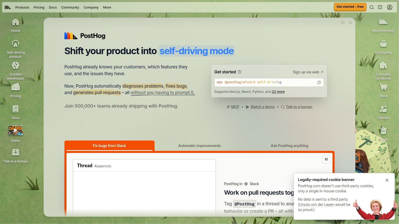
| Join 500,000+ teams already shipping with PostHog. | |
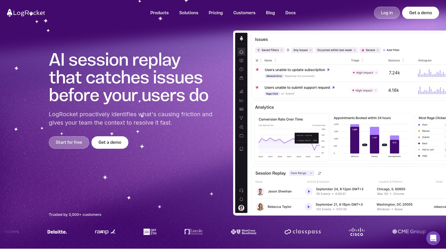
| "Trusted by 3,000+ customers" line above a logo wall including Deloitte, Cisco, BlueCross BlueShield, ClassPass, and CME | |
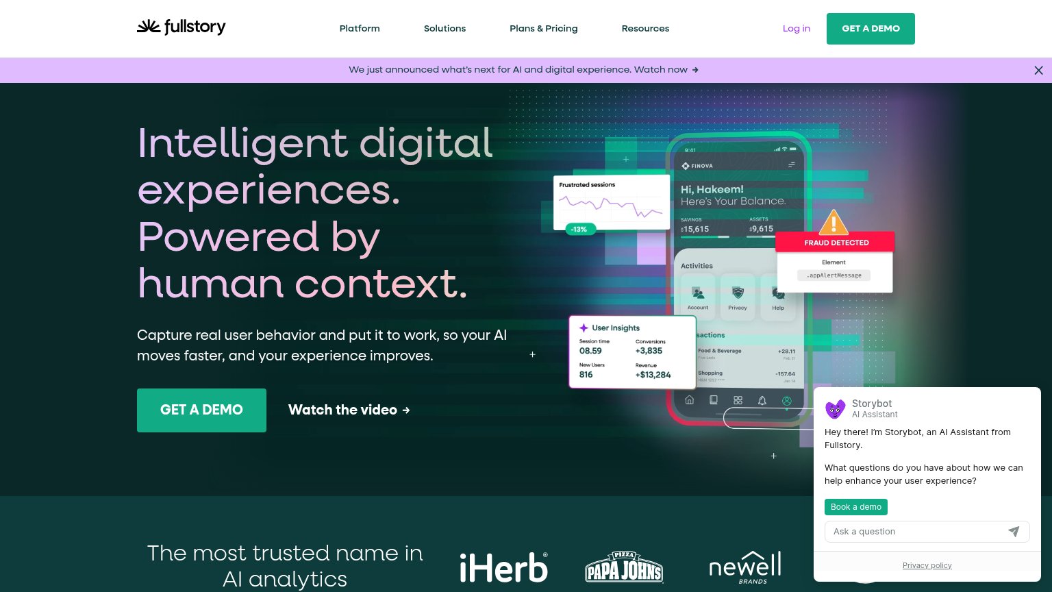
| Customer logo strip: iHerb, Papa John's, Newell Brands |
Value props
36PoorTitle, subtitle, hero — do they sell the product's true value?
Primitive Labs’s headline vague
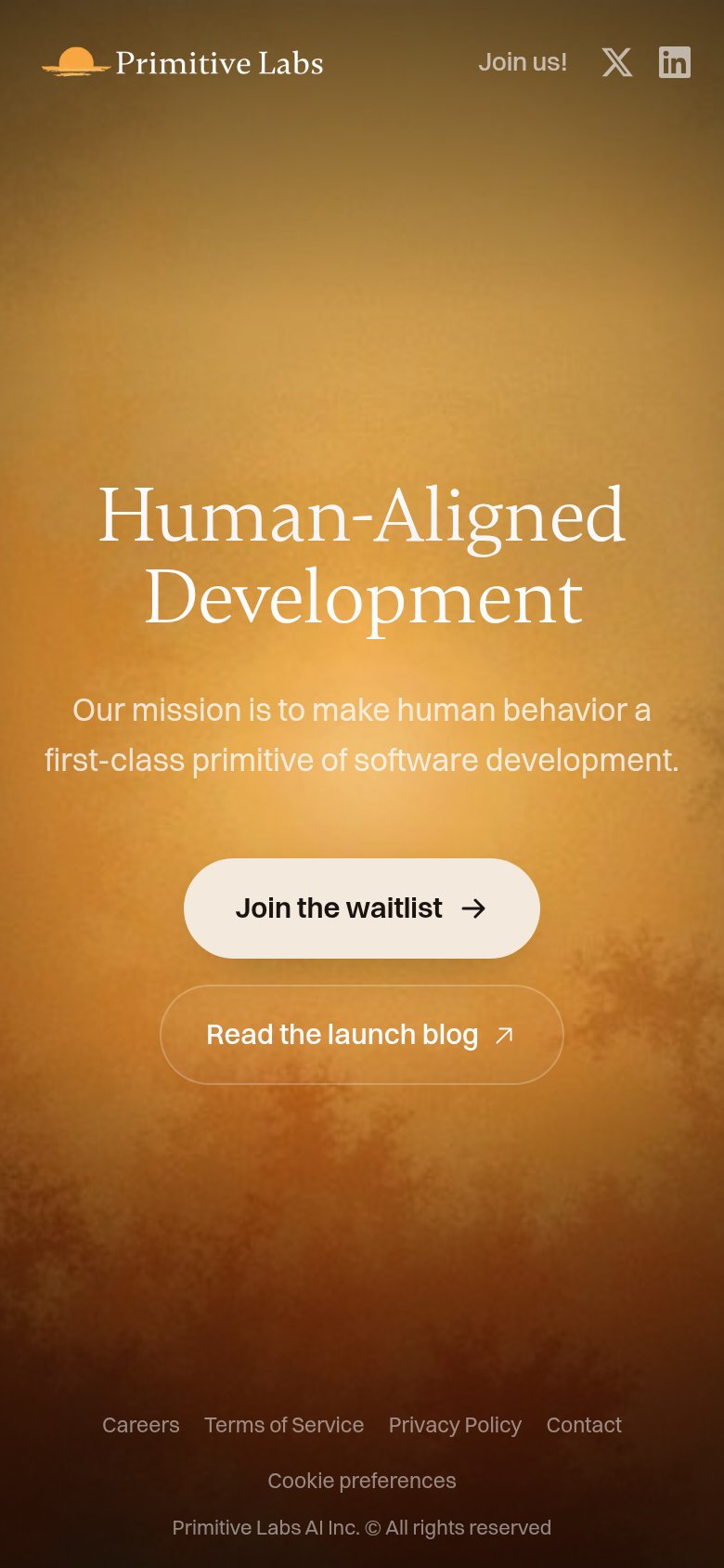
Human-Aligned Development
Our mission is to make human behavior a first-class primitive of software development.
Working
- Distinctive, memorable phrase
- Clean single-message fold
- Clear primary CTA to waitlist
Could improve
- No concrete product or outcome named
- Mission statement replaces value prop
- Hero image decorates, demonstrates nothing
CTA
72FairCopy, size, verb, cost-feel — does the primary CTA earn the click?

Problems
- waitlist = waiting, not value
- no payoff or benefit stated
- 'Join us!' nav label collides
Information hierarchy
79FairDoes the design help or inhibit what the page is trying to say?
123- Footer link row — Five exit links (Careers through Cookie preferences) sit inside the first viewport, leaking attention from the waitlist CTA.
- Header social icons — X and LinkedIn icons plus 'Join us!' offer three off-site exits before the visitor reaches the primary action.
- Read the launch blog — Sits at equal size directly beside the primary button, inviting a split click away from the waitlist.
Mobile web
86StrongThe phone experience as a first-class citizen.
 123
123- Join the waitlist button — Sits at ~60% column width instead of near full-bleed, shrinking the thumb target for the page's one conversion action.
- Header social icons — X and LinkedIn icons in the first viewport route taps off-site before the visitor reaches the waitlist CTA.
- Read the launch blog — Equal-sized secondary pill directly under the primary CTA competes for the same thumb zone.
Competitors
closest by platform, customer profile, and value propGraded against Lazyweb’s growth rubrics.