Your landing page’s weakest score is Trust.
How Rhema Health ranks
- 1.
Assort Health81
- 2.
Notable Health76
- 3.
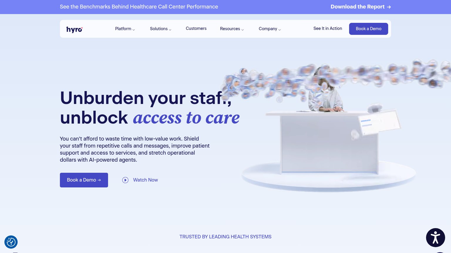
Hyro71
- 4.
Rhema Health70
- 5.
Luma Health69
70Growth scoreupdated
category scores
category scoresShowHide
 Lazyweb ProAI Growth PMTurn this score into growth.Analyze your site and propose fixes across conversion, SEO, and AEOMonitor competitors’ in-product UX and A/B testsLearn from growth experiments across 10,000+ top productsTry Pro Free →
Score over time
Trust
32PoorProof that the product is real, competent, and safe to try.
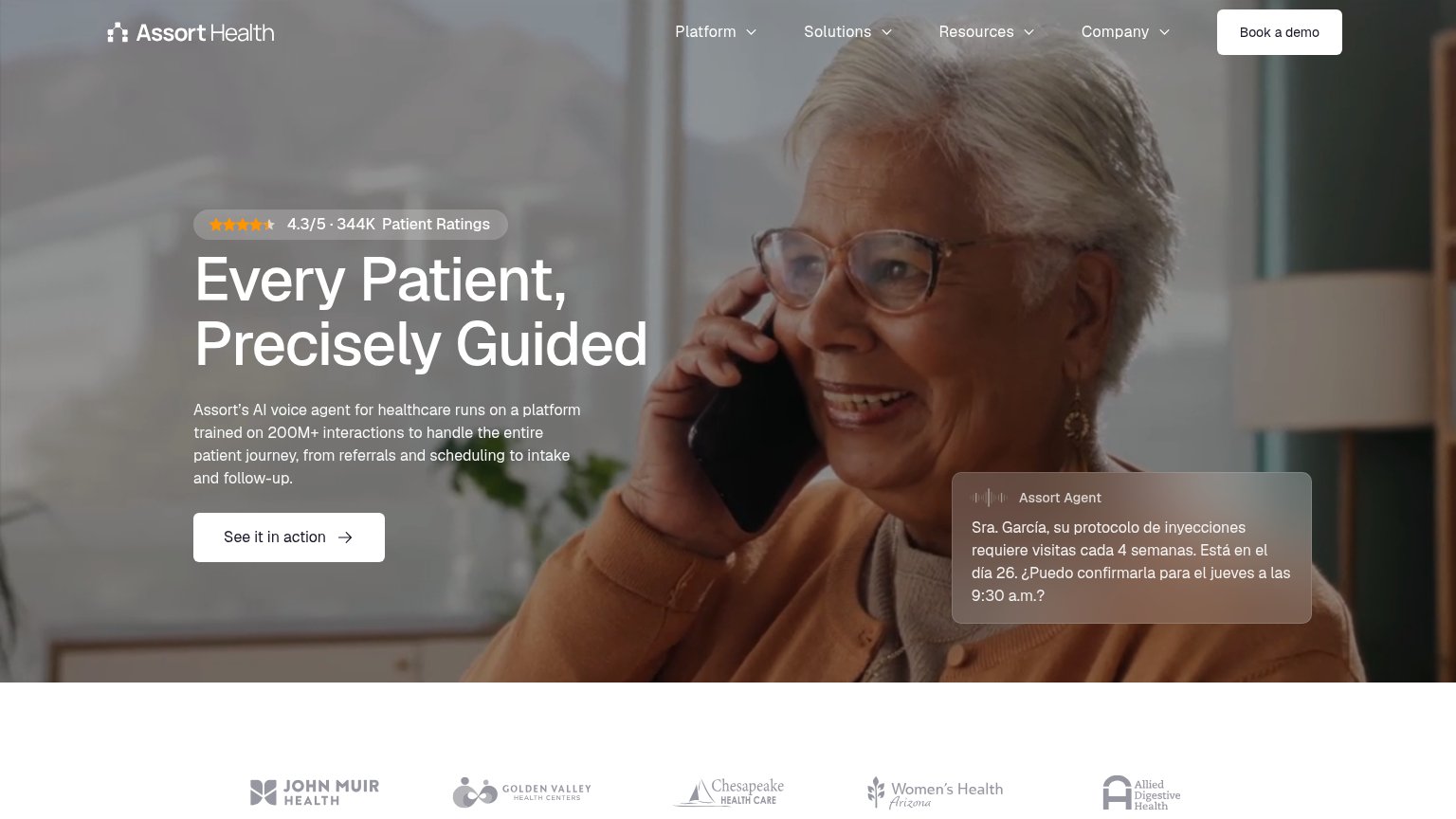
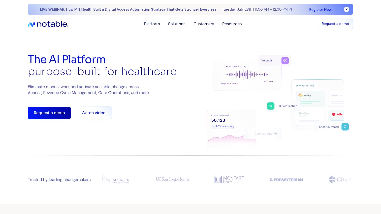
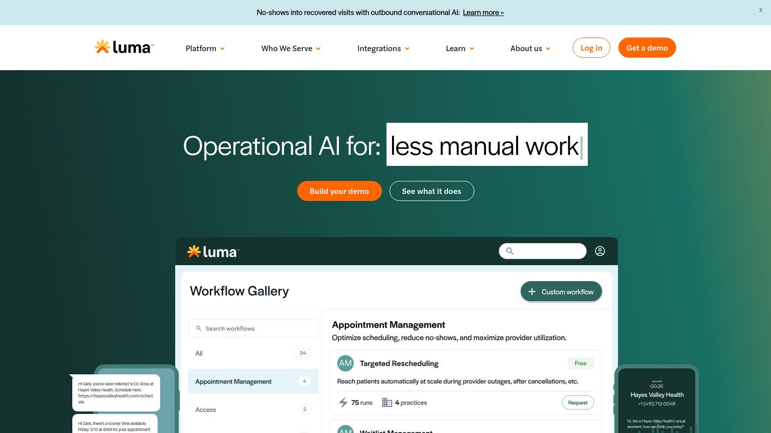
| Trust read | |
|---|---|
| Rhema Health | No visible trust signal identified. |
| "Trusted by leading changemakers" logo strip with MUSC Health, UC San Diego Health, Montage Health, and Presbyterian | |
| No visible trust signal identified. | |
| "4.3/5 · 344K Patient Ratings" star badge above the headline | |
| Workflow Gallery product UI with 'Targeted Rescheduling' card showing '75 runs · 4 practices' |
CTA
71FairCopy, size, verb, cost-feel — does the primary CTA earn the click?
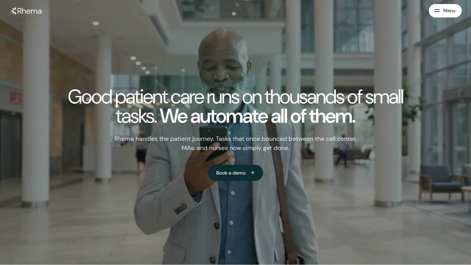
Problems
- high-commitment sales-call framing
- no low-friction alternative visible
- no value promise in the label
Value props
78FairTitle, subtitle, hero — do they sell the product's true value?
Rhema Health’s headline sells
Good patient care runs on thousands of small tasks. We automate all of them.
Rhema handles the patient journey. Tasks that once bounced between the call center, MAs, and nurses now simply get done.
Working
- Names the real pain: task ping-pong
- Subhead names actual roles: call center, MAs, nurses
- Outcome stated: tasks simply get done
Could improve
- No concrete task examples or numbers
- 'All of them' overclaims without proof
- Hero video decorates, never shows product
Mobile web
84StrongThe phone experience as a first-class citizen.
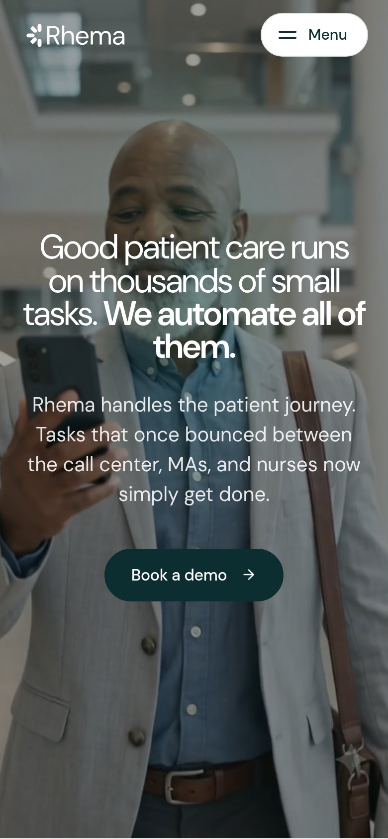 12
12- Book a demo button — Desktop-proportioned button floats at half column width instead of a near-full-bleed thumb target.
- Body paragraph text — White copy sits over a busy photo with a light overlay, softening contrast at arm's length.
Information hierarchy
86StrongDoes the design help or inhibit what the page is trying to say?
123- Hero headline text — Thin white type over bright columns and glass loses contrast mid-sentence, weakening the core message.
- Subheadline copy — Light-grey text on a light, busy video frame is the least legible element in the visitor's scan path.
- Book a demo button — Small footprint relative to the oversized hero under-weights the page's only conversion action.
Competitors
closest by platform, customer profile, and value propGraded against Lazyweb’s growth rubrics.