Your landing page’s weakest score is Trust.
How San Francisco Data ranks
- 1.
TollBit72
- 2.
San Francisco Data68
- 3.
Datarade68
- 4.
Protege62
- 5.
Narrative56
68Growth scoreupdated
category scores
category scoresShowHide
 Lazyweb ProAI Growth PMTurn this score into growth.Analyze your site and propose fixes across conversion, SEO, and AEOMonitor competitors’ in-product UX and A/B testsLearn from growth experiments across 10,000+ top productsTry Pro Free →
Score over time
Trust
34PoorProof that the product is real, competent, and safe to try.
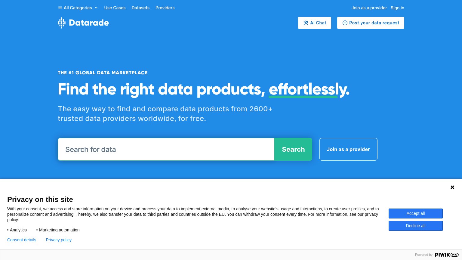
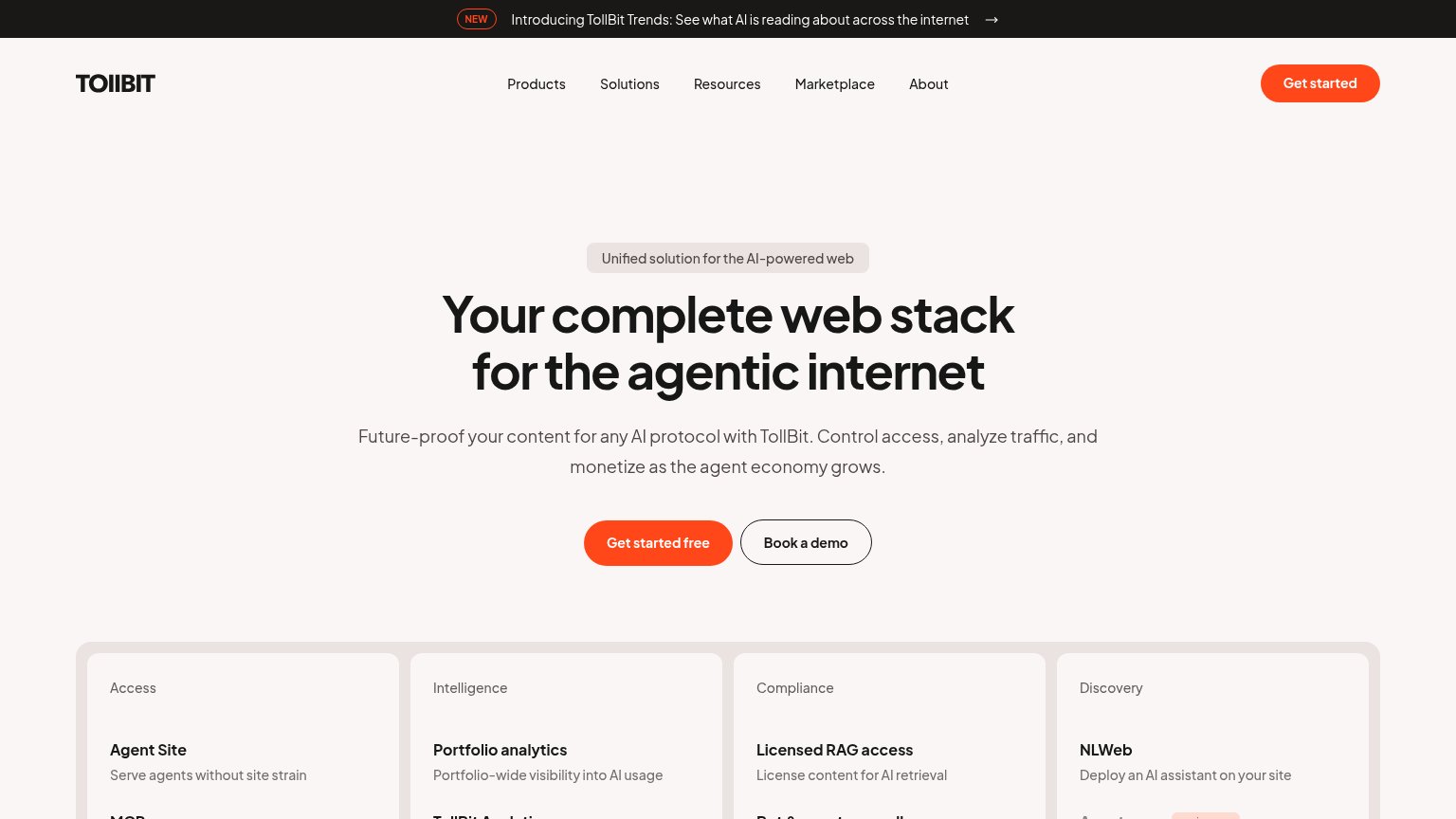
| Trust read | |
|---|---|
| San Francisco Data | No visible trust signal identified. |
| No visible trust signal identified. | |
| Four-column capability grid naming concrete products: "Agent Site", "Portfolio analytics", "Licensed RAG access", "NLWeb | |
| "2600+ trusted data providers worldwide" in the hero subhead | |
| No visible trust signal identified. |
CTA
64FairCopy, size, verb, cost-feel — does the primary CTA earn the click?
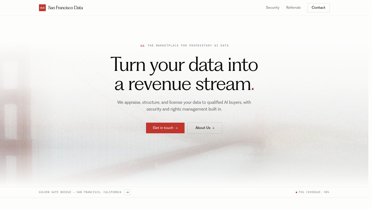
Problems
- vague contact ask, no value payoff
- conflicts with nav 'Contact' label
- sales-call cost feel
Value props
72FairTitle, subtitle, hero — do they sell the product's true value?
San Francisco Data’s headline sells
Turn your data into a revenue stream.
We appraise, structure, and license your data to qualified AI buyers, with security and rights management built in.
Working
- Outcome-led headline: revenue from data
- Subhead names mechanism: appraise, license
- Addresses security and rights fears
Could improve
- No numbers, deals, or buyer proof
- Fog-bridge hero shows nothing of product
- Who it's for (data owners) stays implicit
Information hierarchy
84StrongDoes the design help or inhibit what the page is trying to say?
123- Contact nav button — Boxed styling duplicates the primary CTA and pulls first-glance attention to the top-right corner.
- About Us button — Same footprint as "Get in touch", splitting the action row into two equal-weight choices.
- Caption arrow button — An interactive arrow beside the bridge caption invites a click that leads nowhere near the conversion.
Mobile web
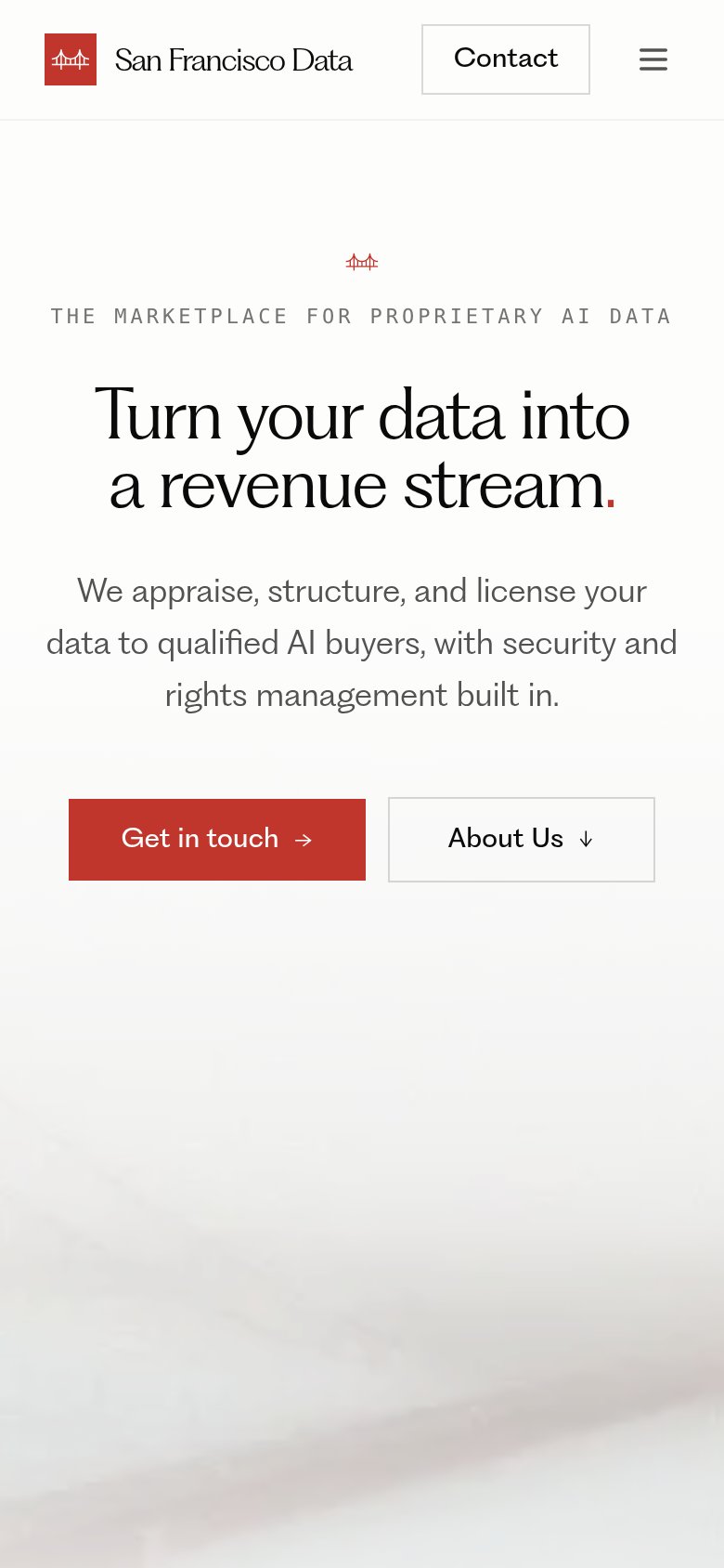
84StrongThe phone experience as a first-class citizen.
 12
12- Get in touch button — Shares its row with "About Us" at half-width — the primary CTA should be full-bleed and thumb-sized on mobile.
- Eyebrow tagline — Wide letter-spaced caps run edge-to-edge with no side padding, making the line feel cramped against the viewport.
Competitors
closest by platform, customer profile, and value prop#1TollBittollbit.com72
Dataradedatarade.ai68
#4Protegewithprotege.ai62
#5Narrativenarrative.io56
#2San Francisco Data68
#3Graded against Lazyweb’s growth rubrics.