Your landing page’s weakest score is Trust.
How Sotant ranks
70Growth scoreupdated
category scores
category scoresShowHide
 Lazyweb ProAI Growth PMTurn this score into growth.Analyze your site and propose fixes across conversion, SEO, and AEOMonitor competitors’ in-product UX and A/B testsLearn from growth experiments across 10,000+ top productsTry Pro Free →
Score over time
Trust
50FairProof that the product is real, competent, and safe to try.

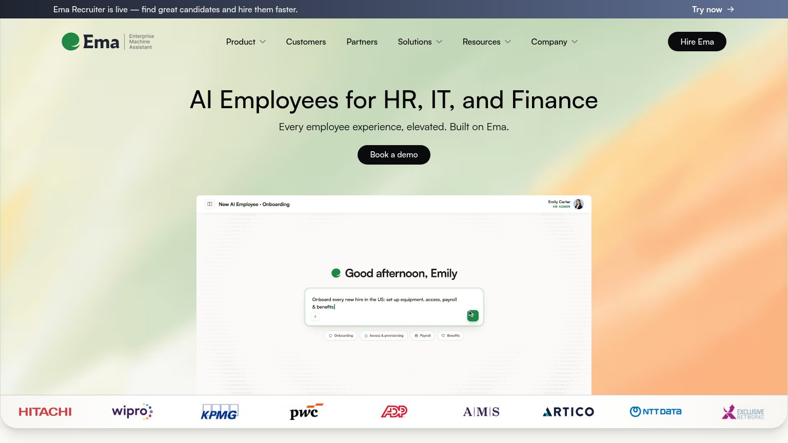
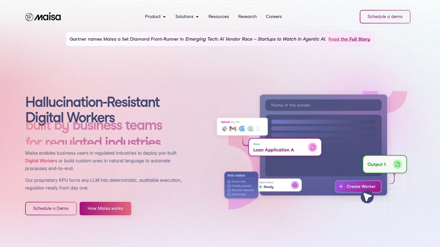
| Trust read | |
|---|---|
| Sotant | 'Built by AI and operations leaders from' strip with MIT, Stanford, Tesla, and Bosch logos |
| Logo wall with Hitachi, Wipro, KPMG, PwC, ADP, AMS, Artico, NTT Data | |
| No visible trust signal identified. | |
| Gartner names Maisa a Set Diamond Front-Runner in Emerging Tech: AI Vendor Race – Startups to Watch in Agentic AI | |
| No visible trust signal identified. |
CTA
70FairCopy, size, verb, cost-feel — does the primary CTA earn the click?
Problems
- 'Book a Demo' feels costly/committal
- no value promise on the button
- no self-serve or free path visible
Value props
70FairTitle, subtitle, hero — do they sell the product's true value?
Sotant’s headline sells
Higher margins in your complex operations with AI imitation learning
Sotant maps your operations, imitates your processes, and implements custom AI employees in just weeks to drive higher revenue and margins.
Working
- Outcome-led: 'higher margins' up front
- Subhead explains the actual mechanism
- MIT/Stanford/Tesla/Bosch pedigree strip
Could improve
- No hard numbers anywhere in the fold
- Hero image decorates, never shows product
- 'in just weeks' is the only specificity
Information hierarchy
80StrongDoes the design help or inhibit what the page is trying to say?
123- Supporting paragraph — Stranded bottom-right over busy imagery, off the headline-to-CTA scan path.
- Nav link row — Five equal-weight exits sit above the primary CTA and siphon first clicks.
- Learn more link — Low-contrast gray over the photo makes the secondary action nearly invisible.
Mobile web
81StrongThe phone experience as a first-class citizen.
 1234
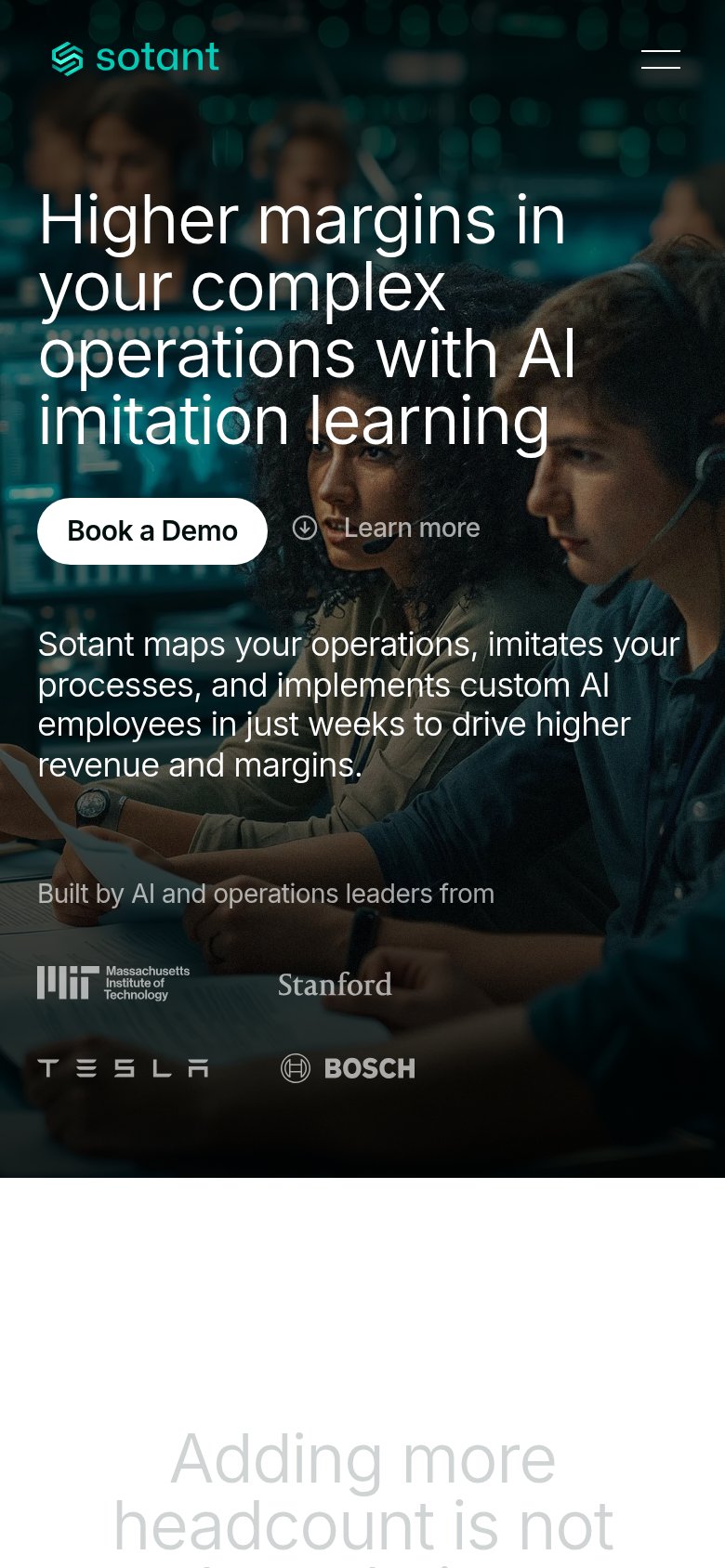
1234- Book a Demo button — Keeps desktop pill proportions at roughly half the column instead of a full-bleed thumb target.
- Five-line hero headline — Desktop headline wraps into five lines, pushing the CTA and value copy deep into the fold.
- Tesla and Bosch logos — Faded gray marks sit over the busy photo and are barely legible, weakening the trust row.
- Adding more headcount — Second-section heading renders in faint gray that nearly disappears against the white background.
Competitors
closest by platform, customer profile, and value propGraded against Lazyweb’s growth rubrics.