Your landing page’s weakest score is Trust.
How Truli ranks
76Growth scoreupdated
category scores
category scoresShowHide
 Lazyweb ProAI Growth PMTurn this score into growth.Analyze your site and propose fixes across conversion, SEO, and AEOMonitor competitors’ in-product UX and A/B testsLearn from growth experiments across 10,000+ top productsTry Pro Free →
Score over time
Trust
56FairProof that the product is real, competent, and safe to try.
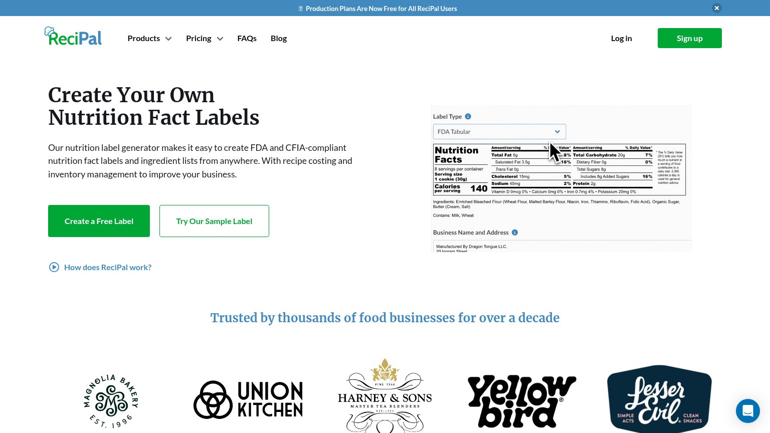
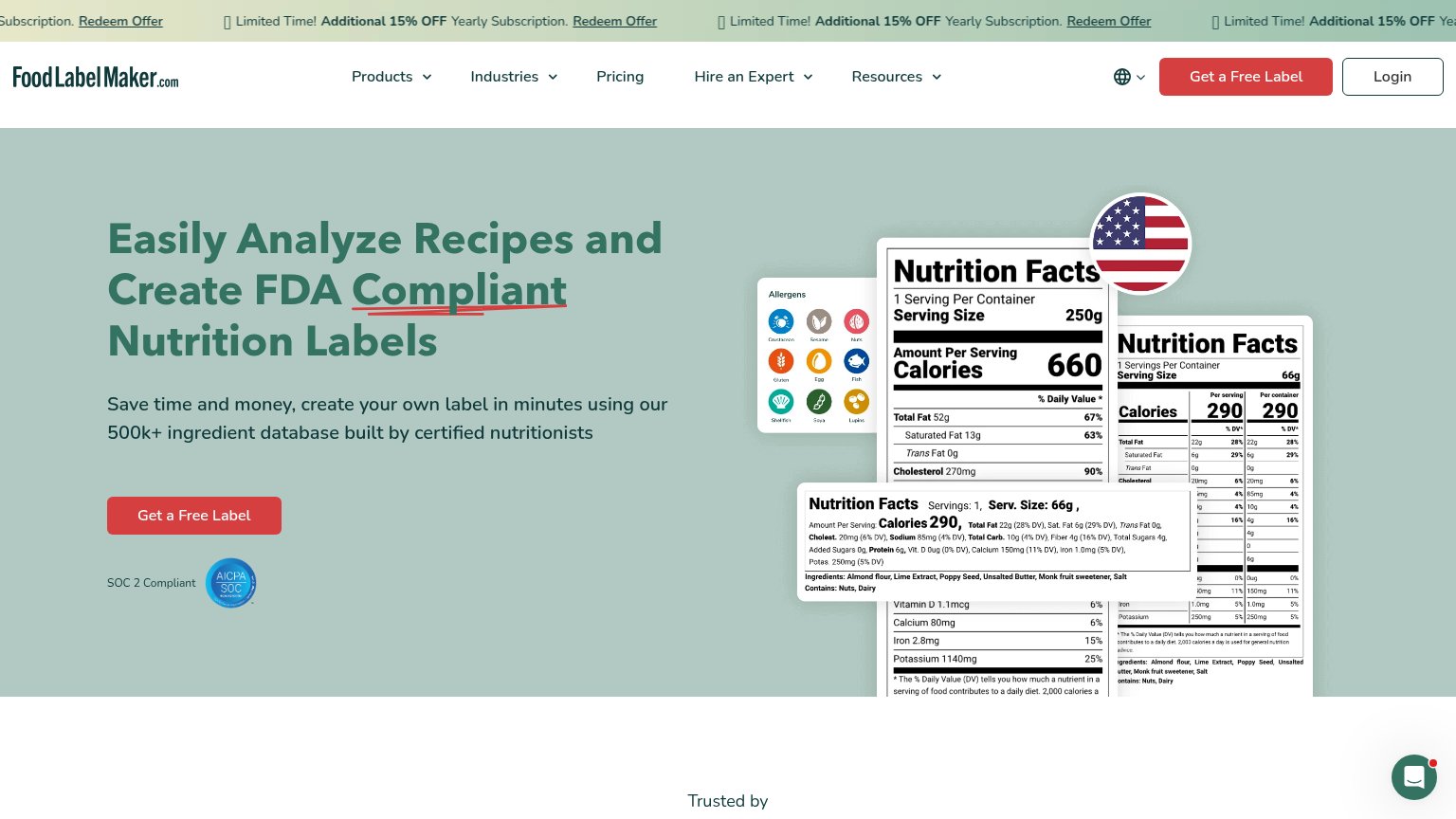
| Trust read | |
|---|---|
| Truli | No visible trust signal identified. |
| "SOC 2 Compliant" AICPA SOC badge placed directly below the Get a Free Label CTA | |
| Customer logo strip (Magnolia Bakery, Union Kitchen, Harney & Sons, Yellow Bird, LesserEvil) under "Trusted by thousands | |
| No visible trust signal identified. | |
| "we've been connecting the dots between food and data for over 40 years" longevity claim in hero copy |
CTA
74FairCopy, size, verb, cost-feel — does the primary CTA earn the click?
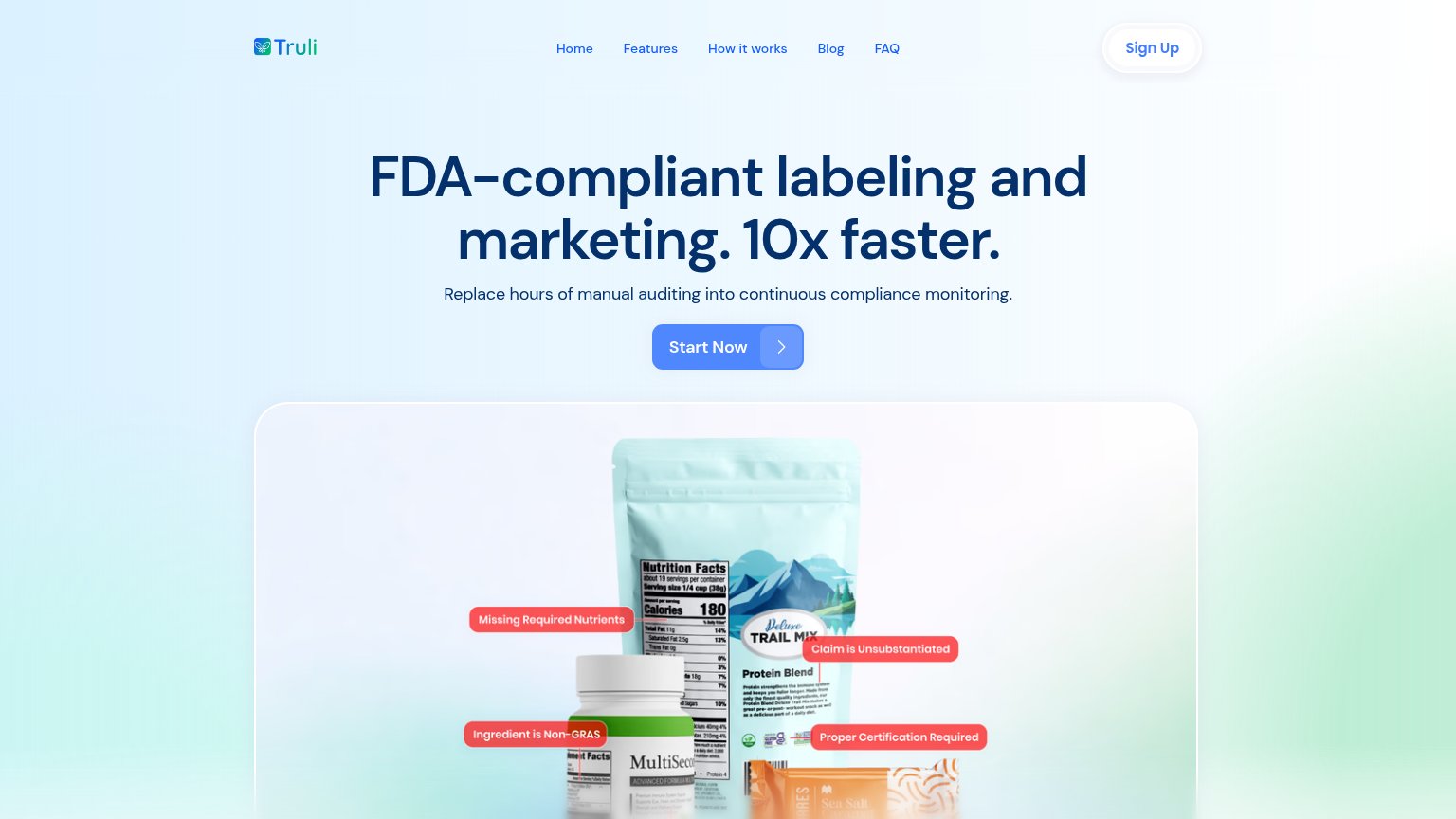
Problems
- generic — names no payoff
- no 'free' or price signal
- nav 'Sign Up' splits the label
- desktop button small vs headline
Information hierarchy
79FairDoes the design help or inhibit what the page is trying to say?
123- Start Now button — Mid-blue pill on a blue-green gradient has weak contrast, and its detached arrow segment reads as a second, separate button.
- Nav link row — Five same-weight links (Home, Features, How it works, Blog, FAQ) give attention five exits before the primary CTA.
- Sign Up pill — High-contrast white pill in the top-right is the most visible button in the fold, outranking Start Now.
Value props
84StrongTitle, subtitle, hero — do they sell the product's true value?
Truli’s headline sells
FDA-compliant labeling and marketing. 10x faster.
Replace hours of manual auditing into continuous compliance monitoring.
Working
- '10x faster' quantifies the payoff
- Hero image shows real compliance flags on labels
- Subhead contrasts manual audits vs monitoring
Could improve
- Subhead grammar broken ('Replace...into')
- Proof stats hidden below desktop fold
- No explicit audience callout in hero
Mobile web
86StrongThe phone experience as a first-class citizen.
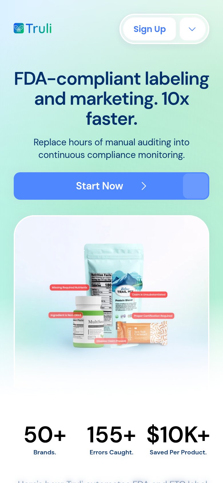 12
12- Stray block on CTA — A detached lighter-blue rectangle overlaps the right edge of the Start Now button, reading as a broken second button on the primary tap target.
- Headline last line — The word "faster." wraps alone onto a fourth line, leaving an orphan that weakens the headline's scan.
Competitors
closest by platform, customer profile, and value propGraded against Lazyweb’s growth rubrics.