Your landing page’s weakest score is Trust.
How Tydra ranks
59Growth scoreupdated
category scores
category scoresShowHide
 Lazyweb ProAI Growth PMTurn this score into growth.Analyze your site and propose fixes across conversion, SEO, and AEOMonitor competitors’ in-product UX and A/B testsLearn from growth experiments across 10,000+ top productsTry Pro Free →
Score over time
Trust
32PoorProof that the product is real, competent, and safe to try.
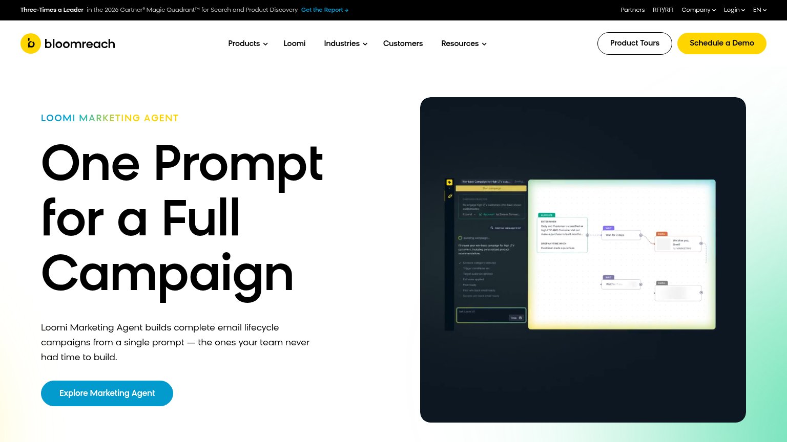
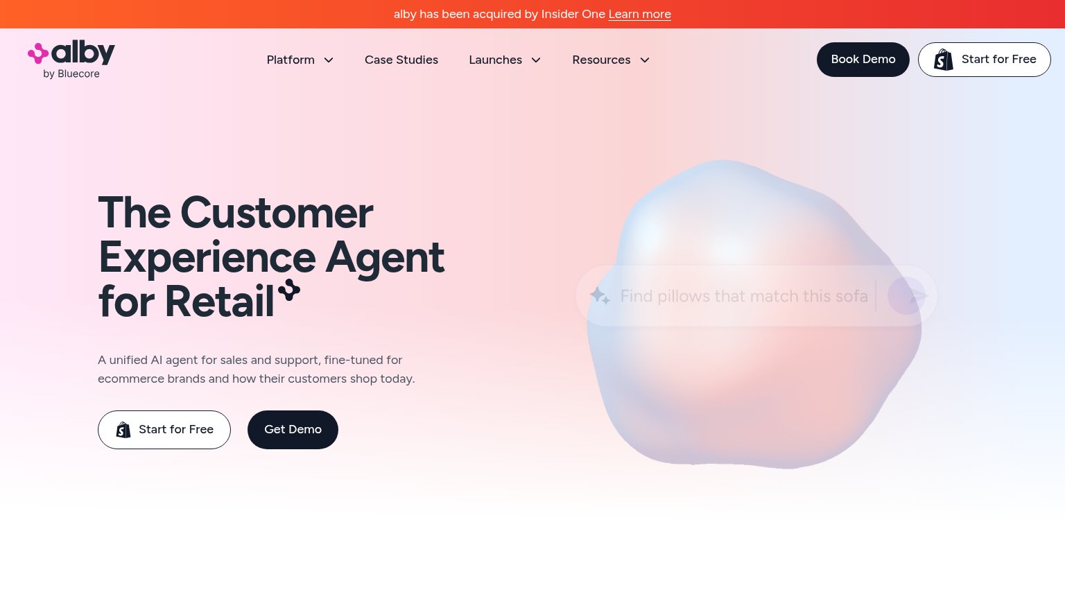
| Trust read | |
|---|---|
| Tydra | No visible trust signal identified. |
| "alby has been acquired by Insider One" banner | |
| No visible trust signal identified. | |
| No visible trust signal identified. | |
| "Three-Times a Leader in the 2026 Gartner® Magic Quadrant™ for Search and Product Discovery" banner |
Value props
48PoorTitle, subtitle, hero — do they sell the product's true value?
Tydra’s headline vague
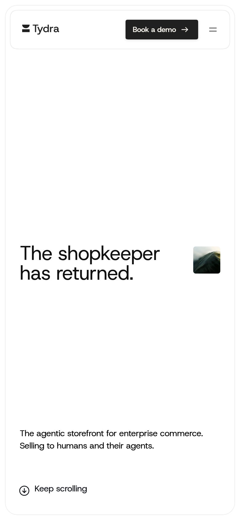
The shopkeeper has returned.
The agentic storefront for enterprise commerce. Selling to humans and their agents.
Working
- Memorable, evocative headline hook
- Subhead names category and buyer
- "Humans and their agents" is a sharp twist
Could improve
- Headline unreadable without context
- Zero numbers or proof points
- Hero image decorates, shows nothing
CTA
63FairCopy, size, verb, cost-feel — does the primary CTA earn the click?
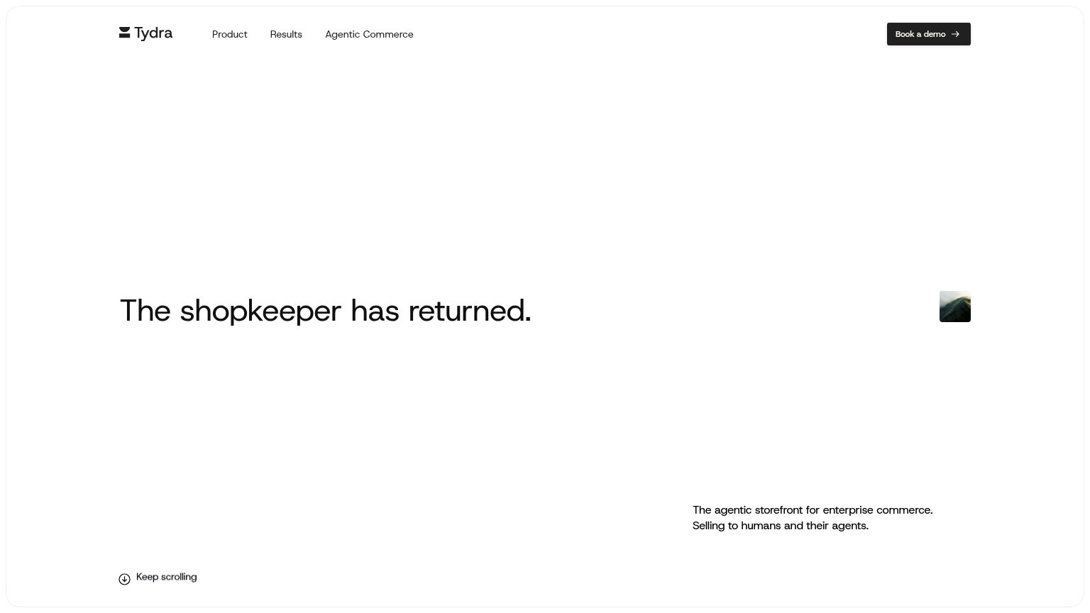
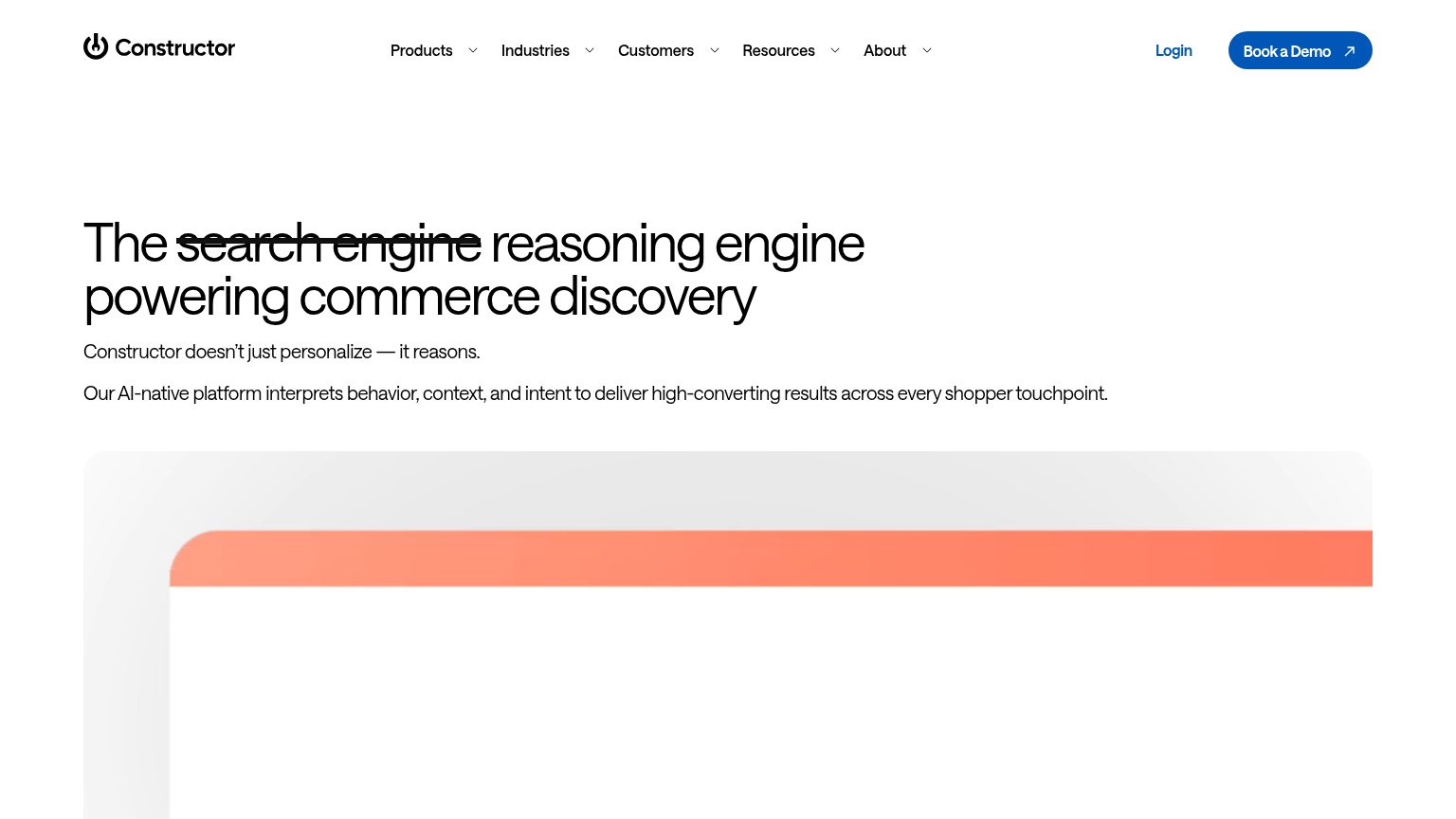
Problems
- no CTA in the hero itself
- 'Book a demo' feels costly/committal
- nav-sized button in a vast empty fold
Information hierarchy
66FairDoes the design help or inhibit what the page is trying to say?
123- Value prop subtitle — The only line explaining what Tydra is sits in small type at the bottom-right, far outside the headline's scan path.
- Book a demo button — The sole CTA is a small nav-corner button with no hero-level counterpart near the headline where the visitor's eye lands.
- Tiny wave thumbnail — A postage-stamp image floats beside the headline, too small to communicate the product's category or feeling.
Mobile web
84StrongThe phone experience as a first-class citizen.
 123
123- Book a demo button — Header-sized pill instead of a full-width, thumb-friendly button near the hero.
- Subheadline placement — The only product explanation sits at the bottom edge of the fold, far from the headline it supports.
- Tiny hero image — An 88px decorative thumbnail floats beside the headline and communicates nothing at this size.
Competitors
closest by platform, customer profile, and value propGraded against Lazyweb’s growth rubrics.