Your landing page’s weakest score is Trust.
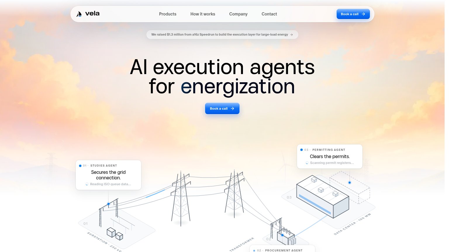
How Vela Energy ranks
70Growth scoreupdated
category scores
category scoresShowHide
 Lazyweb ProAI Growth PMTurn this score into growth.Analyze your site and propose fixes across conversion, SEO, and AEOMonitor competitors’ in-product UX and A/B testsLearn from growth experiments across 10,000+ top productsTry Pro Free →
Score over time
Trust
55FairProof that the product is real, competent, and safe to try.
| Trust read | |
|---|---|
| Vela Energy | "We raised $1.3 million from a16z Speedrun to build the execution layer for large-load energy" |
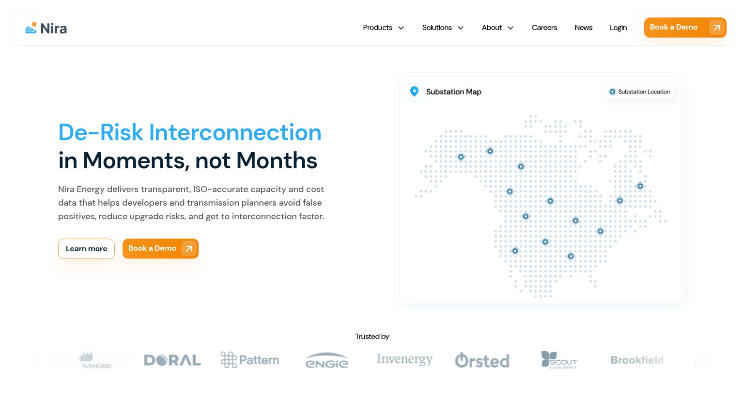
| "Trusted by" logo wall with Ørsted, ENGIE, Invenergy, Brookfield, Pattern, Doral, Avangrid, Scout Clean Energy | |
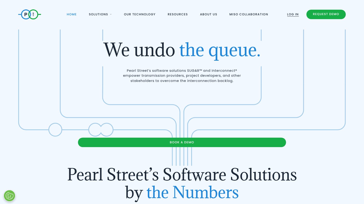
| "MISO COLLABORATION" navigation item | |
| Banner: "Access the webinar on demand: AI in energy development." | |
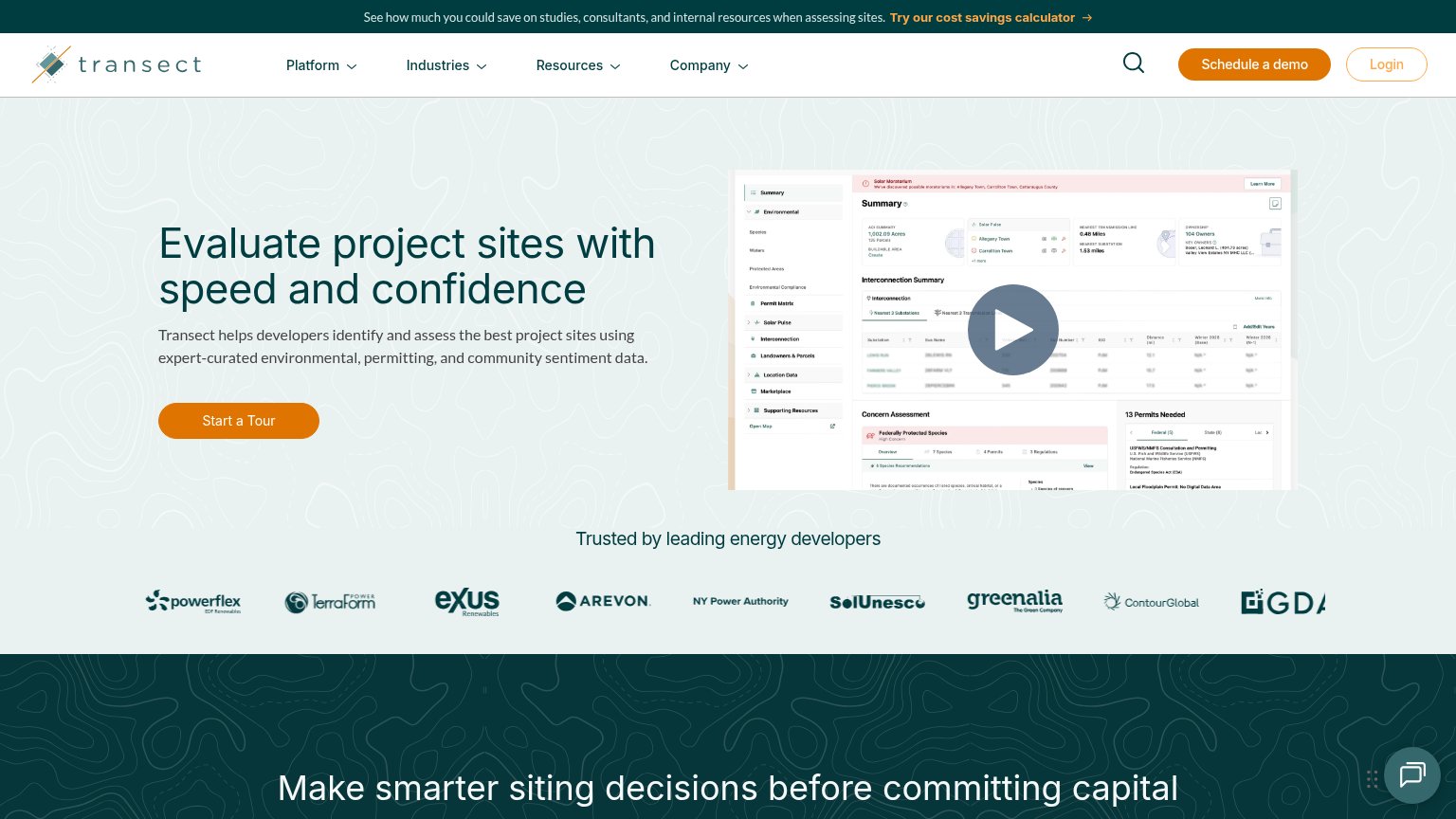
| "Trusted by leading energy developers" logo strip with Arevon, NY Power Authority, ContourGlobal, TerraForm Power |
Value props
62FairTitle, subtitle, hero — do they sell the product's true value?
Vela Energy’s headline vague
AI execution agents for energization
Working
- Illustration shows agents doing real grid work
- Agent cards name outcomes: permits, grid connection
- Diagram grounds claim: 230 kV substation, 100 MW DC
Could improve
- No subhead — headline carries pitch alone
- "Energization" is insider jargon with no outcome
- Only number in copy is the funding round
CTA
70FairCopy, size, verb, cost-feel — does the primary CTA earn the click?
Problems
- a call is a high-commitment ask
- no lower-friction alternative path
- mobile nav CTA is unlabeled arrow
- no header-echo in copy
Mobile web
81StrongThe phone experience as a first-class citizen.
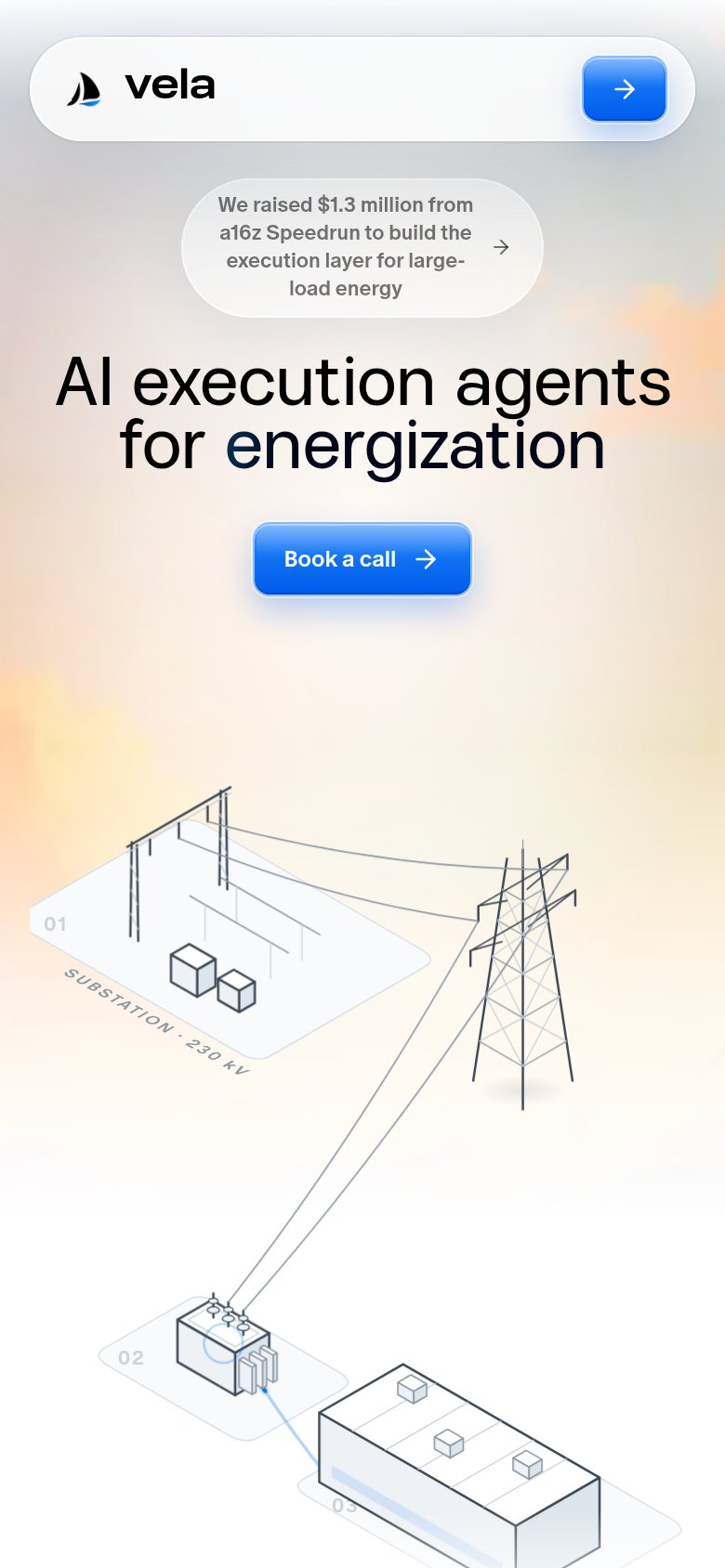 123
123- Funding announcement pill — Wraps into four cramped lines and pushes the headline and CTA down the fold.
- Header arrow button — Icon-only with no label — the desktop 'Book a call' text was dropped, leaving its purpose unclear.
- Book a call button — Desktop-proportioned width floating in the column; a near-full-bleed button would be easier to thumb.
Information hierarchy
84StrongDoes the design help or inhibit what the page is trying to say?
123- a16z funding pill — Sits above the headline in the scan path and links away before the value proposition or CTA is read.
- Procurement agent card — Clipped at the fold edge so the third agent message is illegible and looks broken.
- Agent card status lines — Light-gray micro-copy like "Reading ISO queue data..." is too low-contrast to communicate what the agents actually do.
Competitors
closest by platform, customer profile, and value propGraded against Lazyweb’s growth rubrics.