Your landing page’s weakest score is Value props.
How Proper Motion ranks
- 1.
Mem078
- 2.
Zep78
- 3.
LlamaIndex (LlamaCloud)68
- 4.
Letta52
- 5.
Proper Motion50
- 6.
Ragie43
50Growth scoreupdated
category scores
category scoresShowHide
 Lazyweb ProAI Growth PMTurn this score into growth.Analyze your site and propose fixes across conversion, SEO, and AEOMonitor competitors’ in-product UX and A/B testsLearn from growth experiments across 10,000+ top productsTry Pro Free →
Score over time
Value props
32PoorTitle, subtitle, hero — do they sell the product's true value?
Proper Motion’s headline vague
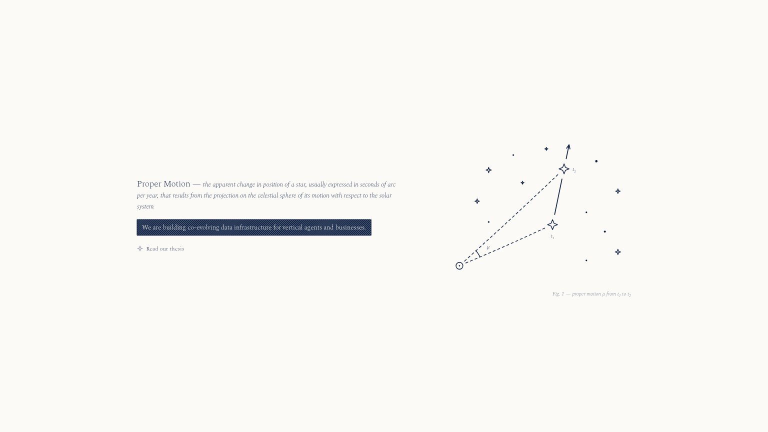
Proper Motion — the apparent change in position of a star, usually expressed in seconds of arc per year, that results from the projection on the celestial spher
We are building co-evolving data infrastructure for vertical agents and businesses.
Working
- Distinctive, memorable brand metaphor
- Names a target market: vertical agents
- Clean single-message fold
Could improve
- Headline is a definition, not a value prop
- 'Co-evolving data infrastructure' is jargon
- No numbers, outcomes, or proof points
Trust
32PoorProof that the product is real, competent, and safe to try.
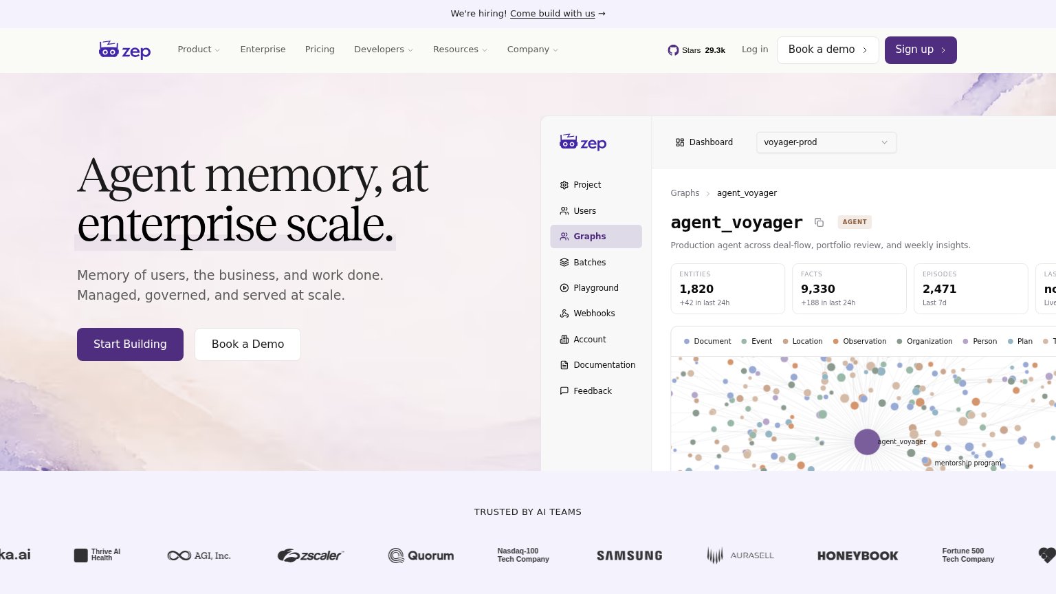
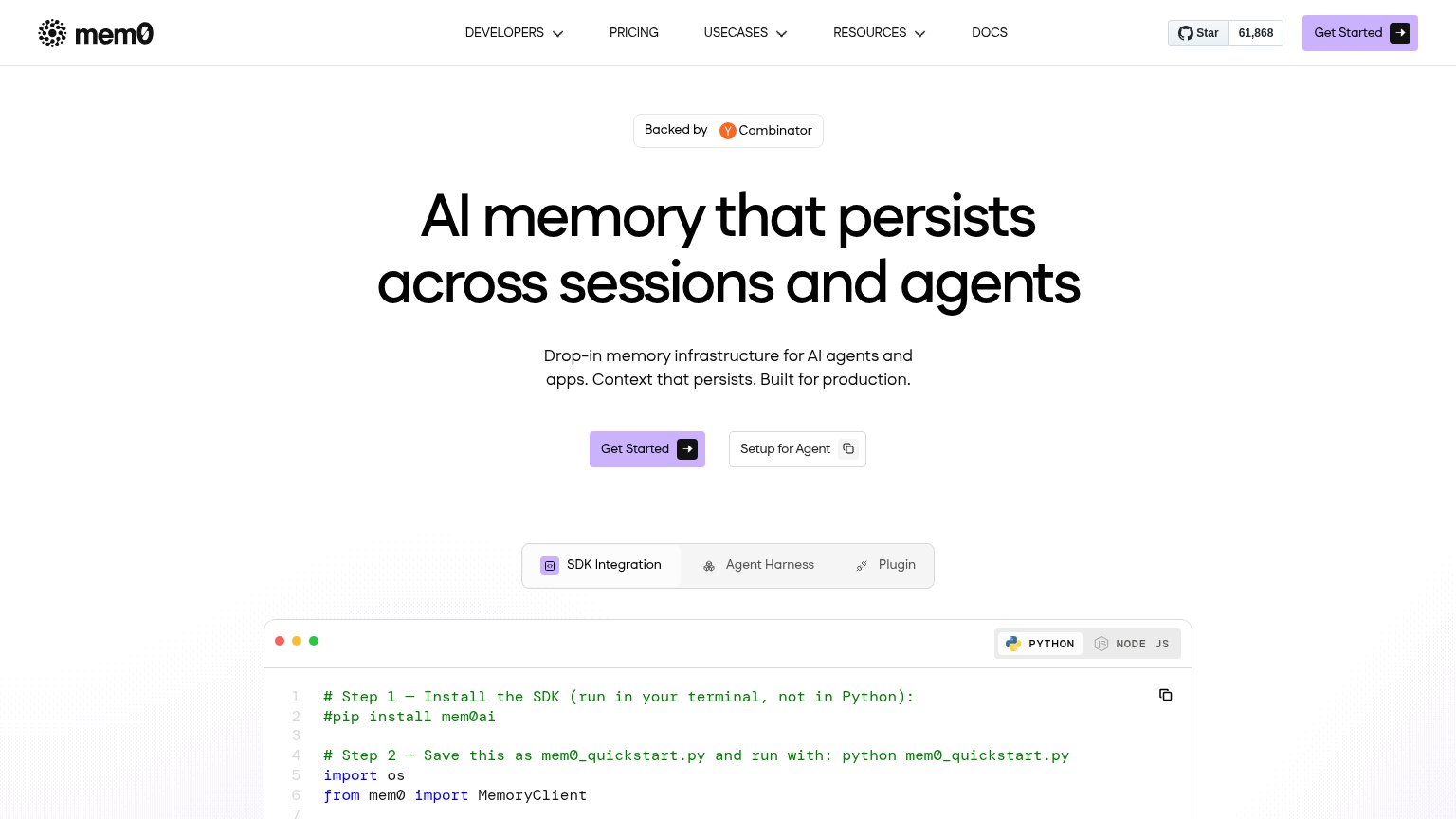
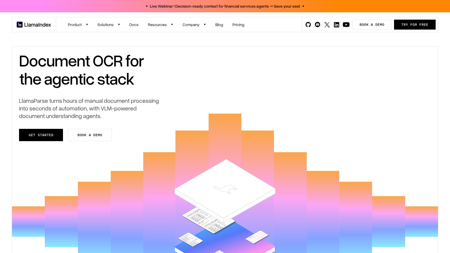
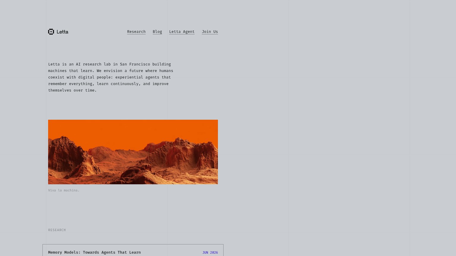
| Trust read | |
|---|---|
| Proper Motion | No visible trust signal identified. |
| GitHub star badge showing "61,868" stars in the nav | |
| "TRUSTED BY AI TEAMS" logo wall with Samsung, Zscaler, HoneYBOOK, Quorum, and AGI, Inc. | |
| Research listing "Memory Models: Towards Agents That Learn — JUN 2026" | |
| No visible trust signal identified. | |
| GitHub and Discord icons in the header navigation |
CTA
48PoorCopy, size, verb, cost-feel — does the primary CTA earn the click?
Problems
- styled as tiny text link, not a button
- leads to content, not the product
- smaller footprint than banner and headline
- no path to signup or access
Mobile web
64FairThe phone experience as a first-class citizen.
 12
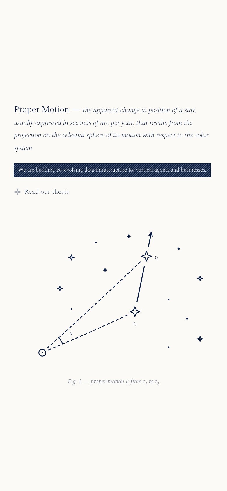
12- Read our thesis link — The only CTA is a small text link with no button styling or tap-target size, so thumbs skim past it.
- Hatched value banner — The diagonal hatching runs through the copy, making the core value statement hard to read on a phone.
Information hierarchy
72FairDoes the design help or inhibit what the page is trying to say?
123- Read our thesis link — The only CTA on the page is a small, low-weight text link with no button affordance — findable in one second only by luck.
- Hatched mission banner — The core statement about vertical agents sits under a striped hatch texture that degrades legibility of the one sentence that matters.
- Dictionary definition subhead — The astronomy definition gets larger type and top billing than the company's actual value proposition, inverting the message hierarchy.
Competitors
closest by platform, customer profile, and value propGraded against Lazyweb’s growth rubrics.