Your landing page’s weakest score is Trust.
How Switchfrog ranks
67Growth scoreupdated
category scores
category scoresShowHide
 Lazyweb ProAI Growth PMTurn this score into growth.Analyze your site and propose fixes across conversion, SEO, and AEOMonitor competitors’ in-product UX and A/B testsLearn from growth experiments across 10,000+ top productsTry Pro Free →
Score over time
Trust
32PoorProof that the product is real, competent, and safe to try.
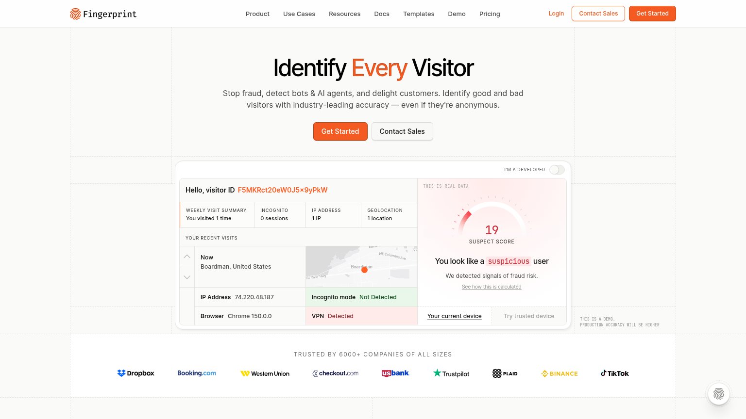
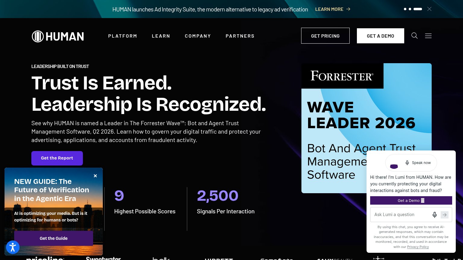
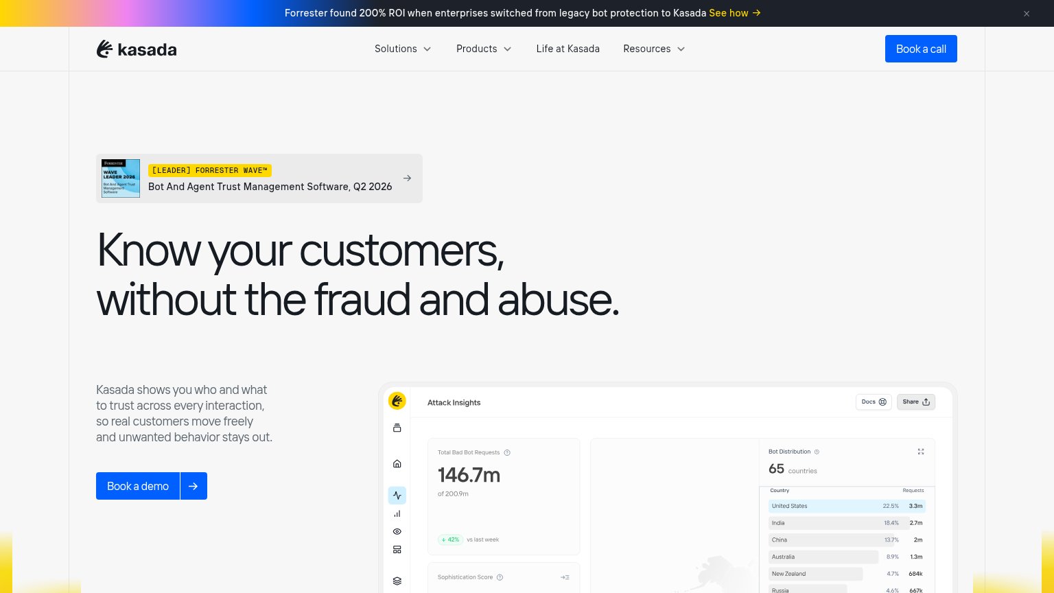
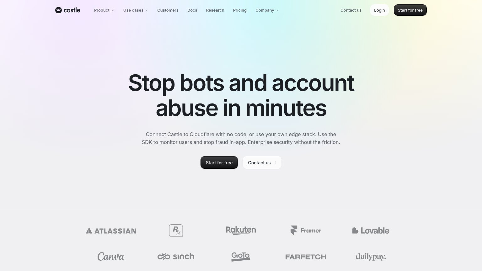
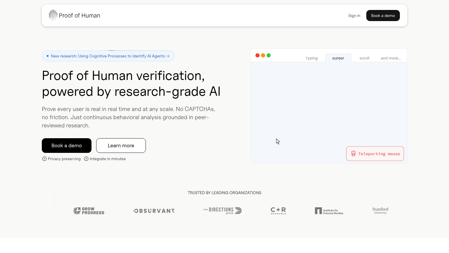
| Trust read | |
|---|---|
| Switchfrog | No visible trust signal identified. |
| Customer logo wall: Atlassian, Rockstar Games, Rakuten, Framer, Lovable, Canva, Sinch, GoTo, Farfetch, Dailypay | |
| Live demo widget showing the visitor's real data — visitor ID, IP 74.220.48.187, VPN Detected, and Suspect Score 19 — la | |
| Forrester 'WAVE LEADER 2026 — Bot And Agent Trust Management Software' badge | |
| [LEADER] FORRESTER WAVE™ Bot And Agent Trust Management Software, Q2 2026 badge | |
| 'TRUSTED BY LEADING ORGANIZATIONS' logo strip including Stanford University, C+R Research, and Institute for Futures Stu |
CTA
64FairCopy, size, verb, cost-feel — does the primary CTA earn the click?
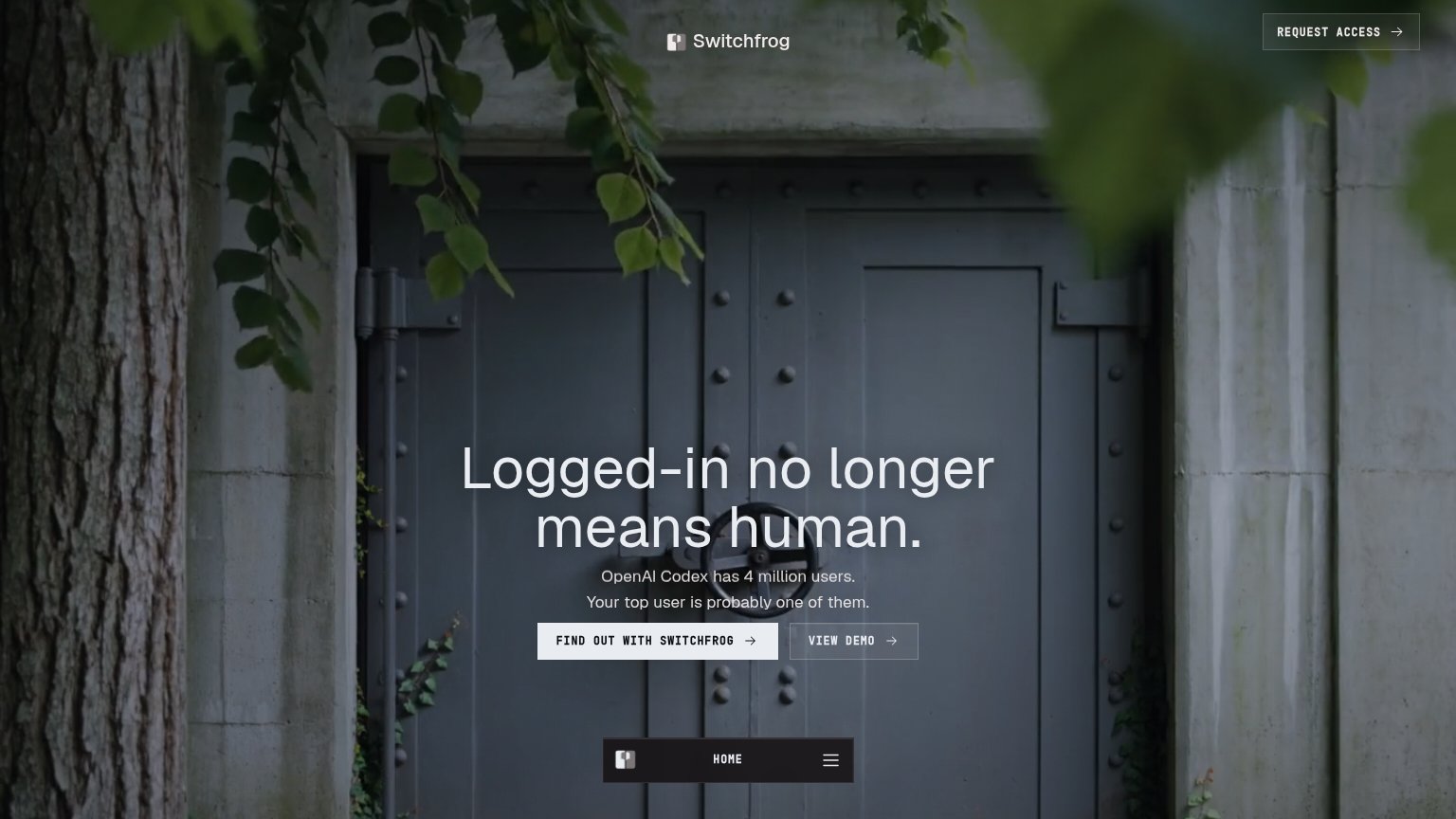
Problems
- 4 words — over 3-word limit
- brand name wastes label space
- 'find out' names no payoff
- clashes with nav 'REQUEST ACCESS'
Value props
73FairTitle, subtitle, hero — do they sell the product's true value?
Switchfrog’s headline undersells
Logged-in no longer means human.
OpenAI Codex has 4 million users. Your top user is probably one of them.
Working
- Provocative, problem-first headline
- Concrete stat: 4 million users
- 'Switchfrog's top user' makes threat personal
Could improve
- Product outcome never stated
- Hero image decorates, not demos
- Value requires inference from CTA
Information hierarchy
80StrongDoes the design help or inhibit what the page is trying to say?
123- Request Access button — A second conversion path with a different label than the hero's 'FIND OUT WITH SWITCHFROG', splitting attention between two doors to the same action.
- Floating bottom nav — The HOME bar and hamburger sit inside the hero's scan path, introducing navigation exits right below the primary CTA pair.
- View Demo button — Same size and adjacent position as the primary CTA; the outline treatment alone is not enough subordination at a glance.
Mobile web
86StrongThe phone experience as a first-class citizen.
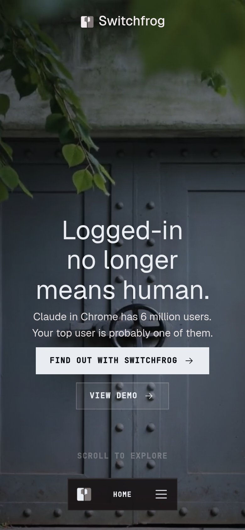 12
12- VIEW DEMO button — Thin ghost outline nearly vanishes against the dark door photo, making the secondary action easy to miss.
- SCROLL TO EXPLORE label — Low-contrast gray text over a dark textured background is barely legible at arm's length.
Competitors
closest by platform, customer profile, and value propGraded against Lazyweb’s growth rubrics.